Updated on May 23, 2017
In this article, I share the steps to
- remove header right widget area
- reposition the primary navigation menu from below the header to inside header so that the site title is at left and nav menu is on the right
- set the hamburger menu icon to appear inline floated to the right as the screen size comes down to 1022px. When the menu icon is clicked/tapped, the primary menu slides down below the header
in Genesis Sample child theme.
Tested in Genesis Sample v2.3.0
Step 1
Edit child theme’s functions.php.
a) Change
// Rename primary and secondary navigation menus.
add_theme_support( 'genesis-menus', array( 'primary' => __( 'After Header Menu', 'genesis-sample' ), 'secondary' => __( 'Footer Menu', 'genesis-sample' ) ) );
to
// Rename primary and secondary navigation menus.
add_theme_support( 'genesis-menus', array(
    'primary' => __( 'Primary Navigation Menu', 'genesis-sample' ),
    'secondary' => __( 'Footer Menu', 'genesis-sample' ) )
);
b) Add
// Remove the header right widget area.
unregister_sidebar( 'header-right' );

// Reposition the primary navigation menu.
remove_action( 'genesis_after_header', 'genesis_do_nav' );
add_action( 'genesis_header', 'genesis_do_nav' );

// Remove Primary Menu's wrap.
add_theme_support( 'genesis-structural-wraps', array(
    'header',
    // 'menu-primary',
    'menu-secondary',
    'footer-widgets',
    'footer'
) );
Step 2
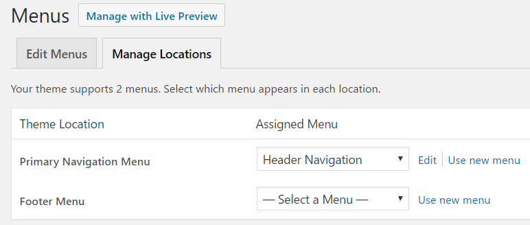
If you haven’t already, create and assign a WordPress menu to Primary Navigation Menu theme location at Appearance > Menus.
Step 3
Add the following at the end in Genesis Sample’s style.css:
.nav-primary {
    border-top: none;
    float: right;
}

@media only screen and (max-width: 1023px) {

    .site-header .wrap {
        padding-left: 0;
        padding-right: 0;
    }

    .title-area {
        width: auto;
    }

    .header-image .title-area {
        float: left;
        width: 100%;
    }

    .menu-toggle {
        width: auto;
        border-top: none;
        float: right;
        margin-top: 16px;
    }

    .menu-toggle,
    .menu-toggle:focus,
    .menu-toggle:hover {
        border-top: none;
    }

    .nav-primary {
        float: none;
        clear: both;
    }

}

@media only screen and (max-width: 860px) {

    .site-header .wrap {
        padding-left: 5%;
        padding-right: 5%;
    }

}

@media only screen and (max-width: 500px) {

    .title-area,
    .menu-toggle {
        float: none;
        width: 100%;
    }

    .header-image .title-area {
        float: none;
        overflow: hidden;
    }

}
This is exactly what i have been looking for. Could you make a tutorial for Centric Pro theme?
Hi Sridhar Katakam!
Thank you for this tutorial, this is exactly what I was looking for! But I have a question and hope you can help:
In general I understand that the lines beneath will change the text that is displayed before the menu icon. But I dont understand how it really works, could you please explain a little bit?
Thank you very much,
Kilmo
$output = array(
‘mainMenu’ => __( ‘Menu’, ‘my-theme-text-domain’ ),
‘subMenu’ => __( ‘Menu’, ‘my-theme-text-domain’ ),
);
wp_localize_script( ‘responsive-menu’, ‘ResponsiveMenuL10n’, $output );
wp_localize_script is being used here to send data from PHP to JS.
responsive-menuis the handle of the JS file, responsive-menu.js to which data is sent to.ResponsiveMenuL10nis the name of the array variable sent from PHP to the js file.$outputis the array which has two name-value pairs: 1) mainMenu-Menu 2) subMenu-Menuresponsive-menu.js has the code to use and show these received values.
Thank you for your explanation!
This is a great tutorial, Shridhar, this is what I really need. But the new Genesis Sample does not have a Primary Navigation theme location your code request. There are just After Header Menu and Footer Menu. Can it make any trouble when using your code? For me it does not work and this is the only reason I have found.
You may want to either use my Genesis Sample Starter child theme which is based on the current latest Genesis Sample 2.2.3 and has inline mobile menu or examine the changes in it and implement them in your theme.
Go here: https://sridharkatakam.com/genesis-starter-child-theme/
Thank you for this tutorial but I found an issue. When the mobile menu is open we can’t click on the logo.
Is there any solution for that or maybe a better approach?
Just delete in style.css
.header-image .site-title > a {
background-position: center top;
}
How can I change the font size? For some reason, when I change it (like putting it in 40px) in the .menu-toggle:before, .menu-toggle.activated:before section, it dosent change the “before” state font size, but the “after” state. The before state still reamain in font-size 20px.
Nevermind, since I’m not using sub menu, a simple:
———
$( “.genesis-nav-menu .menu-item” ).click(function() {
$( “.nav-primary” ).slideToggle();
});
——–
in the responsive-menu.js do the job!
Oups…Wrong bug post 😉
Nope I still dont know how to edit the size of the menu icon.
Hello sir, do you have video tutorial?.. i’m sorry because i dont understand better.. here’s my website, healthcertified2k.com can you please check if its work..
Hi Sridhar Katakam
Great Job even I don’t have any idea, how it works. I am not a programme and did strictly what you mentioned and it works.
But there is a question: What can I do to change the menu to a hamburger also on the resolutions greater than 960px? Means, I want to replace the menu in all sizes with a hamburger.
Thanks for helping a greenhorn and kind regards.
Hi Sridhar,
can you update this theme with last update genesis-sample ?
because last update have more compability with woocommerce
,but i like this inline menu 🙂
,thanks
[…] Source: https://sridharkatakam.com/add-inline-mobile-responsive-menu-genesis-sample/ […]
This didnt work for me, the menu moved, but when resizing the menu moves to its normal position under the logo.
thank you for sharing, Genesis is really good
Dear Sir, I want to fully customize my genesis child theme. Can you please help me or work for my website
You can contact me for freelancing work via the form here: https://sridharkatakam.com/contact