Updated on May 23, 2017
In this article, I share the steps to
- remove header right widget area
- reposition the primary navigation menu from below the header to inside header so that the site title is at left and nav menu is on the right
- set the hamburger menu icon to appear inline floated to the right as the screen size comes down to 1022px. When the menu icon is clicked/tapped, the primary menu slides down below the header
in Genesis Sample child theme.
Tested in Genesis Sample v2.3.0
Step 1
Edit child theme’s functions.php.
a) Change
// Rename primary and secondary navigation menus.
add_theme_support( 'genesis-menus', array( 'primary' => __( 'After Header Menu', 'genesis-sample' ), 'secondary' => __( 'Footer Menu', 'genesis-sample' ) ) );
to
// Rename primary and secondary navigation menus.
add_theme_support( 'genesis-menus', array(
    'primary' => __( 'Primary Navigation Menu', 'genesis-sample' ),
    'secondary' => __( 'Footer Menu', 'genesis-sample' ) )
);
b) Add
// Remove the header right widget area.
unregister_sidebar( 'header-right' );

// Reposition the primary navigation menu.
remove_action( 'genesis_after_header', 'genesis_do_nav' );
add_action( 'genesis_header', 'genesis_do_nav' );

// Remove Primary Menu's wrap.
add_theme_support( 'genesis-structural-wraps', array(
    'header',
    // 'menu-primary',
    'menu-secondary',
    'footer-widgets',
    'footer'
) );
Step 2
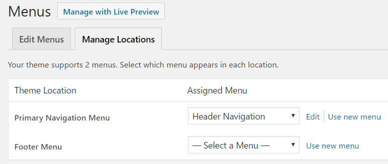
If you haven’t already, create and assign a WordPress menu to Primary Navigation Menu theme location at Appearance > Menus.
Step 3
Add the following at the end in Genesis Sample’s style.css:
.nav-primary {
    border-top: none;
    float: right;
}

@media only screen and (max-width: 1023px) {

    .site-header .wrap {
        padding-left: 0;
        padding-right: 0;
    }

    .title-area {
        width: auto;
    }

    .header-image .title-area {
        float: left;
        width: 100%;
    }

    .menu-toggle {
        width: auto;
        border-top: none;
        float: right;
        margin-top: 16px;
    }

    .menu-toggle,
    .menu-toggle:focus,
    .menu-toggle:hover {
        border-top: none;
    }

    .nav-primary {
        float: none;
        clear: both;
    }

}

@media only screen and (max-width: 860px) {

    .site-header .wrap {
        padding-left: 5%;
        padding-right: 5%;
    }

}

@media only screen and (max-width: 500px) {

    .title-area,
    .menu-toggle {
        float: none;
        width: 100%;
    }

    .header-image .title-area {
        float: none;
        overflow: hidden;
    }

}