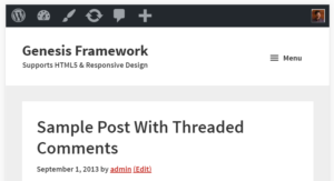
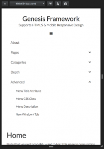
Updated on May 23, 2017 In this article, I share the steps to remove header right widget area reposition the primary navigation menu from below the header to inside header so that the site title is at left and nav menu is on the right set the hamburger menu icon to appear inline floated to […]
mobile responsive
Mobile Responsive Genesis Header Nav
Gary Jones authored a plugin called Genesis Header Nav for Genesis that registers a menu location and displays it inside the header. The benefit of using this plugin over the built-in Header Right widget area is that when the requirement is to display a custom menu in header’s right side, Genesis Header Nav plugin does […]
How to add Beautiful Pro’s mobile responsive menu in other Genesis themes
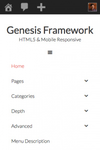
This is an update to my earlier article titled How to make Header menu in Genesis mobile responsive similar to that in Beautiful Pro. The earlier article worked with Beautiful Pro version 1.0.1. This tutorial is for the current latest v1.1. Below are screenshots showing the result of applying the steps in Genesis Sample. Step […]
How to add News Pro’s mobile responsive menu in other Genesis themes
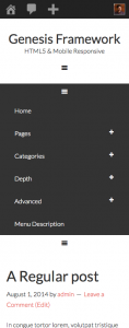
In this article I show how we can use the code for mobile responsive menus taken from News Pro and use it in other Genesis child themes. Genesis Sample theme is used for the purpose of this tutorial. The top level menus can be expanded by tapping on the + at their far right and […]
How to make Header menu mobile responsive in Outreach Pro
To view the full content, please sign up for the membership. Already a member? Log in below or here.
Links to tutorials on Mobile Responsive Navigation Menus in Genesis
To view the full content, please sign up for the membership. Already a member? Log in below or here.
How to display full sized menu instead of the mobile responsive menu in Minimum Pro
To view the full content, please sign up for the membership. Already a member? Log in below or here.


Recent Comments