In the comments section of Responsive menu inside an off-canvas side menu using Slideout.js in Genesis, a user asked: Looks great Sridhar! Would love to use this on a new project. I’m using Altitude Pro as my base theme and I can’t get it to work. Any tips? In this article, I share the steps […]
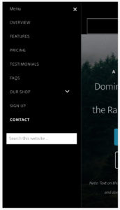
Mobile menu
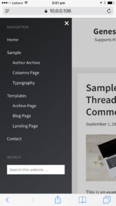
Off-canvas side menu in Genesis using Slideout.js
Update on January 12, 2020: Follow the updated tutorial here instead. Slideout.js is a touch slideout navigation menu for mobile web apps. In this tutorial, I share the steps to display a hamburger menu icon at smaller widths which when clicked/tapped will slide out the widgets placed in a widget area from the side of […]
Animated Hamburger Menu Icon in Genesis
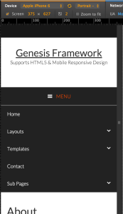
In Genesis (Genesis Sample, to be precise as well as most other child themes from StudioPress), tapping on the hamburger menu icon at smaller screen widths will toggle the responsive menu and the menu icon does not change i.e., remains a hamburger. It is possible to customize this such that tapping the mobile menu’s icon […]
Google Webmasters site’s Mobile Menu in Genesis
In my Facebook group, a user asked: Hello Sridhar, Google just released a new design for the webmaster tools (https://www.google.nl/intl/nl/webmasters/#?modal_active=none) and I love the mobile menu. Could you make a tutorial on how to make that using your Genesis Sample Master theme? Thanks a lot! The redesigned Google Webmasters website shows a hamburger menu icon […]
How to add a responsive mobile menu before footer in Focus Pro
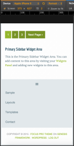
In Genesis Facebook group, a user wrote: I am using Studiopress Focus Pro on this site. I have the custom menu widget in the header right widget area…I also have it in the footer 1 widget area… What is happening is that the header menu will turn into a hamburger when viewed on a small […]
Accessible Responsive Menu in Genesis
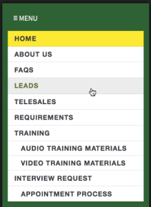
Newer Genesis child themes like Workstation Pro and Atmosphere Pro come with responsive mobile hamburger menu code which is better than the one in older themes like Beautiful Pro or Magazine Pro in that accessibility is taken care of. In this article I share the code taken from Workstation Pro and slightly modified so that […]
How to add a responsive mobile menu in any Builder theme
The recent iThemes Builder themes like Reddinger come with a nice mobile responsive menu built in. We can use the code in such themes in other Builder themes that do not have the mobile menu. In this article I will list the steps to use Reddinger’s mobile menu in Avail’s child theme. Desktop view: Mobile […]
How to add a working second Mobile Navigation menu in iThemes Builder
Newer iThemes Builder child themes like Air come built-in with mobile navigation feature. When a layout is edited and Navigation Module modified there will be a Style called Mobile Navigation. With this Style applied to the module, in the front-end at mobile widths i.e, < 500px, menu items will no longer appear and will be […]
Recent Comments