April 24, 2018: The tutorial on this page is for an older version of Genesis Sample. For v2.6.0 and above, follow this instead.
The theme version is yet to be updated.
Updated on July 03, 2017
If you’d like to purchase a theme version of this tutorial, get it here.
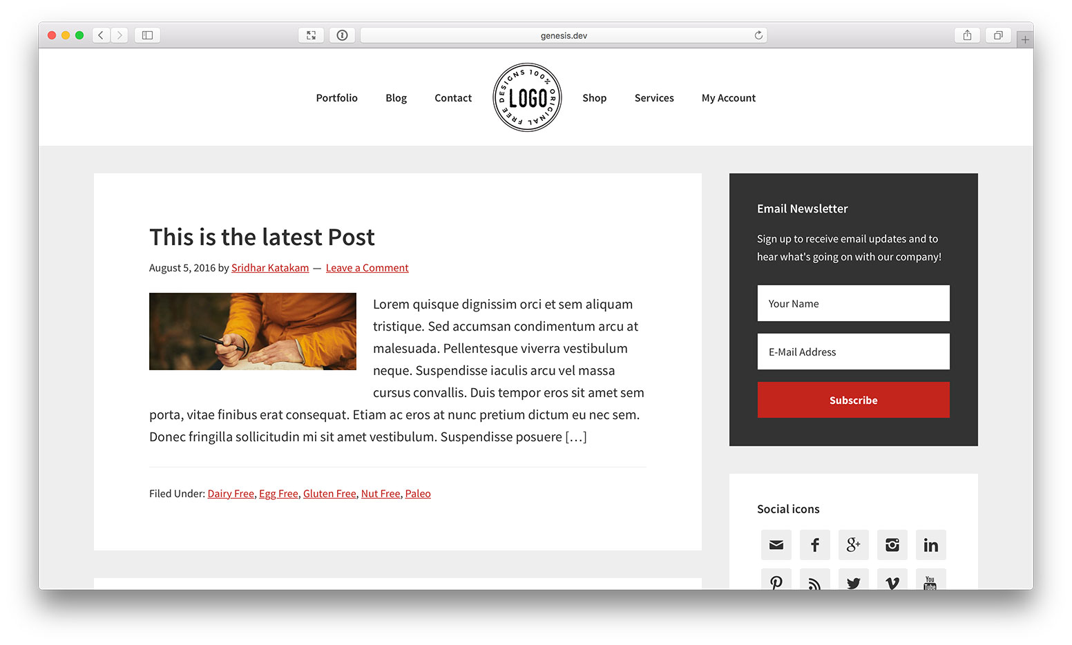
In the past, I wrote about splitting the menu items of a nav bar into left and right areas with header image (logo) in the middle here. That tutorial relied on a (commercial) plugin WP Nav Plus.
In this article, I present a better, cleaner and easier method to achieve the same.

Benefits of this approach over others:
- Does not need a plugin
- No negative margins or absolute positioning or other CSS hacks
- No need to have the menu items split into two separate primary and secondary menus
While the tutorial has been written for Genesis Sample child theme it should work with minor adjustments in any Genesis child theme.
Step 1
Edit child theme’s functions.php.
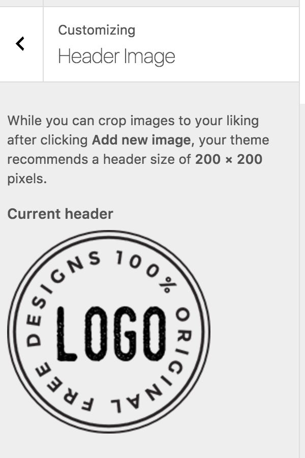
a) Decide the size of your image logo and specify twice its dimensions in the custom header add theme support function call.
In this example, I would like to display the logo 100px x 100px. Hence I am going to change the width and height to 200px each.
i.e., change
//* Add support for custom header
add_theme_support( 'custom-header', array(
    'width'           => 600,
    'height'          => 160,
    'header-selector' => '.site-title a',
    'header-text'     => false,
    'flex-height'     => true,
) );
to
//* Add support for custom header
add_theme_support( 'custom-header', array(
    'width'           => 200,
    'height'          => 200,
    'header-selector' => '.site-title a',
    'header-text'     => false,
    'flex-height'     => true,
) );
b) Add
// if header image is set, remove Header Right widget area and inject CSS to apply the header image as background image for home menu item and more
add_action( 'wp_head', 'sk_home_menu_item_background_image' );
function sk_home_menu_item_background_image() {

    if ( get_header_image() ) {
        // Remove the header right widget area
        unregister_sidebar( 'header-right' ); ?>

        <style type="text/css">
            .nav-primary li.menu-item-home a {
                background-image: url(<?php echo get_header_image(); ?>);
                text-indent: -9999em;
                width: 100px;
                height: 100px;
            }

            @media only screen and (min-width: 1024px) {
                .site-header > .wrap {
                    padding: 0;
                }

                .title-area {
                    display: none;
                }

                .nav-primary {
                    padding: 20px 0;
                }

                .menu-primary {
                    display: -webkit-box;
                    display: -webkit-flex;
                    display: -ms-flexbox;
                    display: flex;
                    -webkit-box-pack: center;
                    -webkit-justify-content: center;
                        -ms-flex-pack: center;
                            justify-content: center; /* center flex items horizontally */
                    -webkit-box-align: center;
                    -webkit-align-items: center;
                        -ms-flex-align: center;
                            align-items: center; /* center flex items vertically */
                }
            }
        </style>
    <?php }

}
Set the width and height for .nav-primary li.menu-item-home a to those of your desired logo image display size.
Step 2
Add the following in child theme’s style.css:
.header-image .site-title > a {
    min-height: 100px;
}

@media only screen and (min-width: 1024px) {

    .nav-primary li.menu-item-home a {
        background-repeat: no-repeat;
        background-size: contain;
        margin: 0 10px;
    }

}

@media only screen and (max-width: 1023px) {

    .nav-primary .genesis-nav-menu .menu-item.menu-item-home {
        display: none;
    }

}
Set the minimum height of .header-image .site-title > a to that of your desired logo image display size.
Step 3
At Appearance > Header, upload/select your desired logo image.

Step 4
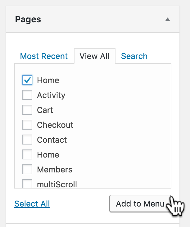
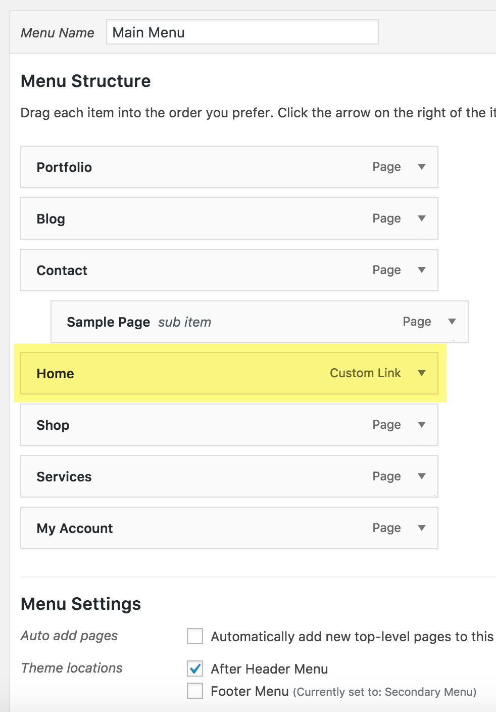
At Appearance > Menus, edit your primary menu. Add a “Home” menu item (Pages section > View All tab > tick Home > Add to Menu button) and move it so it is in the middle with menu items above and below it.


That’s it!
Note: You may be wondering why all that CSS (other than the line to set background image) need to be added via PHP in Step 1b when it can be done via style.css. The reason is to ensure that site header and primary nav look okay on the front end in the case when the header image has not been set.
[…] Update on October 08, 2016: Also see https://sridharkatakam.com/split-navigation-menu-items-logos-left-right-genesis/ […]
Oh yeah!! Much better than the StudioPress way and without having to rely on the Nav Plus plugin. Great job!
Nice setup.. i was doing this whith some code.
Now we have a elegent way..
[…] tutorial covers implementing split navigation with menu items on logo's left and right in […]
Hi Sridhar,
Is this working exactly the same on the Master Sample theme provided by you?
Hi Sridhar,
Thanks for this, it works great. One thing you forgot to mention in Step 4 is to add the “menu-item-home” class to the CSS Classes (optional) in the Appearance > Menus > Home tab.
Hi,
That class automatically gets added by WordPress for the built-in Home menu item.
I have noticed that class get removed when I migrate sites.
I wasn’t sure how to get it back, but adding “menu-item-home” manually to the CSS Classes works like a charm.
This works perfectly! I just have one question. How do we get the logo to display in responsive mode?
I need this as well… no matter what I try the logo doesn’t appear in the responsive mode!
Wondering if this works on Brunch Pro. I tried it and it did not work for me.
You can ignore this! I got it working 🙂
Works well! The only problem I see is that the menu is not aligned to the center. Instead, the length of menu link word is pushing the menu around. You can see the issue on my site.
What I mean is, the logo is not fixed to the center of the website. The whole menu is moving around depending on the length of menu link words.
This worked spot on first time, on Gallery Pro theme. It was just what I had been asked for an hour earlier. Amazing Sridhar. Thanks so much.
The only issue that I have with this is that on mobile view, expanding the burger menu button, you get in effect two logos visible. The one in the navbar plus the regular site logo. Is there a way in mobile to ‘hide’ the image and just have the word ‘Home’? Otherwise, it’s a great easy workaround and saves a lot of coding.
Hi Liz,
Did you ever figure out a way to hide the logo that shows up within the burger menu on responsive view?
Thanks!
Which child theme are you using?
Can you provide the URL of your site?
I’m using Infinity Pro. The header also seems to be aligned to the left for some reason.
http://dev.thearmoryofchattanooga.com/
Thanks Sridhar!
In your theme’s style.css, you’ll see that
.nav-primaryis set to float left and have a width of 60%. If you delete those lines, the nav will be centered.I can implement this in the current latest version of Infinity Pro and writ a tutorial, if you want. Let me know.
https://sridharkatakam.com/split-navigation-in-infinite-pro/
Works for Inifinity Pro,
but like Atila I discover the same problem with the menu. Its is not centered on the logo but on all text navigation words.
Depending on the length of the words the logo moves.
It took me a while to get it to this point and quite some changing code was necessary to get there.
https://sridharkatakam.com/split-navigation-in-infinite-pro/
OMG! Can’t thank you enough!
I tried it and the logo doesn’t appear at all. The only thing that happens is that the links are centered.
Are you sure this works with the latest version of Genesis?
Does the Home menu item have
menu-item-homeCSS class?Can you provide the URL of your site?
No i didn’t, now it works! Thanks.
[…] tutorial covers the details of implementing Split Navigation with menu items on logo’s left and right in Genesis in Gallery […]
This didn’t work for me on the genesis sample theme 🙁
Sorry, I managed to get it working! Is it possible to make it something other than the home button?
Sure. You can add a custom link, set the URL to that of your choice, set a CSS class and change
menu-item-homein the code to the class of this menu item.[…] tutorial covers implementing Split Navigation with menu items on logo’s left and right in Genesis tutorial in Infinite […]
[…] Split Navigation with menu items on logo’s left and right in Genesis tutorial is now available as a functionality theme. […]
yay! This is perfect. I’m so excited. How would I change the code to still show the logo even if it’s not placed in the Menu Bar (it does not have to be in the menu bar)? Right now if I add a logo… it does not show unless I add ‘Home’ to the menu bar. I would essentially like to add a logo and it still show up (like a logo would normally appear) then if I choose to place it in the menu bar… I can add ‘Home’ to the menu bar. Thanks.
I am afraid I don’t get what you are asking for.
Do you want logo at left and nav bar at the right?
Thanks for your reply 🙂
So sorry. Right now when I add a logo in customizer the logo does not show up and the title is also gone. The logo will only show if I add Home to the menu bar. I would still like the logo to show even if I haven’t added ‘Home’ to the menu bar yet. Is that possible? Or, maybe I did something wrong in the coding? Thanks a lot. I’m using the Lifestyle theme.
Lifestyle Pro (theme demo) has primary nav at the top, then the header with site title+tagline below that and then the secondary nav below that.
So you want the primary nav to be split with an image logo in the middle but continue to have the site title appearing as is in the header?
Hi. It’s probably easier for me to show you via video. Please watch this https://youtu.be/y-dX0Vym4e8
I essentially would like my customers to choose whether or not they want the logo to appear in the menu bar or in the regular header area (not both). If they wanted to use a logo but not in the menu bar… that wouldn’t be an option for them unless I removed all the coding.
Thanks again.
Watched the video. Thanks for the appreciation.
I understand that you want the logo to be shown in the header when the Home menu item hasn’t been added to the Primary menu. But what if it is added? Do you then want the logo image to NOT appear in the header? or should it continue to appear or should it be replaced with site title and/or tagline?
Hi, thanks for this tutorial! I’m trying to implement this using your updated Genesis Starter Theme. Everything works perfectly, except when responsive, the .title-area appears with the .site-title text and description over top of part of the logo image.
I tried using your other tutorial for the same thing for infinity pro since the behavior in the video demo is exactly what I’m trying to do, and that didn’t work for me either.
I’m guessing there’s something specific to the new starter theme, (mobile first?). Any help is appreciated, thanks.
Josh
Worked great. However when in mobile mode, the logo is not a link anymore. How would you fix this.
Hi Jeff,
This tutorial was written for Genesis Sample. I see that you are using Dynamik which, in my opinion, is a pain to customize especially responsiveness.
Unfortunately, I will not be able to assist you with this. If you are using any theme other than Dynamik, like a child theme from StudioPress and this tutorial is not working as expected, please let me know.
I understand the struggle Dynamik. I was successful in modding the code to work with Dynamik. I ended up making the responsive image a background image that showed up below 1023px. Now the struggle to make it a link.
@media only screen and (max-width: 1023px) {
.nav-primary .genesis-nav-menu .menu-item.menu-item-home {

    display: none;

}

.site-header {

        background: url(https://pineapple-pc.com/wp-content/uploads/dynamik-gen/theme/images/pineapple-pc-logo-300-180.png);

        background-repeat: no-repeat;

        background-position: center;

}

.homeicon2{

     display: none;

}
}
[…] Reference: https://sridharkatakam.com/split-navigation-menu-items-logos-left-right-genesis/ […]
Im working on a dev build (offline) with the genesis sample theme with no menu alterations.
Everything from the tutorial works EXCEPT the logo disappears on mobile. I followed the instructions exactly and this is the case. I need the logo to center above or beside the hamburger menu toggle.
If you can make your site live and share the link, I can take a look and ask for WP login if necessary.
Ok made it live, It’s not much to look at right now but you can see the menu issue I am having here: https://cammunro.net/dev/
cammunro at gmail.com is my email if needed. — Thanks so much for following up with my comment!
Any luck with looking into the logo issue?
Sorry about the delay.
I am looking at your dev site and can’t find .title-area element inside .site-header .wrap.
Have you added any other code besides the one in this tutorial that might remove that element?
Ahh I was using one of your genesis sample themes from a while back (I believe from one of your widgetized homepage tutorials).
This was in my functions.php :
//* Remove the default header
remove_action( ‘genesis_header’, ‘genesis_do_header’ );
I commented it out and it fixed my issue.
Thanks for your help Sridhar 🙂
Hi Sridhar,
Any chance you can adjust or update this tutorial to work with Genesis Sample 2.6.0
I am noticing many of the tutorials are not compatible with the custom logo in Customizer.
Done.
https://sridharkatakam.com/split-navigation-in-genesis-sample-2-6-0/
[…] is an updated version of Split Navigation with menu items on logo’s left and right in Genesis tutorial, customized and tested in the current latest Genesis Sample, […]
I have a dev site setup and had the split menu working great until the client decided to change one of the navigation items so it has many more characters than the other items. My logo isn’t centered anymore because, any suggestions on how to fix it?
Can you provide the URL of the site?
Sorry, I had meant to include the URL http://gdf.t3webservices.com/
I am not able to figure out an elegant solution to this problem.
Until then you could hardcode a left padding to
.menu-primary.Found a few discussions on this problem like at https://stackoverflow.com/questions/37891839/keep-one-element-centered-between-two-elements-of-different-widths-in-flexbox.
Thank you for this tutorial.
Is there any way to add textual link to home?
Which Genesis child theme are you using and what is its version number?