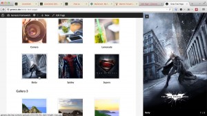
Strip is a jQuery script by Nick Stakenburg for elegantly sliding images and videos (YouTube and Vimeo hosted) from your screen edge rather than the traditional lightbox that appears no top of the content. In this article I show how Strip can be implemented in WordPress and share custom jQuery code for making Strip work […]
Search Results for: responsive
Responsive Design View Presets in Firefox for Web Development
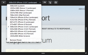
Firefox has a fantastic featured baked in called Responsive Design View for quickly resizing your active tab to different Preset dimensions. To bring it up, go to Tools > Web Developer > Responsive Design View or press Cmd + Alt + M on a Mac or Ctrl + Shift + M on a PC. If […]
How to add a link to switch between responsive and desktop views in Genesis
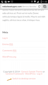
A user emailed me today: …I am working on a website for a client but having a problem coming up with a solution per her request. She would like for her readers to be able to have a choice when viewing her website on mobile devices. Currently her site is responsive (thanks to your help […]
How to add Beautiful Pro’s mobile responsive menu in other Genesis themes
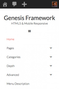
This is an update to my earlier article titled How to make Header menu in Genesis mobile responsive similar to that in Beautiful Pro. The earlier article worked with Beautiful Pro version 1.0.1. This tutorial is for the current latest v1.1. Below are screenshots showing the result of applying the steps in Genesis Sample. Step […]
How to add News Pro’s mobile responsive menu in other Genesis themes
In this article I show how we can use the code for mobile responsive menus taken from News Pro and use it in other Genesis child themes. Genesis Sample theme is used for the purpose of this tutorial. The top level menus can be expanded by tapping on the + at their far right and […]
How to add a full width responsive image below site header in Genesis
To view the full content, please sign up for the membership. Already a member? Log in below or here.
Responsive header banner image in Beautiful Pro
In Beautiful Pro the .site-header-banner div has background image set via CSS and as such is not responsive. It is possible to make image backgrounds responsive but I personally prefer to just “embed” images vs using them as backgrounds and using CSS/JS to make them responsive. Just feels more natural and the proper way of […]
How to change mobile responsive hamburger icon in Genesis
To view the full content, please sign up for the membership. Already a member? Log in below or here.
How to position Secondary Nav below Slider and make it mobile responsive in Outreach Pro
To view the full content, please sign up for the membership. Already a member? Log in below or here.
Making YouTube videos responsive when using Dynamik
On a website I am currently working on the active theme is Dynamik, a commercial child theme for Genesis. There’s a YouTube video in the content on homepage inserted via the WordPress oEmbed that automatically inserts the player by detecting video URL in the following format: http://www.youtube.com/watch?v=4EErMxbKhLM The video is not responsive at smaller widths […]


Recent Comments