I am using the Agency Pro theme and have my primary navigation menu in the “Header Right” widget. On mobile screens, this places the navigation menu underneath the site title. Is it possible to move the header right inline with the site title, similar to the navigation menu on the Navigation Pro theme?
Search Results for: responsive
How to enable responsive hamburger menu for the footer menu in Infinity Pro

A menu appearing in the Footer Menu location in Infinity Pro will appear expanded at all widths out of the box like this: If you want to have this secondary menu collapse into a mobile hamburger menu 800px and below similar to the header (primary) menu simply edit Infinity Pro’s functions.php and change to Users […]
How to always show responsive menu in Genesis Sample
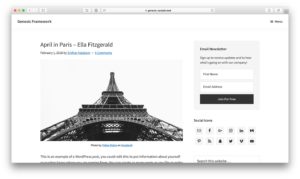
In Genesis Facebook group a user asks: Hi Everyone, Using Genesis Sample child theme and I want to always display the mobile navigational menu – even on desktop. I’m having a hard time finding a tutorial for that. Thanks! And the answer is to simply remove the relevant CSS in the 960px min-width media query. […]
Genesis ResponsiveMenus in Minimum Pro
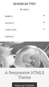
StudioPress has a Github repo called ResponsiveMenus.js for their responsive mobile menu code which is already included in their newer child themes like the Genesis Sample. This tutorial provides the steps to replace the older mobile responsive menu code with Genesis ResponsiveMenus.js in Minimum Pro. https://sridharkatakam.com/wp-content/uploads/2018/05/Genesis-ResponsiveMenus-in-Minimum-Pro.mp4 Tested in Minimum Pro 3.2.1. Step 1 Replace the […]
Responsive Front Page 1 image in Atmosphere Pro

Front Page 1 section of Atmosphere Pro uses Backstretch for its background image and is hence not responsive. Left and right side of the image will get cut off as we reduce the viewport width. This tutorial provides the steps to disable Backstretch and setup the Front Page 1 image inline i.e., as a regular […]
Full width responsive featured image with page title overlay on landing pages in Genesis
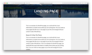
In the comments section of Full width featured image header with page title overlay on landing pages in Genesis, a user asked: Is there a way to make this pickup responsive? Not sure what “pickup” is in this context, but assuming that the user wants to have the featured image behave responsively I’ve worked out […]
Responsive Backstretch Image in AgentPress Pro

In Genesis Facebook group a user asked, Sridhar, are you able to create a tutorial on the Backstretch header image scaling issue on mobile devices for the AgentPress Pro theme? Like in my tutorial for Digital Pro we can add the backstretch image inside the .home-featured div above the .wrap, show it only at 768px […]
Adding Fancy Responsive Menu (see example site)
Hi Sridhar Would you please create help making a menu like http://www.reformcollective.com/ for genesis. I shall greatly appreciate it. Regards, Frank.
Responsive menu inside an off-canvas side menu using Slideout.js in Genesis
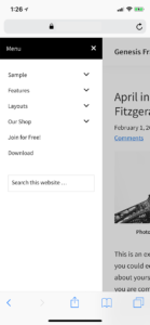
Updated on June 12, 2018 In one of my earlier tutorials, I wrote about Slideout in Genesis where the off-canvas side menu was set to show the widgets placed in a custom widget area. In this article, we shall move the mobile responsive menu which appears after clicking/tapping the hamburger menu icon (from 959px and […]
Responsive “background” image for Front Page 1 section in Digital Pro

Digital Pro has code that automatically sets the height of Front Page 1 widget area to that of viewport height and uses Backstretch jQuery script to set an image (changeable via WordPress customizer) as its background. There might be cases when you want the Front Page 1 section to take up only as much height […]
Recent Comments