In the comments section of How to Add a Right Sidebar in Atmosphere Pro a user asked: This is pretty awesome, thank you for the awesome tutorial. I have another modification for Atmosphere Pro that I would like to implement and that’s around the Responsive Menu. Would it be possible for you to put together […]
Search Results for: mobile
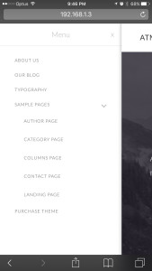
How to add a responsive mobile menu before footer in Focus Pro
In Genesis Facebook group, a user wrote: I am using Studiopress Focus Pro on this site. I have the custom menu widget in the header right widget area…I also have it in the footer 1 widget area… What is happening is that the header menu will turn into a hamburger when viewed on a small […]
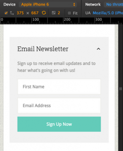
How to display Jetpack Subscriptions Form Horizontally in Remobile Pro

In this site’s Facebook group, a user asked I would like to make Jetpack’s Subscription (email input box & subscribe button) HORIZONTAL. I have tried a few things and nothing seems to be working. Any ideas? In this tutorial I share the CSS to make the Email input box and Subscribe button to appear next […]
How to Have Secondary Menu Show up in Mobile using Runway Pro
I’m using Runway Pro for a library website: http://www.sequoyahregionallibrary.org. When I view the site on a phone, or tablet, the secondary menu disappears. I’d love for it to display along with the primary menu, even if it is a hamburger displaying above the primary. The ideal would be for it to fall into line seamlessly […]
How to make Primary navigation in Altitude Pro sticky for mobile & Desktop
Hello Shridhar, How do i make Primary navigation in Altitude Pro sticky for mobile & Desktop. I will appreciate your support on the same. I have tried lot n have failed if you could help me out. Thanks.
Using mobble to set up collapsible horizontal opt-in form on mobiles in Genesis
In the members-only Tutorial Requests forum a user asked, Question – I’m implementing a horizontal opt-in on my new site but I’d like for it to be collapsible ONLY on mobile (primarily phones – kind of like mobile menus) since it takes up a lot of room when not collapsible and viewed on mobile. How […]
Collapsible Horizontal Opt-In in mobile
Hi! Just realized this is where I should’ve posted my question! Question – I’m implementing a horizontal opt-in on my new site but I’d like for it to be collapsible ONLY on mobile (primarily phones – kind of like mobile menus) since it takes up a lot of room when not collapsible and viewed on […]
How to make Primary navigation in Genesis sticky on scroll for desktops and mobile responsive on handhelds
In this tutorial I share the code for setting up a sticky Primary navigation below as users scroll past it. We are going to use Sticky-Kit jQuery script to make the nav fixed on non-handhelds and use code from Beautiful Pro for the hamburger menu. Set up: Genesis Sample is the active theme with menus […]
Displaying Full Navigation on Desktops in Remobile Pro

In the members-only forum in Tutorial Requests topic, Bodie asks: Could you help me change the Remobile pro navigation? I would like to: 1) move it under the header instead of above it. 2) Have it centered below the site title and tagline and be visible by default (no hamburger menu) 3) Implement the Beautiful […]
Centric Pro Parallax Image Mobile Responsive
Hi, I was able to follow the tutorial and implement a parallax image for Centric Pro theme. Looks awesome on computer but terrible on mobile devices. Is there a way this make parallax image mobile responsive? How to add Parallax background to After Header and Before Footer sections in Centric Pro
Recent Comments