Newer Genesis child themes like Workstation Pro and Atmosphere Pro come with responsive mobile hamburger menu code which is better than the one in older themes like Beautiful Pro or Magazine Pro in that accessibility is taken care of.
In this article I share the code taken from Workstation Pro and slightly modified so that it works for not just Primary Menu but Header Menu and Secondary Menu as well.
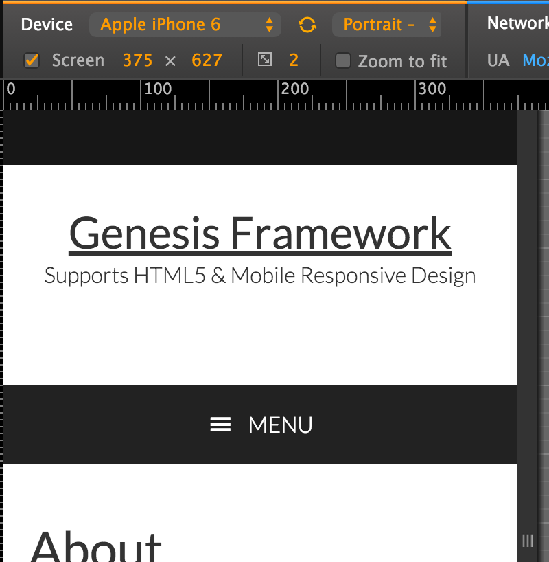
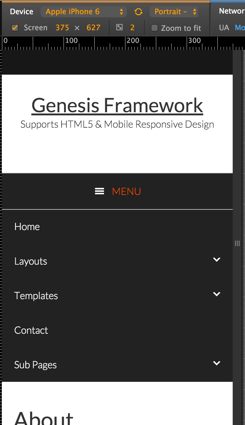
When the hamburger icon or MENU text is clicked,
Step 1
Create a file named responsive-menu.js in your child theme’s js directory (create if not existing) having the following code:
Step 2
Add the following in child theme’s functions.php:
| // Enqueue Scripts and Styles | |
| add_action( 'wp_enqueue_scripts', 'custom_enqueue_scripts_styles' ); | |
| function custom_enqueue_scripts_styles() { | |
| // wp_enqueue_style( 'google-fonts', '//fonts.googleapis.com/css?family=Roboto+Condensed:300italic,700italic,700,300', array(), CHILD_THEME_VERSION ); | |
| wp_enqueue_style( 'dashicons' ); | |
| wp_enqueue_script( 'responsive-menu', get_stylesheet_directory_uri() . '/js/responsive-menu.js', array( 'jquery' ), '1.0.0', true ); | |
| $output = array( | |
| 'mainMenu' => __( 'Menu', 'my-theme-text-domain' ), | |
| 'subMenu' => __( 'Menu', 'my-theme-text-domain' ), | |
| ); | |
| wp_localize_script( 'responsive-menu', 'ResponsiveMenuL10n', $output ); | |
| } |
Step 3
Add the following in child theme’s style.css:
| /* Responsive Menu | |
| --------------------------------------------- */ | |
| .sub-menu-toggle, | |
| .menu-toggle { | |
| display: none; | |
| visibility: hidden; | |
| } | |
| @media only screen and (max-width: 880px) { | |
| .js nav { | |
| display: none; | |
| position: relative; | |
| } | |
| .js nav .wrap { | |
| padding: 0; | |
| } | |
| .js nav.pagination { | |
| display: block; | |
| } | |
| .menu-toggle, | |
| .sub-menu-toggle { | |
| background-color: #222; | |
| color: #fff; | |
| display: block; | |
| margin: 0 auto; | |
| overflow: hidden; | |
| text-align: center; | |
| visibility: visible; | |
| } | |
| .menu-toggle { | |
| position: relative; | |
| right: 0; | |
| z-index: 1000; | |
| width: 100%; | |
| } | |
| .menu-toggle:before, | |
| .menu-toggle.activated:before { | |
| color: #fff; | |
| content: "\f333"; | |
| display: inline-block; | |
| font: normal 20px/1 'dashicons'; | |
| margin: 0 auto; | |
| padding-right: 10px; | |
| text-rendering: auto; | |
| -webkit-transform: translate(0, 0); | |
| -ms-transform: translate(0, 0); | |
| transform: translate(0, 0); | |
| /*vertical-align: bottom;*/ | |
| vertical-align: top; | |
| padding-top: 3px; | |
| } | |
| .sub-menu-toggle { | |
| float: right; | |
| padding: 18px; | |
| position: absolute; | |
| right: 0; | |
| top: 0; | |
| z-index: 100; | |
| } | |
| .sub-menu-toggle:before { | |
| content: "\f347"; | |
| display: inline-block; | |
| font: normal 16px/1 'dashicons'; | |
| text-rendering: auto; | |
| -webkit-transform: translate(0, 0); | |
| -ms-transform: translate(0, 0); | |
| transform: translate(0, 0); | |
| } | |
| .sub-menu-toggle.activated:before { | |
| content: "\f343"; | |
| } | |
| .js .genesis-nav-menu .menu-item { | |
| display: block; | |
| float: none; | |
| position: relative; | |
| text-align: left; | |
| } | |
| .js .genesis-nav-menu .menu-item:hover { | |
| position: relative; | |
| } | |
| .js .genesis-nav-menu .menu-item a { | |
| border: none; | |
| color: #fff; | |
| /*font-family: 'Roboto Condensed', sans-serif;*/ | |
| padding: 20px; | |
| width: 100%; | |
| } | |
| .js .genesis-nav-menu .menu-item a:hover, | |
| .js .genesis-nav-menu .sub-menu { | |
| border: none; | |
| } | |
| .js .genesis-nav-menu .menu-item > a:focus ul.sub-menu, | |
| .js .genesis-nav-menu .menu-item > a:focus ul.sub-menu .sub-menu { | |
| left: 0; | |
| margin-left: 0; | |
| } | |
| .js .genesis-nav-menu > .menu-item-has-children > a:after { | |
| content: none; | |
| } | |
| .js .genesis-nav-menu .sub-menu { | |
| clear: both; | |
| display: none; | |
| margin: 0; | |
| opacity: 1; | |
| position: static; | |
| width: 100%; | |
| padding-left: 20px; | |
| } | |
| .js .genesis-nav-menu .sub-menu .sub-menu { | |
| margin: 0; | |
| } | |
| .js .genesis-nav-menu .sub-menu a { | |
| border: none; | |
| } | |
| .js nav .genesis-nav-menu .menu-item .sub-menu li a, | |
| .js nav .genesis-nav-menu .menu-item .sub-menu li a:hover, | |
| .js nav button:hover, | |
| .js .menu-toggle:hover, | |
| .js .nav-primary { | |
| background-color: #222; | |
| color: #fff; | |
| } | |
| .js nav .genesis-nav-menu .menu-item .sub-menu li a:focus, | |
| .js nav .genesis-nav-menu .menu-item a:focus, | |
| .js nav button:focus, | |
| .js .menu-toggle:focus { | |
| background-color: #222; | |
| color: #ff4800; | |
| } | |
| .js .nav-header .genesis-nav-menu .menu-item a, | |
| .js .nav-secondary .genesis-nav-menu .menu-item a { | |
| color: #333; | |
| } | |
| } |
Due to the vast number of available Genesis child themes, it is practically not possible to come up with CSS that makes the mobile menus look good in all of them. Therefore you will need to tweak the CSS so it matches your theme/design.
Hey Sridhar
What is that device size orientation in the admin bar of the above screenshots – I would love to use this on the sites I develop it would really be of an enormous help designing and testing for different devices. Is it a plugin??
Phil
https://developer.chrome.com/devtools/docs/device-mode
Yes, would love to see what tool you are using in the screenshots.
Thanks Sridhar!
Hi Sridhar…
Thanks for code.
With the example code, can we create all of menu like primary menu, secondary menu, etc just in one hamburger menu?
I mean like SuperSide Me plugin does?
Try this:
In responsive-menu.js change http://pastie.org/pastes/10558140/text to http://pastie.org/pastes/10558141/text.
Thanks for highlighting this Sridhar. The more menus like this get out, the easier it will be for people to build accessible websites.
I wanted to add a quick tip regarding color contrast. Although the CSS here doesn’t make any reference to the color of the menu, both foreground, I wanted to point out that when styling the menu otherwise, theme authors should make sure that there is a contrast of at least 4.5:1 for foreground and background, and that link color needs to also contrast with the same ratio with foreground and background color. Also, link designation should not depend on color alone, so either links need to be underlined, or some other non-color related decoration should be used.
would this code work if added to the genesis sample child theme? The theme has some responsive code but no hamburger.
Yes. Unless otherwise mentioned all the tutorials in this site were worked out on a test site with Genesis Sample as the active theme.
[…] does NOT take care of accessibility. For a simpler but accessible mobile navigation, follow my Accessible Responsive Menu in Genesis tutorial […]
Hi,
I’ve been searching for this and tech support at studiopress sent me this link. I have added the code but am seeing 3 “hamburger” menus on mobile… any thoughts?
[…] this article I share a modification of my Accessible Responsive Menu in Genesis tutorial […]
Looks like a great tutorial again. I am trying to implement on a new Centric Pro site but have several problems. The Word menu is encased in a button ad seems to display for each menu item. It displays with normal desktop display AND mobile sizes. Do you have any suggestions?
URL: http://sccwp.polishedwp.com/