Update on September 02, 2016: For an updated tutorial on this topic, see Fixed Primary Nav and Split Header Nav in Genesis.
In the past I wrote about achieving Primary Nav on left, Site Title or Logo in the middle and Secondary Nav on right in Genesis.
In this article I show how menu items of a single custom menu can be split with logo (or any HTML) appearing in the middle when using Genesis.
This method is certainly easier, less error-prone and straightforward.
Tested with Genesis Sample child theme. Should work with any Genesis theme with minor changes where applicable.
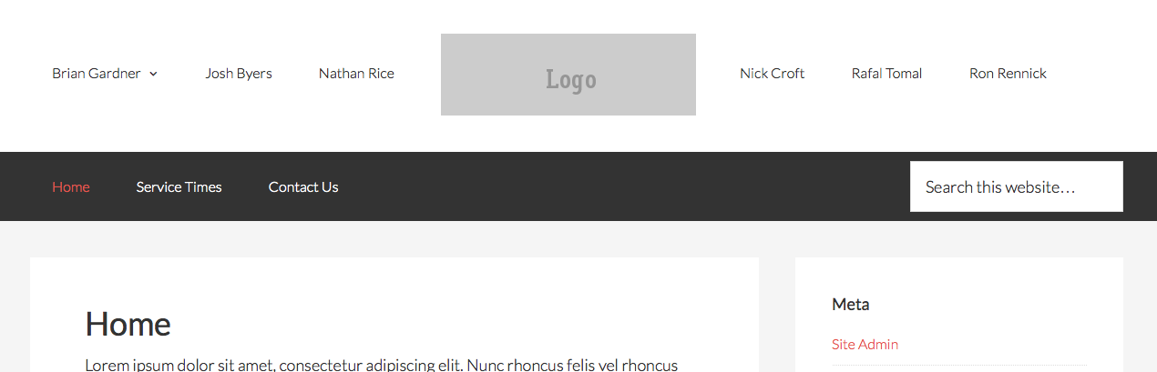
Desktop view:
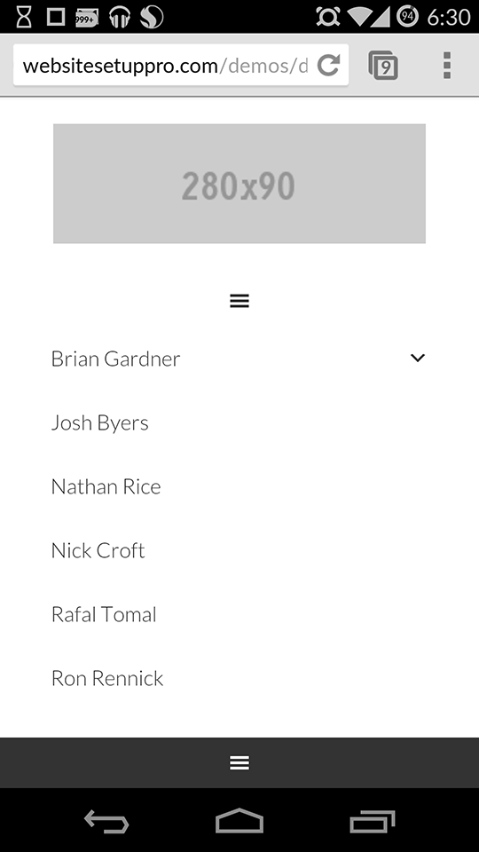
Mobile view:
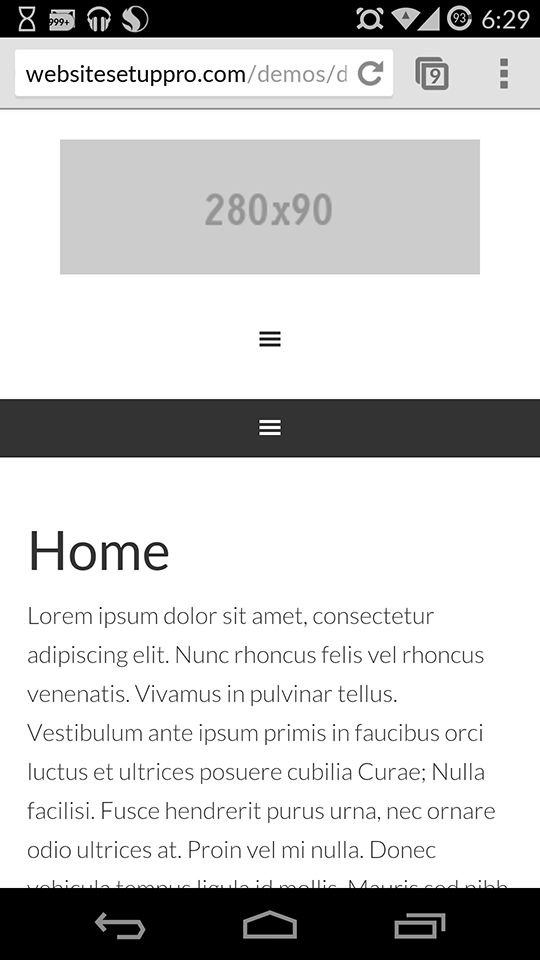
When the Header menu icon is tapped,
Note: We are going to use WP Nav Plus, a commercial plugin. This plugin has a 'Name Your Price' model starting with $11. According to the plugin's terminology, what is being discussed here are called 'Divided Menus' (Split Menus are different - basically Submenus).
Summary of steps
- Remove the Header Right widget area.
- Register a 'Header Navigation Menu' custom menu.
- Remove the standard Header content and add custom content in its place.
- Details of custom content: On mobile devices we will set logo to appear and a hamburger mobile menu below that . On non-mobiles, three menu items will appear to the left of logo and three menu items on the right (in this example). You can have any number of items on the left and right. It need not be equal.
- For the hamburger mobile menu, we will use code from Beautiful Pro.
- We will display right and down sub menu indicators (small arrows using Dashicons) for menu items that have children at desktop widths.
Implementation
Step 1
Upload beautiful-pro/js/responsive-menu.js (mirror) to {child theme directory}/js (create 'js' if not existing).
Sample file path: wp-content/themes/genesis-sample/js/responsive-menu.js
Step 2
Add the following in child theme's functions.php:
[…] How to split Navigation Menu in Genesis using WP Nav Plus […]
Hi Sridhar,
Thx for the slick tut again –
Would you mind telling me the name of the social plugin you are using on this very page?
Cheers 🙂
Genesis Simple Share: http://briangardner.com/genesis-simple-share/
Thank you!
Hi Sridhar,
I’ve read this tut, and took a look at the demo to see all this magic in action.
But there seems to be something wrong.
When I change the width of my Safari browser window to smartphone size, the logo picture disappears. This logo doesn’t stay on top of the menu’s (as shown in the screenshots on top of this tut). The picture only shows up when I click on the ‘hamburger’ icon of the first menu.
Was this intentional?
As you reduce the width of your desktop browser and hit 768px, the entire Header navigation gets tucked into and appears when the hamburger menu icon is tapped. Logo will continue to be in its position (with some menu items on its left and some on its right). It’s only in the real mobile devices that you will see logo appearing at the top and below that the regular menu items in hamburger menu.
Hi Sridhar
Just working through this now and would like to show the logo on top of the hamburger icon and not when you click on the icon, so even when people are viewing on a desktop they can see the logo. Is there a something that can be used to overide if ( wp_is_mobile() ) to make it if width 768px?
Thanks
James
Hi James,
I am not sure what you are trying to do.
Logo does appear above the hamburger icon, not when the icon is clicked.
That is already the case. Isn’t it?
It is not a common practice to write if conditions based on screen width in PHP. Workarounds exist but I do not have experience with any of them. It is possible to do device checks like is_tablet() and is_mobile().
One of the needed pieces of the puzzle, the js file for mobile menu is missing in my instructions. I shall update my post and add a comment soon after.
Done.
Added it as Step 1 under the “Implementation” section.
Hi Sridhar,
Thank you very much for another great tutorial.
I’m using Dynamik Website Builder to try out your tutorial. I tried the whole process except the mobile responsive part because Dynamiks has a built in responsive section with hamburger button. Unfortunately it didn’t work out for me despite following the exact process, can you please let me know how it can be done using Dynamiks. Thanks
Regards
Tino
If you would like me to take a look and fix it, contact me via http://GenesisCustomizations.com/.
Hi Tito,
I’m working on a solution to this problem, and I’ve got my menu nicely centered with the logo in the middle, but I’ve gotten stuck with the responsive menu. The new code removes the opportunity to assign a responsive menu and the the one from the code in this tutorial isn’t working in Genesis Dynamik. Did you find a solution? My work in progress is here: womendisciplingwomen
[…] How to split Navigation Menu in Genesis using WP Nav Plus – by Sridhar […]
I appreciate the tutorial. I was able to follow it. I was hoping it would look more like the Lovely Theme by Restored 316 Designs. Her theme has a better look for the mobile theme.
Hello!
Is it possible to make this divided menu stick to the top??
Thank you so much for your tutorial!
Whitney
Thank you for this amazing tutorial. I had only one issue. I found that the Beautiful Pro script was missing the “#” before the header id references so the hamburger was not displaying when the view port was made smaller. Adding the “#” in front of the header id references made everything work as described.
Only issue now is editing the CSS so that the logo displays at the top of the menu when viewed on a smaller view port.
This is how I managed to get the logo to appear at the top of the responsive menu rather than in the middle. Add the following code to the responsive-menu.js file after “jQuery(function( $ ){“:
$( "#header" ).prepend( "" );
Find “@media only screen and (min-width: 768px) {” in styles.css and add:
.responsive-logo {

	display: none;

}
Find “@media only screen and (max-width: 768px) {” in styles.css and add:
.menu-divider-item a {

	display: none;

}
Now you have a responsive menu that is not divided with a logo that appears at the top of the page.
Thanks again for a great tutorial!
Sorry. Missed some code on the last post. This is what you need to add to the js file:
$( "#header" ).prepend( "" );
The code is being filtered. Sorry. Let’s try it again as plain text.
$( “#header” ).prepend( “” );
Nope.
You might want to paste the code at http://www.pastebin.com and provide the link.
Here’s the link. You may need to change the selector to match your version of the Genesis Sample Theme.
http://pastebin.com/6VEfJhue
Thanks for this tutorial! Worked like a champ! Now can you show me how to get top and bottom borders on the left and right side of the logo like on the Pretty Darn Cute Design site: https://prettydarncute.com/
Thank you for your help!
Hi,
Thanks for this post.
I have a question about the hard code url for the logo. Do you have a tip how I can make that dynamic with the functionality of the header image you normally can edit. (this is what you wrote: replace both instances of http://cl.ly/image/3v3Q2b330y2z/logo.gif with the URL of your logo image.) That is not very maintainable for me.
Is there a post of way to do this?
Thank you very much.
Kind regards Diana
Hey, thanks for the great tut! Can anyone tell me why my nav bar is no longer sitting center?
I’m sure I’m just missed one tiny bit of code which is throwing it out?
Any ideas?
Thanks in advance!
http://sridharkatakam.com/split-navigation-menu-genesis-using-wp-nav-plus/#comment-391924
Hello Srid, thanks for this great tutorial.
I have a couple of questions :
– How could put a line above and below the menu without also frame the logo, as in this new StudioPress theme: http://my.studiopress.com/themes/modern-studio/#demo-full
– Everything works fine , except that all accents look bad now (like ñ,´, etc.). How to fix it?
Thanks.
Try adding http://pastebin.com/raw.php?i=EkFpyj7b in style.css.
Can you give me a link where this can be seen?
Thanks Srid! It works perfectly for the border lines.
I can’t give you the link, because the site is on stage server on maintenance mode. Probably the “accent problem” is caused by the sub menu indicators.
Hello Srid,
The site is online now: http://www.xanelachic.com/
Do you know how to fix the problem with the accents and the split menu?
As you can see the problem is only with the header menu. I’m using a fixed top menu and have no problem with the accents.
Thanks.
Another thing: the mobil view of the menu is also not very good. Do you have any suggestion for that? Thanks
I’ve adjusted the CSS on your site to fix the tablet and mobile views.
Just to report: the problem with the accents is solved. It was a bug of WP Nav Plus plugin, but it is already fixed. Thanks Sridhar for all your support.
Good to know.
Hi Sridhar
I bought the nav plugin and managed to get this working for me on Dynamik. It look’s great, but the menu is aligned left rather than centre.
Can you help please?
Try adding
text-align: center;for the nav element.If that doesn’t work or you are not sure, give me the URL of your site.
All working now, thanks Sridhar.
Haven’t been able to get the border working yet by using this:
http://pastebin.com/raw.php?i=EkFpyj7b but i’ll keep at it.
cheers
Can you provide the URL of your site?
No problm ,could I message you somewhere?
Got your email with the URL.
I now see the border for menu items. To remove the horizontal gaps between them, add this CSS: http://pastebin.com/raw.php?i=qTBhaVCF
Outstanding, thanks for your time and patience.
Hello Sridhar – I’m having a few issues implementing this code…
To keep things simple, I’ve uploaded your Genesis-Sample-Master theme and the WP Nav bar before I’ve done anything else. I also kept your GIF logo and created a menu called Contributors to keep things consistent before I make any adjustments to the code.
My website is:
http://gatovato.com/
Here are some of the things I’m tackling:
1) When I pull the desktop browser in to check mobile configuration on my desktop, I’m presented with 2 hamburger menus and the logo disappears. The logo appears at the top on my mobile device, but I’m not sure if it’s supposed to be consistent within the desktop browser itself (perhaps an issue for iPads, etc.).
2) At the moment, there are two hamburger browsers – only the second one is active as I’ve added content to the Contributors menu. Is there a way to remove the first?
3) When I try to configure menus (Step 3), I’m unable to assign the Primary Navigation Menu to the Header Navigation Menu. I can only choose Contributors. I’ve tried creating a new menu called Primary Navigation Menu, assigning Primary Navigation status, and then adding that to the Header Navigation Menu – but that didn’t work either.
4) Will I ultimately populate all my header content in the Contributors menu, or will it end up in the Primary Navigation menu?
Thanks so much for all your help,
Paul
Oh, I see what you’ve written about the two hamburger menus appearing in my desktop browser with my logo disappearing as I pull the screen in, but I don’t think both menus should appear in my mobile browser (as they currently are) with the top menu being inactive… I’m still working to figure this out 🙂
Is http://gatovato.com/ still the site to check the problem?
Hi Sridhar,
Thank you for this! I am using Minimum Pro and I am wondering if I can use this technique to create a similar nav style to http://www.oliviarosecosmetics.com/ which was built on Minimum as well.
Thank you Sridhar!
No.
Follow https://sridharkatakam.com/floating-circular-logo-in-minimum-pro/ instead.
[…] the comments section of How to split Navigation Menu in Genesis using WP Nav Plus tutorial, a user […]
Hi Sridhar
Should the logo be showing on mobile view? I’m sure it did but mine’s disappeared. Could this be related to any recent updates as I see it’s gone from the demo too.
thanks.
Yes. Logo seems to appear fine on mobile view: http://d.pr/i/11Vvb
Can you check again?
Hi there – How would you go about adding the website site description below the nav created with this tutorial and centered with the logo?
Try this:
1) Replace the custom_do_header() function code with http://pastebin.com/raw/Cb0WBbsB
2) Add this in CSS: http://pastebin.com/raw/V7BnNiU7
Perfect thank you! One last question – is it possible to combine the two hamburger menu’s @ mobile into the one that appears below the logo?
Is anyone else having issues with the logo displaying on Google Crome on iPhones and Android phones? ref website toutenuit.wpengine.com
Thanks!
Hello – This worked really well for me but I would love to make this menu stick to the top on scrolling. When I try to combine this with your tutorial on sticking the menu to the top it breaks this menu. Any suggestions? Thanks so much!
Sharon
Can you provide the URL of your site or tell me about your current header/navigation setup? Do you have header at the top and below that split nav?
Hi –
The url is jend.wpengine.com and the split nav is the header…there is nothing above it.
Thanks!
Sharon
By the way for a more recent version of using this plugin for split nav, see this tutorial: https://sridharkatakam.com/fixed-primary-nav-split-header-nav-genesis/
[…] There’s been several very good articles written that show how to position a logo in the center of the main navigation menu, such as this one by Sridhar Katakam. […]