Updated on March 02, 2021
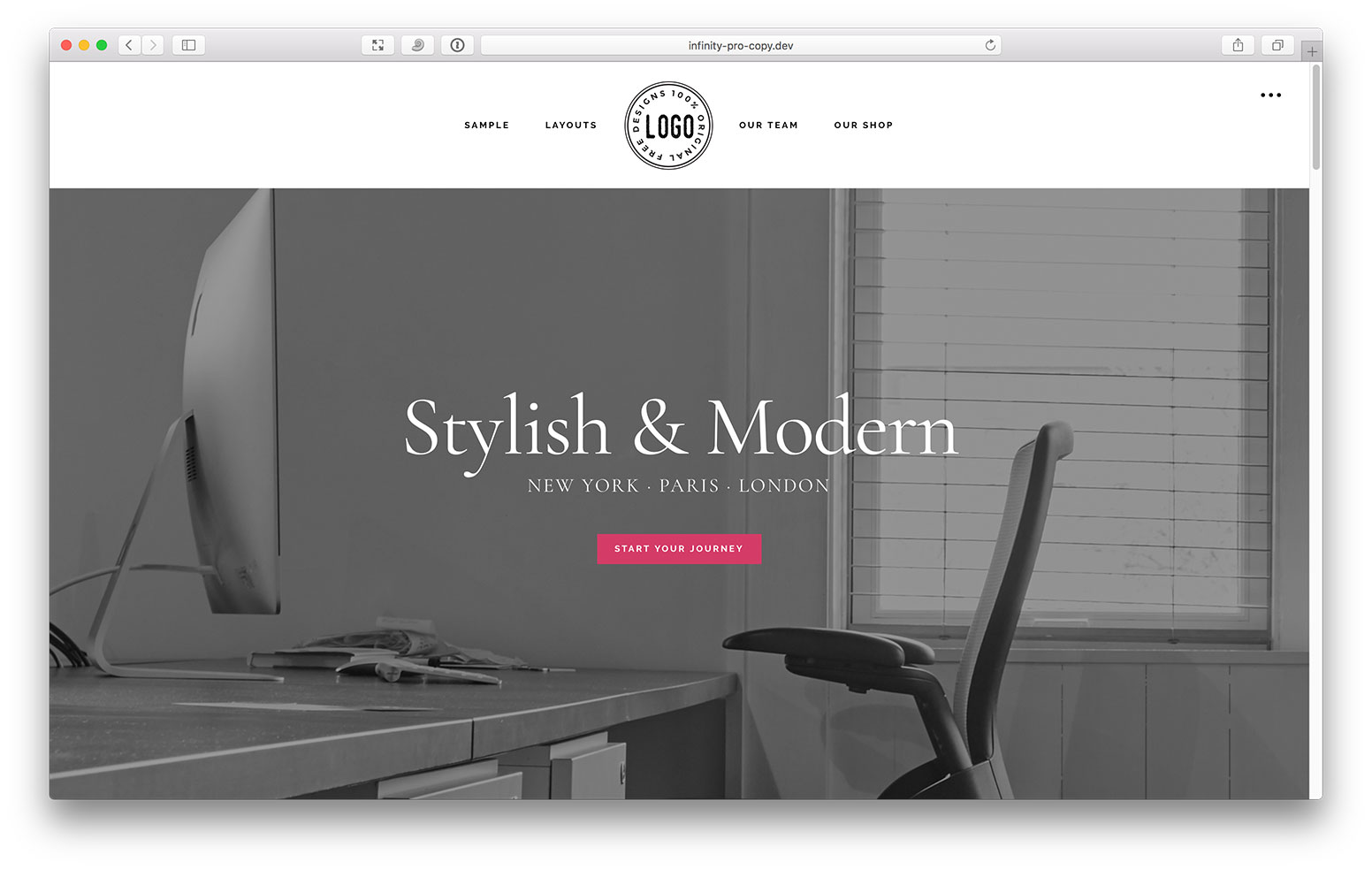
This tutorial covers implementing Split Navigation with menu items on logo’s left and right in Genesis tutorial in Infinity Pro.

Screencast:
Tested in Genesis 3.3.3 and Infinity Pro 1.3.2.
Step 1
Edit Infinity Pro's config/theme-supports.php.
a) Locate
'custom-header'                   => [
    'width'           => 400,
    'height'          => 130,
    'header-selector' => '.site-title a',
    'header-text'     => false,
    'flex-height'     => true,
],
and change 400 and 130 to twice the desired display size of your logo (header image, to be technically correct)'s width and height respectively.
Ex.: To display a 100 x 100 image, I've changed the above to:
'custom-header'                   => [
    'width'           => 200,
    'height'          => 200,
    'header-selector' => '.site-title a',
    'header-text'     => false,
    'flex-height'     => true,
],
b) Add the following at the end:
To view the full content, please sign up for the membership.
Already a member? Log in below or here.
Works perfectly, thanks for the new tutorial!
Just can’t figure out what line to delete to get rid off the duplicate logo that shows up in the middle of the responsive menu.
Can you provide the URL of your site?
http://dev.thearmoryofchattanooga.com
To be able to hide the home logo within the responsive hamburger menu. Thanks!
In your style.css, you forgot to add a comment line properly.
/* custom headershould be
/* custom header */Once you fix that, the problem will be gone.
Thank you! That was it.
Hello Sri,
I’m trying to implement this on dev site with no luck.
http://www.l1.fromdecold.com
Only a small part of the logo shows. the logo is 286 width by 111 height.
I’ve adjusted the numbers in the function file to 572×222 as instructed and edited the CSS as above. No luck.
I even deleted the float:left and width:60% lines and no visible change occurred. Funny enough if i look at it on mobile, more of the logo shows and the whole thing shows if i click on the hamburger icon to expand the menu.
Could you tell me what’s wrong?
Thank you!
Add this in style.css:
Hi Sri,
I implemented this tutorial, but I can’t seem to get rid of the repeating logo in the responsive menu. I tried adding
.nav-primary li.menu-item-home a {
background-repeat: no-repeat !important;
but it’s still not working. Can you help me check if I’m missing something? The staging site is http://test.fancygirldesignstudio.com/. Thanks.
Never mind, I solved it. 🙂
I’ve tried to get this to work, but no luck – My logo is smaller than it was and the nav is all on the right (not splitting… what I would like to accomplish is for the logo to hang off the header wrap – also, my logo is off center when mobile… the site is: bluatthelakehouse.com
Any help you are able to offer is always appreciated! Thank you for your hard work!
Barbara
UPDATE: I was able to get the logo separated and centered but all is aligning right – I’m sure I can figure that out – thank you!
Hello! I purchased this tutorial several years ago and am trying to get it to work with the latest version of Infinity Pro. I’ve got everything working fine except on the mobile version I’m getting two hamburger menus instead of one. Any chance you can tell me what needs to be changed in functions.php to fix this? Thanks!
Hi Tammy, Can you provide the URL of your site?
I’m trying to achieve a split nav menu for my current Infinity Pro themed site: https://monicagarrett990697325.wpcomstaging.com/
I can’t seem to get it with this code. Does it still apply to the most recent theme?
Thanks,
Sarah
Hi Sarah. Just updated the tutorial for the latest Genesis and Infinity Pro.