A user asked,
I am working on a site using INTERIOR PRO. How does one make the ".after-header" area; that big image area behind the nav and page titles, full screen?
In this article I show how How to set height of an element to Viewport height using jQuery in WordPress tutorial can be implemented in Interior Pro for .after-header's full screen backgrounds.
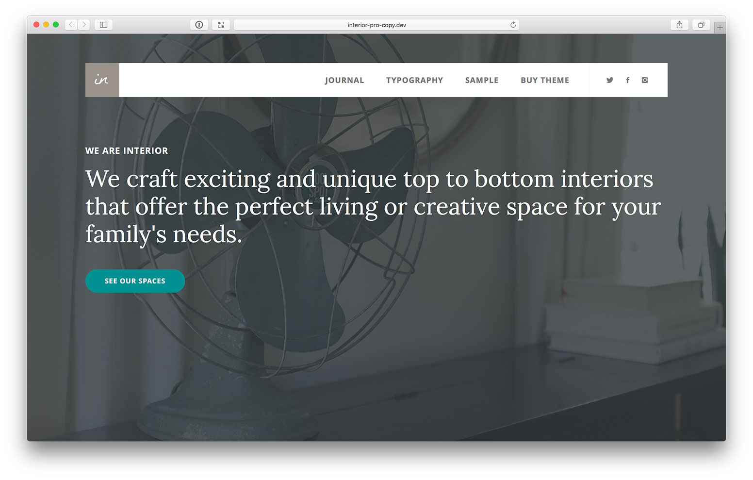
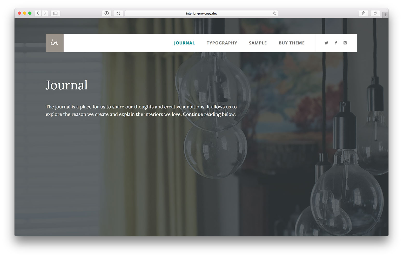
Sample screenshots:
Homepage:
Inner page:
Step 1
Create a file named say, global.js in Interior Pro's js directory having this code:
Thanks for this tutorial. I have a feeling that this could be an important thing to understand however I don’t understand what issue this tutorial solves. Just a bit more explanation could be helpful to us subscribers. I get the impression that perhaps in some mobile views that the background image doesn’t work well. But not sure—and it could solve a number of issues in my past projects. Thanks.
A viewport is what you see on your computer screen. It’s width and height varies depending on the size and resolution of the users’ monitors. What the code in this tut does is to calculate the height of the user’s viewport and sets the height of div.after-header to that value.
To see the effect of the code, you can set up a WordPress site which looks like Interior Pro’s demo (http://demo.studiopress.com/interior), follow the steps in this tutorial and open the homepage in another tab and compare.
It is possible to wrap the wp_enqueue_script() in a if conditional so it works on non-mobiles only.