Updated on June 12, 2018
In one of my earlier tutorials, I wrote about Slideout in Genesis where the off-canvas side menu was set to show the widgets placed in a custom widget area.
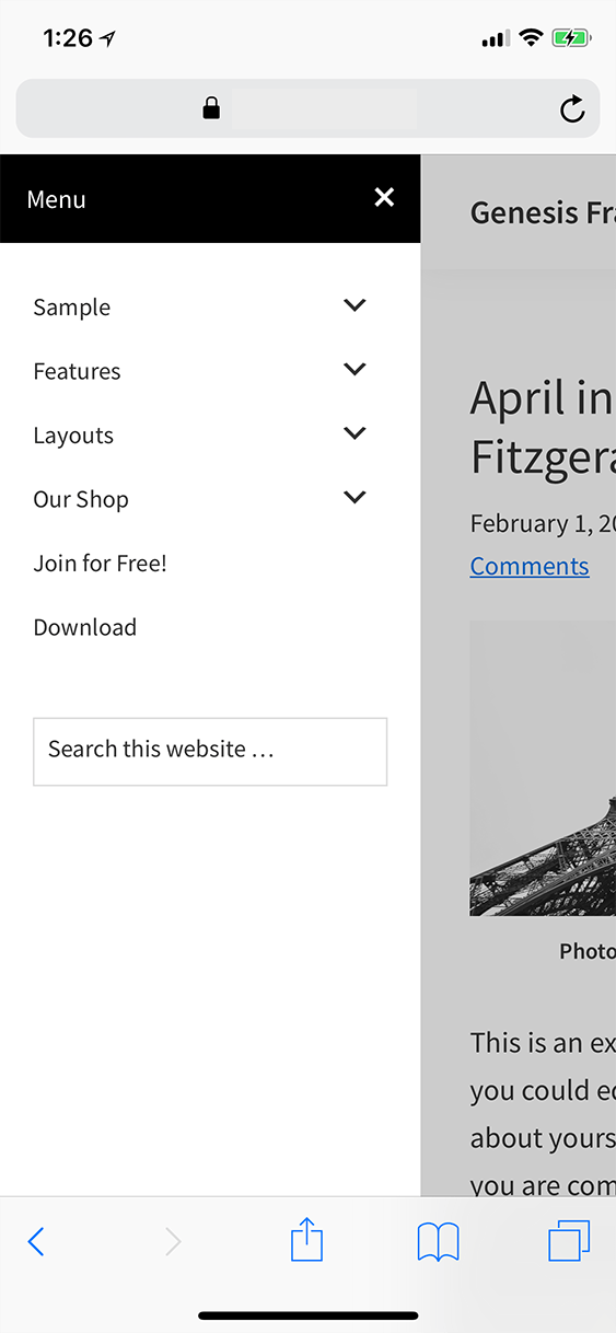
In this article, we shall move the mobile responsive menu which appears after clicking/tapping the hamburger menu icon (from 959px and below in Genesis Sample) from below the hamburger menu icon to slide out from left (or right) of the screen using Slideout.js.
While the tutorial has been written for Genesis Sample 2.6.0, it should work with a few adjustments in any Genesis theme.
Step 1
Install and activate Genesis JS / No JS plugin.
We shall use this to prevent the side menu flash on larger widths as the pages load/reload.
Step 2
Add div.side-menu having
1) a header with a title and close icon
2) an empty div (.nav-menu) where the nav menu (.nav-primary) shall be moved inside using jQuery from 959px and below
3) and a search box
above .site-container.
Add the following in child theme's functions.php:
add_action( 'genesis_before', 'custom_side_menu' );
/**
 * Adds `.side-menu` above `.site-container`.
 */
function custom_side_menu() { ?>
    <div class="side-menu">
        <div class="wrap">
            <!-- Side Menu Header -->
            <div class="side-menu-header">
                <h4 class="menu">Menu</h4>
                <span class="close-icon dashicons dashicons-no-alt"></span>
            </div>

            <!-- Nav menu -->
            <section>
                <div class="nav-menu"></div>
            </section>

            <!-- Search -->
            <section>
                <?php get_search_form(); ?>
            </section>
        </div>
    </div>
<?php
}
Step 3
Upload slideout.min.js to child theme's js directory
Create a file named say, slideout-init.js in the same location having the following:
Looks great Sridhar! Would love to use this on a new project. I’m using Altitude Pro as my base theme and I can’t get it to work. Any tips? By the way, in you’re php code you use ‘close-icon dashicons dashicons-no-alt’ and then in your css you’re referring to ‘.dashicons.close-icon’. Shouldn’t it be ‘.close-icon.dashicons’? Hope hearing from you. I’m guessing more users would be interested in your answer.
https://sridharkatakam.com/off-canvas-slideout-menu-altitude-pro/
.dashicons.close-iconand.close-icon.dashiconsare effectively the same in CSS. It means select any element that has both of those classes. The order in which you specify multiple classes does not matter, in the CSS.Thanks Sridhar! Implenented and working. By the way, in chrome desktop resonsive mode, when swiping, the inspector generates errors/warnings. This also happens with your demo ( the previous off canvas tut). Not your mistake. It’s the javascript. But it is working excellent, so maybe it’s a chrome bug. Thanks again for your super fast response and solution!!
[…] the comments section of Responsive menu inside an off-canvas side menu using Slideout.js in Genesis, a user […]
Hello,
I’ve attempted to replicate this on the maple theme. However, when I minimise the window, there is no Hamburger menu. All code is correct, and no other plugins etc.
*Sample theme 🙂
Received your email with the theme. I see that it is my Genesis Starter theme which is based on Genesis Sample 2.3.0.
To fix the problem, in functions.php replace
with
Thank you so much for taking the time out to check this Sridhar, your website has been very valuable in my learning experience. All the best for 2018. 🙂
Hello,
I would like to ask, how to keep the original responsive menu for the footer and footer widgets only and keep the slide out menu for the primary nav?
Thank you.
Can you elaborate? What is the URL of your site?
Sorry, I don’t have it on a server, I find that if I implement the slide out menu (in the header as the primary navigation) , and opt to have another menu in the footer. The footer menu is no longer responsive, rather it would just slide out the same menu from the primary, even though , they are two different menus. I hope this makes sense 🙂
So, what I’m asking is it possible to have the slide out menu for the primary navigation, and a mobile responsive menu for any other custom menu outside the confines of the header? So in this example a navigation menu in the footer?
Thank you
Hi Sridhar, is there any way you could give me some advice on what to do when the navigation menu is set up vertically already. I have been trying to accomplish this by following your tutorial for a while with Sixteen Nine Pro theme but with no success, any advice? url: http://traveltopspot.com/
Would appreciate any help you could give!
[…] sliding in the primary navigation menu when the hamburger menu icon is tapped on smaller screens in Genesis and Altitude […]
[…] sliding in the primary navigation menu when the hamburger menu icon is tapped on smaller screens in Genesis, Altitude Pro and Brunch […]
[…] the series on off-canvas side menu in Genesis, Altitude Pro, Brunch Pro and Foodie Pro today I write about using Slideout.js for sliding in the […]
Hi Sridhar, I am trying to implement this but my menu isn’t displaying inside the off-canvas area, it is showing a fully expanded below the mobile menu button, any suggestions on how I can get it to work properly?
Here is a link to the site http://dev.midlandgolfcc.com
Thanks
Caley
Hi Caley,
Sorry about the delay. I see that you have switched to a plugin that uses ShiftNav.
I’ve updated the tutorial to work with Genesis Sample 2.6.0 if you want to use this in future.
Hi Sridhar, I’ve customised this so that the slideout menu uses a different menu layout – essentially I’ve pulled in a secondary menu (which isn’t normally in use) to populate the slideout menu. But it doesn’t display submenu items like the primary menu does. Any idea how to fix this?