Update: Current latest version of this tutorial is here.
A user asked in 'Genesis WordPress' Facebook group:
Sridhar - or anyone else - does someone have a code snippet I can use to change the way the navigation displays on the Agency theme on smaller screens - I like the look of the nav for the Beautiful Pro theme in iPad & iPhone size - how would I replicate that?
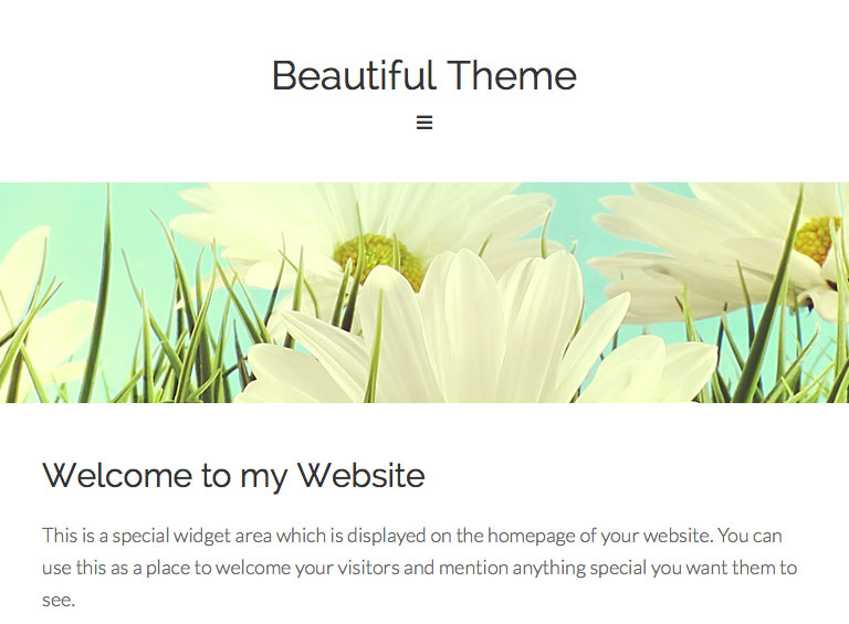
Responsive header menu in Beautiful theme can be seen at widths lower than and equal to 768px.
In this article I am going to provide details of how to get the same working in Agency Pro. The process is the same to get this working in any Genesis child theme that does not already have a responsive header menu.
Tablet view


Mobile view


Step 1
Copy or upload js/responsive-menu.js to js/responsive-menu.js in agency-pro.
Step 2
Add the following in child theme's functions.php:
Hi Sridhar, thanks for all your helpful content – really appreciate the work you put into this site.
Is there any way of achieving the same effect described in this post without buying the Beautiful Pro theme and grabbing the code? Seems a bit wasteful to purchase a full theme just to achieve this effect?
Thanks,
Lee
Lee,
There are several tutorials online on getting a hamburger mobile responsive menu in Genesis.
Ex.: http://bradpotter.com/responsive-mobile-navigation-menu-for-the-genesis-theme-framework/
Have you tried them?
Try these:
http://www.sridharkatakam.com/links-tutorials-mobile-responsive-navigation-menus-genesis/
[…] http://www.sridharkatakam.com/make-header-menu-genesis-mobile-responsive-similar-beautiful-pro/ […]
Hi Sridhar,
I’ve repeated the whole procedure since the beginning again, but the issue is still persisting.
Any thoughts?
Regards
If you would like me to take a look inside, send me WP and FTP login info via http://www.sridharkatakam.com/contact/
That would be great!!
I just sent you an email.
Thank you a lot in advance!
Did not get it yet.
Maybe it’s caught in the spam…
I’ve re-sent it now (2nd attempt)
🙂
Thanks again for your time and effort – The menus look good so far!
Cheers buddy 😉
Hi Sridhar,
Thank you for the awesome tutorial!
I followed your instructions and it works just fine. I have a question about a small issue however:
Is there a way to include both menus in the hamburger?
I have both menus on my homepage yet only the header menu was wrapped in the hamburger, when seen on mobile.
Thanks
Bader
Hi Sridhar,
It’s somehow weird: I’ve posted a comment around 2 hours ago and it stated that it awaited moderation, but then it seems to be deleted or landed in spam!
So here it is again:
Thank you a lot for the awesome tutorial. I followed your instructions and it worked fine.
The only issue I have is that the code snippet above doesn’t include both menus in the “hamburger”.
I have both menus on my homepage (header + main nav)
I tried this but it didn’T seem to bring something:
@media only screen and (max-width: 1023px) {
.nav-primary .site-header .widget-area {
text-align: center;
}
}
Here’s how it looks like for the moment:
https://www.dropbox.com/s/qdflw371xq8f13w/screen-capture-335.png
Is it possible to include both menus in the hamburger?
Thanks
Bader
*Sorry for the double comment*
We can have two hamburger icons for each like this: http://i.imgur.com/3gbvI4A.jpg
Hi Sridhar,
Thank you for taking time to address my issue 🙂
the t2 hamburger icons would be also great.
What do I need to change in the code to achieve that?
Cheers!
Follow http://www.sridharkatakam.com/make-header-menu-mobile-responsive-outreach-pro/
It doesn’t seem to be working for me ;(
After following the new instructions from the outreach-pro post, the both menus vanished in the mobile view!
Here’s what all did:
I followed the instructions in this post:
1. uploaded fonts folder from beautiful-pro to the fonts directory of agency-pro.
2. uploaded js/responsive-menu.js to js folder in agency-pro.
3. added the code above to agency-pro’s functions.php
4. added both CSS snippets mentioned above to theme’s style.css
Then followed the instructions in your new post (outreach-pro):
So additionally to the 4 steps above, I did the following:
1. replaced the existing code which was in js/responsive-menu.js (from the tutorial here above) with the new one from the outreach-pro tutorial.
2. replaced the second part of the CSS (/* Responsive Menu— */) mentioned in the tutorial above with the new one in the outreach-pro post.
The other steps ( fonts upload + //* Enqueue scripts*/ + /*Imports—-*/) are still “on”.
Any thoughts on what I might have done wrong?
Do not add anything from Beautiful Pro theme in Outreach Pro. Only follow my new tutorial.
Well, I went to my initial starting point prior to implementing the instructions above, then followed ONLY your outreach-pro instructions, but it seems it has no effect for me = both menus are there but no hamburger in mobile view.
I´m using agency-pro as a child theme by the way, if that’s of any help.
Thank you for your time and effort 🙂
Thanks! Works great in the Agency Pro theme.
This is working great in standing Iphone mode but then it shows the regular menu in 480px and above. I have no idea whats wrong… Any ideas?
Thank you for many great posts!
This is working well. Not having the Beautiful theme, I substituted files referenced from Parallax. It works perfectly, but there is one major problem. Instead of showing the ‘hamburger’ icon, it shows a ‘thumbs up’ icon?
http://imgur.com/JLPBRUp
Thanks for a great tutorial! Any suggestions?
Hey Chris, did you ever hear anything about this? I am having the same issue! I have the Beautiful Pro theme and am getting the lame thumbs up! http://girlwithblog.com is the site I have the theme on.
Hey Chris,
Seems like iphones (maybe others) aren’t playing nice with the Icon font files somehow.
http://www.sridharkatakam.com/change-mobile-responsive-hamburger-icon-genesis/
Here is what I did to fix the thumbs up.
Perhaps you have tried pasting some code and it got stripped out.
If so, you may want to paste at http://www.pastebin.com and provide its URL.
Thanks to both of you! That worked perfectly!
I want to know where to download the font ?
Supat Sutti
1.0.1 of Beautiful Pro uses Dashicons instead of the icon font as in v1.0.0. I have updated my above post accordingly.
[…] genesis mobile responsive menu […]
[…] genesis mobile responsive menu […]
I have uploaded Beautiful Pro theme to my test site and yet there is no font folder when I look via FTP. this is supposed to come WITH the theme?
Please see http://www.sridharkatakam.com/make-header-menu-genesis-mobile-responsive-similar-beautiful-pro/#comment-58484
I tried applying this tutorial to the Genesis Sample theme with no luck. I checked the fonts folder for dashicons – they are there. I created a js folder in the Sample Theme folder and added responsive-menu.js to it. I added the code to functions.php and the css to style.css as instructed, but no luck. The CSS is working (I tested it by commenting it out, which made the menu display). When I inspected the menu with Chrome Developer Tools and compared it to an Eleven 40 Pro site (where I got the menu js) I noticed there was no ‘before’ being created after the div as instructed by the script. So perhaps the script is not working?
Kimberly,
I’m having the exact same problem.
Kimberly and Vincent: Follow http://www.sridharkatakam.com/add-beautiful-pros-mobile-responsive-menu-genesis-themes/
Sridhar,
Thank you so much for your reply and tutorial!
[…] is an update to my earlier article titled How to make Header menu in Genesis mobile responsive similar to that in Beautiful Pro. The earlier article worked with Beautiful Pro version 1.0.1. This tutorial is for the current […]
Thanks so much for this tutorial! Worked great, however, how do I make it so that the responsive menus are closed by default instead of being open by default?
Cheers,
Karl
Hello Sridhar,
Great post! Thanks a lot. It works great. Could I add text on the left side of the hamburger? I would like to write the word Navigation because I dont think everybody understand the hamburger. How could I do that?
Henry
Hi Sridhar,
How can I put the word “Navigation” on the Left hand site of the hamburger?
Cheers Paula
Thanks for this, I’ve just made a note as it’s late here and will be trying this in the morning.
Hoping this is going to work the theme eleven 40 pro and genesis?
That’s the theme I’m using, but I see it’s the theme you’re using here too, however I see it doesn’t display the mobile friendly menu icon/button.
Hi Sridhar,
Thanks so much for your tutorial. I’m finding everything about Genesis a bit of a steep learning curve. The thing is, I THINK I’ve followed your instructions to the letter, but it’s just not working at all.
I’ve created a directory path: genesis-sample/lib/js/ and then created a file called responsive-menu.js using your link to this code:
https://gist.githubusercontent.com/srikat/f6f22d5fae3a7495c0ad/raw/b66e3f7b5c0d81465f516bfc1842cce71ca3566f/responsive-menu.js
I’ve, then added the code to the functions.php file and the css in step three.
But…nothing at all happens!
Can you help? I’ll happily create a login for you.
Thanks in advance for helping a rookie!
Valerie