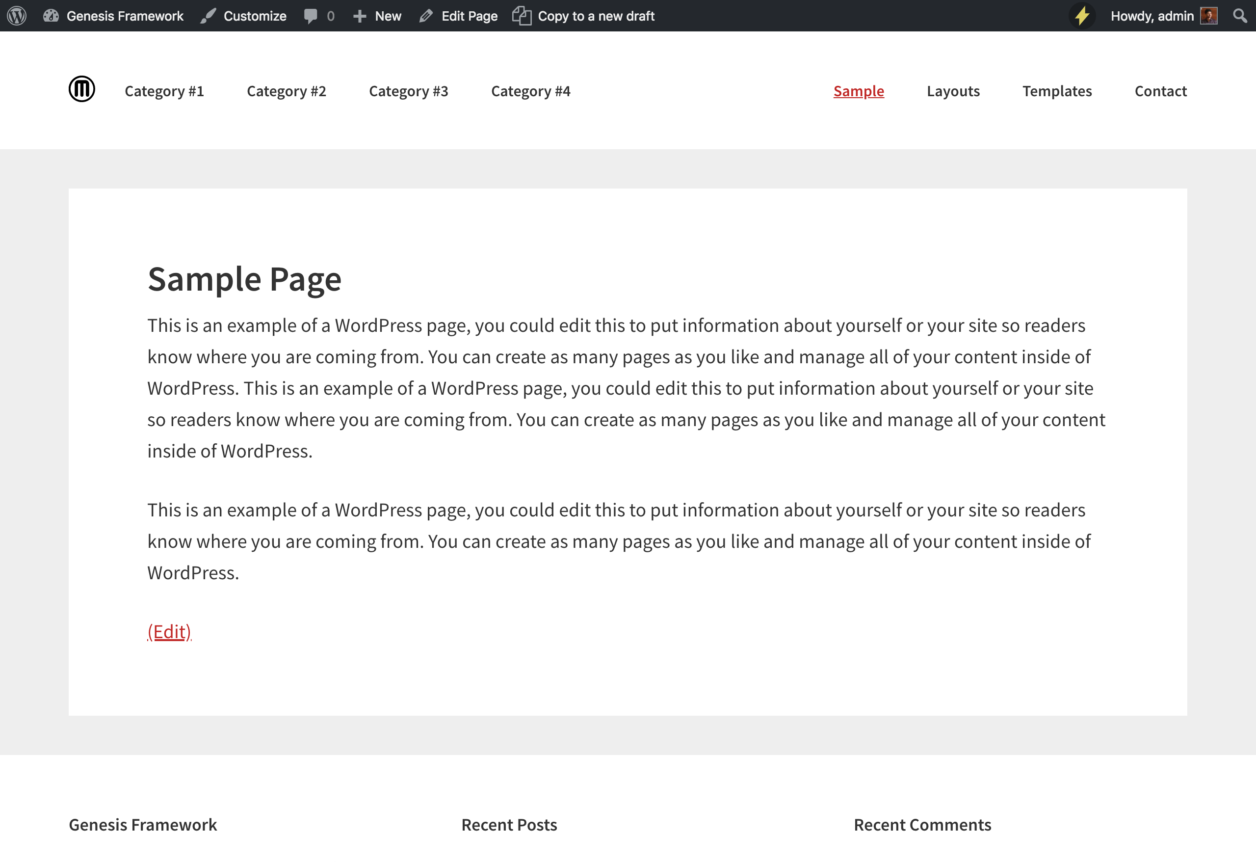
This tutorial provides the steps to relocate the primary nav to in between site title and header right widget area in Genesis and customizing the CSS to display these inline incl. in mobile view.
We are going to
- set up custom image logo instead of the background custom header
- remove the primary navigation menu from below the site header
- append .nav-primary nav menu after .title-area
- remove .nav-primary's wrap
- add a search box before the list items in the primary menu (hidden on desktop and shown inside the mobile menu)
- use Flexbox to display the elements inside the .site-header in columns and vertically centered
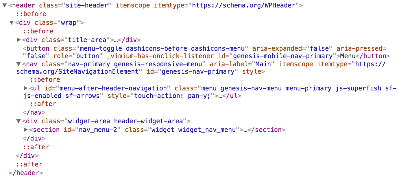
Sample HTML output:
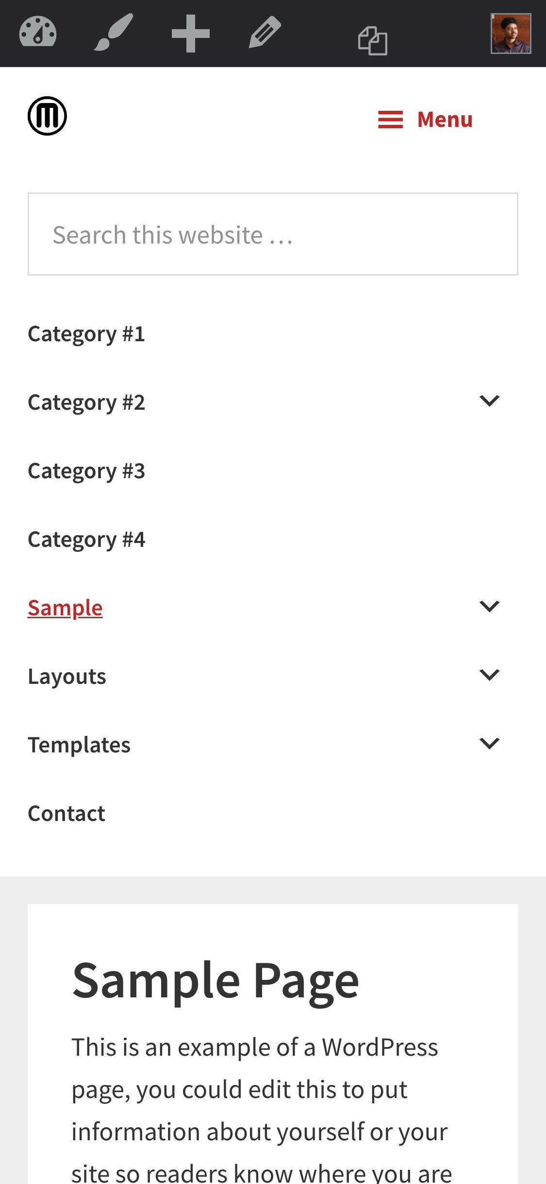
Mobile view:
While the tutorial has been written for Genesis Sample 2.3.0, it should work with a few adjustments in any Genesis theme.
Step 1
Add the following in child theme's functions.php:
Wow. This is amazing. Thanks so much. Didn’t realize this problem was so complex.
If I wanted to add an expandable search icon to the right of the header what would be the best option.
1) Add a search widget and use JS / CSS to restyle it?
2) Move the secondary navigation replacing the right menu widget and use a filter to add the search?
Both the approaches should work.
I’d give 1st approach a try first.
Thanks for showing how to add the primary nav between the site-title and the header-widget-area. I was going to rewrite more than was needed, so this was super helpful.
Does this work on the Magazine Pro theme? I took all the above steps, but I still see the menu in “After Header”. So i have two menus.