In this tutorial I share the code for setting up a sticky Primary navigation below as users scroll past it. We are going to use Sticky-Kit jQuery script to make the nav fixed on non-handhelds and use code from Beautiful Pro for the hamburger menu.
Set up: Genesis Sample is the active theme with menus assigned to Primary and Secondary Navigation locations.
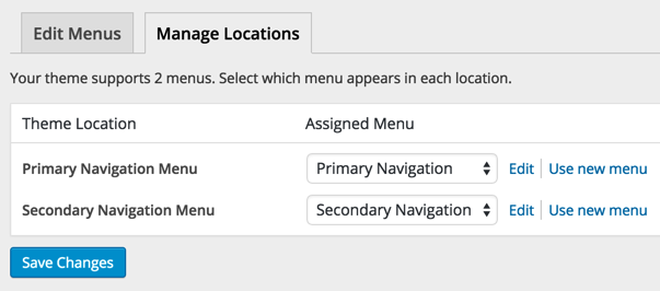
We are going to reposition the secondary navigation so it appears above the header. Primary navigation is below the header.
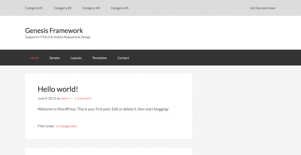
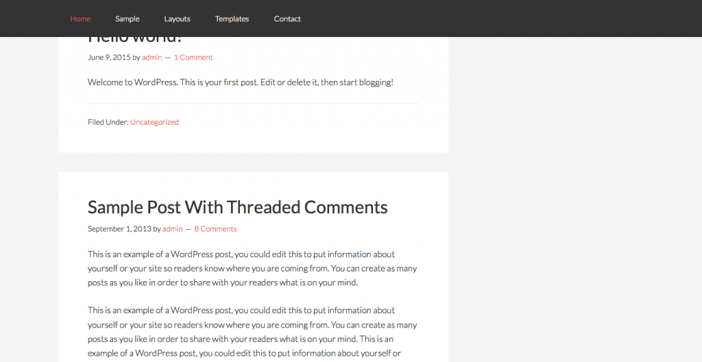
Desktop view:
After scrolling down:
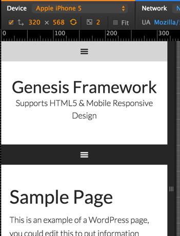
Mobile view:
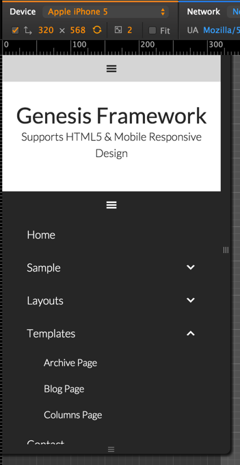
With Primary nav menu expanded:
Step 1
Upload jquery.sticky-kit.min.js to child theme's js (create if not existing) directory.
Step 2
We are going to set the sticky behavior for Primary navigation only on desktops, not on tablets and mobiles. As such create a file named say, non-handhelds.js in child theme's js directory having the following code:
To view the full content, please sign up for the membership.
Already a member? Log in below or here.
Hello Sridhar,
I have implemented the above code in Altitude Pro Theme. Unfortunately the Mobile menu is not sticky when i browsed on mobile device. Will appreciate your help.
Thanks.
This tutorial is written for Genesis Sample. For help with implementing in other child themes like Altitude Pro, please post in the Paid Support forum, http://sridharkatakam.com/forums/forum/paid-support/.
See http://sridharkatakam.com/membership/faq/
You should have mentioned at the top. After looking at the video, I thought it will work with any child theme but it did not. What all one will get as part of paid support? Will you get your all the tutorials working on any child genesis theme?
Hi Sridhar
Could you dvise if this method is useable for the whole site-header? I tried simply changing .nav-.primary to .site-header, but to no effect
Best Regards
It should.
If the .site-header is at the very top above all other elements then there’s no need to use jQuery to make it sticky. We can just use fixed position of CSS. Can you provide the URL of your site?
Hi Sridhar,
Thank you for another great tutorial!
How would I keep the primary nav sticky and up at the top in mobile view?
Thank you!
[…] i.e., essentially a condensed mixture of How to Slide Down Search Box in a Full Screen Overlay in Genesis and How to make Primary navigation in Genesis sticky on scroll for desktops and mobile responsive on han…. […]
I tried adding it to academy pro, but it is not working.