In Genesis Facebook group, a user wrote:
I am using Studiopress Focus Pro on this site. I have the custom menu widget in the header right widget area…I also have it in the footer 1 widget area…
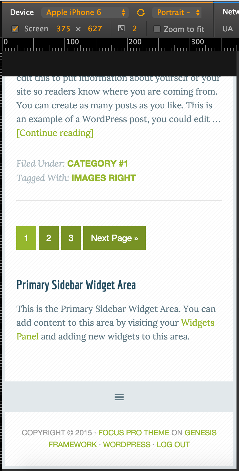
What is happening is that the header menu will turn into a hamburger when viewed on a small device, however the footer menu will not…
I tried adding menu support in the functions file, but not sure I did it correctly..
What am I missing?
Let us register a custom Footer Navigation Menu in addition to the standard Primary and Secondary ones and display it before the footer using genesis_before_footer action hook with a depth of 1 (to not show the sub menus). We shall then adjust the javascript to include this footer menu add a small bit of CSS to ensure that down arrow font icons do not appear for the menu items that have sub menus in our custom footer menu.
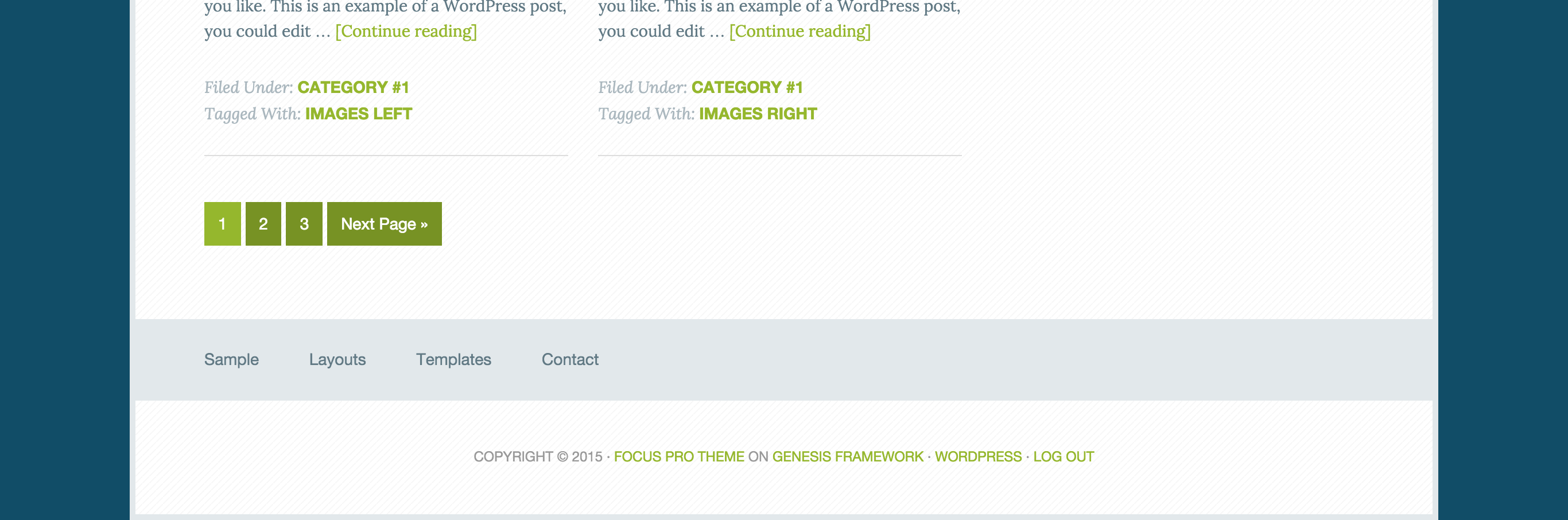
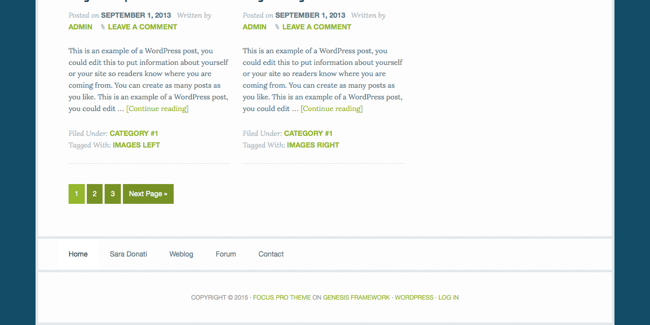
Desktop view:
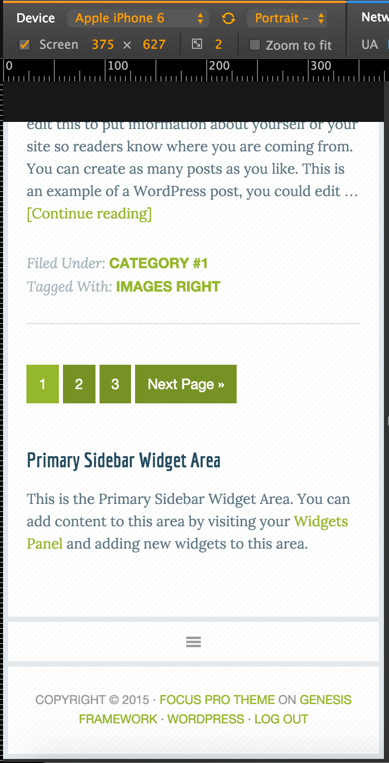
Mobile view:
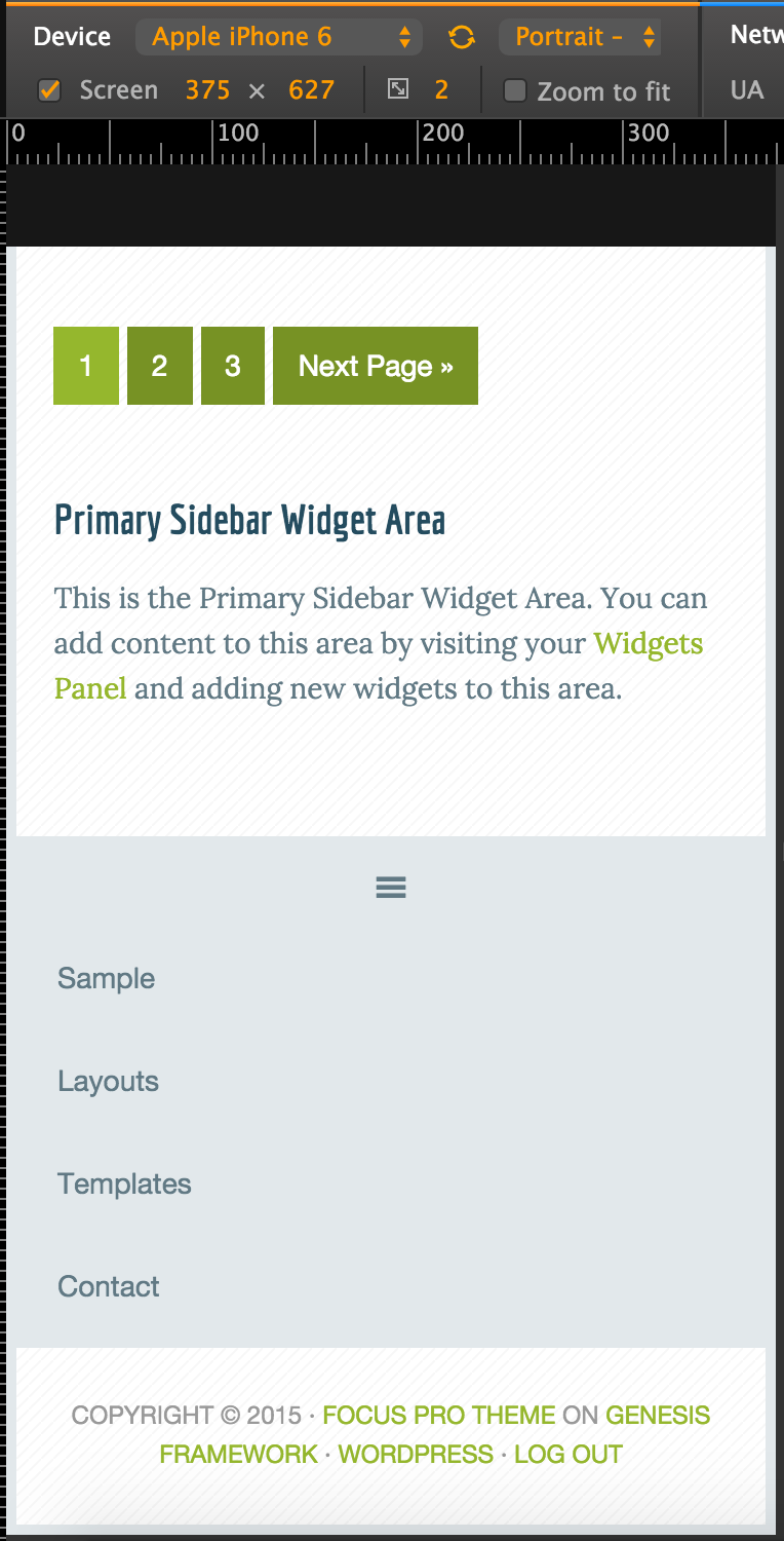
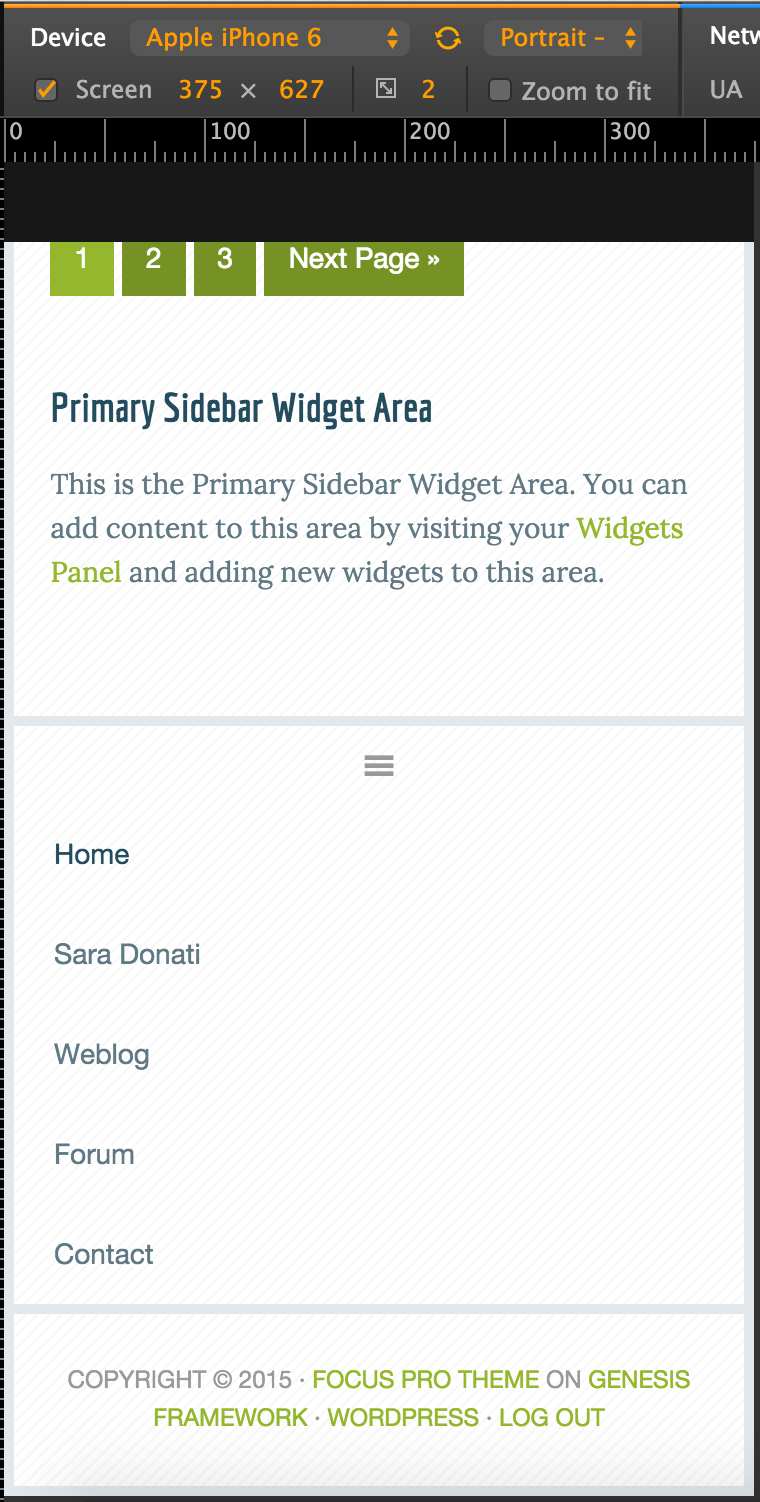
When expanded:
Step 1
Add the following in Focus Pro‘s functions.php:
| // Add Theme Support for Genesis Menus | |
| add_theme_support( 'genesis-menus', array( | |
| 'primary' => __( 'Primary Navigation Menu', 'genesis' ), | |
| 'secondary' => __( 'Secondary Navigation Menu', 'genesis' ), | |
| 'footer' => __( 'Footer Navigation Menu', 'genesis' ), | |
| ) ); | |
| // Hook menu before footer | |
| add_action( 'genesis_before_footer', 'sk_custom_footer' ); | |
| function sk_custom_footer() { | |
| printf( '<nav %s>', genesis_attr( 'nav-footer' ) ); | |
| wp_nav_menu( array( | |
| 'theme_location' => 'footer', | |
| 'container' => false, | |
| 'depth' => 1, | |
| 'fallback_cb' => false, | |
| 'menu_class' => 'genesis-nav-menu', | |
| ) ); | |
| echo '</nav>'; | |
| } |
Step 2
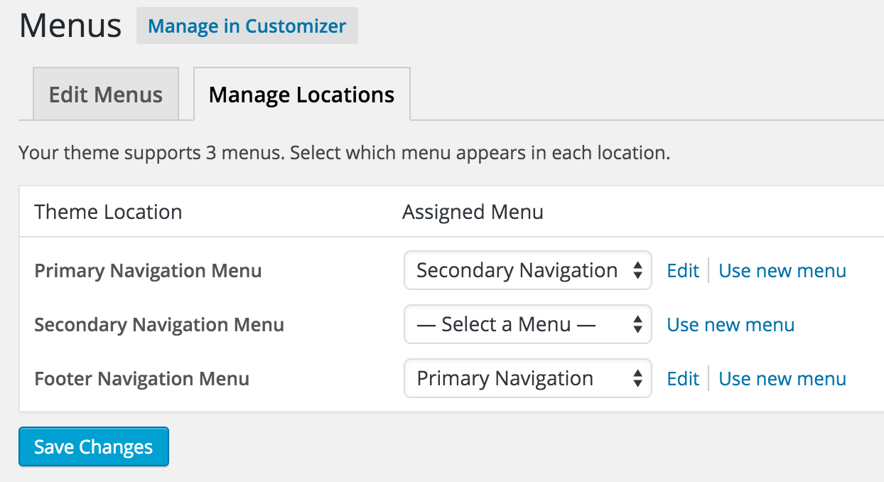
At Appearance > Menus > Manage Locations assign the menu you would to display in the Footer Navigation Menu.
Step 3
Replace the entire code in js/responsive-menu.js with:
Step 4
In Focus Pro’s style.css, in 767px media query, add the following after .genesis-nav-menu.responsive-menu > .menu-item-has-children::before CSS block:
| .nav-footer .genesis-nav-menu.responsive-menu > .menu-item-has-children::before { | |
| content: normal; | |
| } |
Source: Altitude Pro.
Update on Sunday, November 22, 2015
Chuck asks:
I see what I was doing wrong…I had the nav in footer widget 1 which is why I didn’t think your method was working…when I realized that you were not targeting the widget area…I got it to work…so thank you for that…. is there a way to make this work in the footer widget area?
Desktop:
Mobile:
If you would like a custom menu placed in Footer 1 widget area be mobile responsive instead of using a new footer menu, follow these steps instead of the above.
Step 1
Replace the entire code in js/responsive-menu.js with:
Step 2
Edit style.css.
a) Change
| .footer-widgets { | |
| background: #fff url(images/lines.png); | |
| background-size: 6px 6px; | |
| color: #999; | |
| clear: both; | |
| font-size: 14px; | |
| margin-bottom: 5px; | |
| padding: 60px 60px 16px; | |
| } | |
| .footer-widgets-1, | |
| .footer-widgets-2, | |
| .footer-widgets-3 { | |
| width: 310px; | |
| } | |
| .footer-widgets-1 { | |
| margin-right: 40px; | |
| } | |
| .footer-widgets-1, | |
| .footer-widgets-2 { | |
| float: left; | |
| } | |
| .footer-widgets-3 { | |
| float: right; | |
| } | |
| .footer-widgets .widget { | |
| margin-bottom: 24px; | |
| } |
to
| .footer-widgets { | |
| background: #fff url(images/lines.png); | |
| background-size: 6px 6px; | |
| color: #999; | |
| clear: both; | |
| font-size: 14px; | |
| margin-bottom: 5px; | |
| /*padding: 60px 60px 16px;*/ | |
| } | |
| /*.footer-widgets-1, | |
| .footer-widgets-2, | |
| .footer-widgets-3 { | |
| width: 310px; | |
| } | |
| .footer-widgets-1 { | |
| margin-right: 40px; | |
| } | |
| .footer-widgets-1, | |
| .footer-widgets-2 { | |
| float: left; | |
| } | |
| .footer-widgets-3 { | |
| float: right; | |
| } | |
| .footer-widgets .widget { | |
| margin-bottom: 24px; | |
| }*/ |
b) Add
| .nav-footer { | |
| overflow: hidden; | |
| margin-bottom: 5px; | |
| } | |
| .footer-widgets .widget { | |
| margin-bottom: 0; | |
| } | |
| .footer-widgets .widget ul > li::before { | |
| content: normal; | |
| } | |
| .footer-widgets .widget ul > li { | |
| border-bottom: none; | |
| margin: 0; | |
| padding: 0; | |
| } |
c) In 1160px media query, comment out or delete
| .footer-widgets-1, | |
| .footer-widgets-2, | |
| .footer-widgets-3, | |
| .sidebar-primary { | |
| width: 250px; | |
| } |
d) In 1023px media query, comment out or delete
| .footer-widgets { | |
| padding: 40px 5% 16px; | |
| } |
Note: The other two footer widget areas, Footer 2 and Footer 3 will also be 100% wide with the above changes.
Aloha Sridhar!
Thank you for this. I am trying to make it work a second time…( I failed the first LOL )…but I am noticing that in the functions file, there is an echo statement closing the nav…
echo ”;
but there is not one opening the nav…there is a printf function with
could you please explain the %s? Thank you.
I see what I was doing wrong…I had the nav in footer widget 1 which is why I didn’t think your method was working…when I realized that you were not targeting the widget area…I got it to work…so thank you for that…. is there a way to make this work in the footer widget area?
Yes. I have updated the tutorial and added steps for this.
Thank you
printf will print (or output) the first argument of that function, i.e., a formatted string. The
%splaceholder(s) will be substituted with further arguments in that order. See page 106 of ftp://ik.su.lt/PHP/John_Wiley_&_Sons_PHP_5_For_Dummies.pdf.https://github.com/copyblogger/genesis-simple-share/issues/42#issuecomment-71958888 has an example of printf and sprintf. You typically use printf when you want to display and sprintf when you want to return (pass on) something and store it in a variable.
Thank you for those links Sridhar!
Hi Sridhar
What do you use for Mobile view ??
Does this method work for Minimum Pro and Agency Pro?
Thanks
Hi Leon,
I use Google Chrome’s built-in Device Mode. https://developers.google.com/web/tools/chrome-devtools/iterate/device-mode/?hl=en
Please give it a try and let me know if it doesn’t. I will then look into it.
I need to add a menu similar to the one in this tutorial and doesn’t seem to be working with the current sample theme – I think it’s because the responsive code is different in the current sample theme, now combining the primary nav + header (widget area) menus and deals with accessibility. So how would this tutorial change to take those things into account?
Follow https://sridharkatakam.com/how-to-make-secondary-navigation-menu-mobile-responsive-in-genesis/
[…] the comments section of How to add a responsive mobile menu before footer in Focus Pro, a user […]