In the members-only forum, a user wrote:
I like the new child theme but miss the versatility of having a right widget area. The demo shows a nice button that can be used for a CTA, but it folds into the menu when the site is mobile.
What would be the best way to add that widget back? I like the narrow header on large screens, so it would have to be styled inline. But on mobile screens I am ok with an extra line for extra gain to keep a CTA or a phone number in ready view.
Thank you!
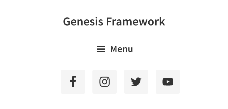
This can be done by uncommenting the code that removes the Header Right widget area in Genesis Sample 2.6.0 and adding custom CSS to line up the title area, primary nav and header right widget areas on desktops and one below the other from 959px and below.
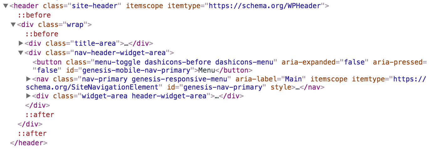
We acheive this by inserting the primary nav menu after/below the .title-area and wrapping .nav-primary and .header-widget-area in a custom div.nav-header-widget-area using genesis_markup_title-area_close and genesis_markup_header_widget-area_close dynamic filter hooks in Genesis.
We shall also remove the primary nav menu's wrap.
Step 1
Edit Genesis Sample 2.6.0's functions.php.
a) Change
// Repositions primary navigation menu.
remove_action( 'genesis_after_header', 'genesis_do_nav' );
add_action( 'genesis_header', 'genesis_do_nav', 12 );
to
// Removes primary navigation menu.
remove_action( 'genesis_after_header', 'genesis_do_nav' );
b) Delete
// Removes header right widget area.
unregister_sidebar( 'header-right' );
c) At the end, add
To view the full content, please sign up for the membership.
Already a member? Log in below or here.


Hi Sridhar,
Great tutorial. I was wondering how you would center the navigation menu so it’s between the site title and right widget area.
I followed your tutorial below but this also pulls the right widget area across.
https://sridharkatakam.com/left-aligned-site-title-with-centered-navigation-in-genesis/
Your help would be most appreciated.
Hi Sridhar,
What I’d like to achieve is probably a combination of a few of your tutorials put together.
I’d like the site title on the left. The site menu centered. The social icons to the right and then if possible, integrate your header search tutorial so that the search magnifying glass sits to the right of the social icons.
https://sridharkatakam.com/header-right-widget-area-in-genesis-sample-2-6-0/
https://sridharkatakam.com/left-aligned-site-title-with-centered-navigation-in-genesis/
https://sridharkatakam.com/header-search-in-genesis/
Hi Adam,
I have just published a new tutorial for you: https://sridharkatakam.com/site-title-on-left-primary-nav-in-the-middle-and-header-right-widget-area-on-the-right-in-genesis-sample/
Hi Sridhar,
That’s perfect, as always! Thank you so much.
Hello Hi Sridhar, thank you for the solution. Additionally I would like to also add a widget area above the Primary Nav. I searched through the tutorials but could not find a solution. Please see an image of what I am looking for at https://ibb.co/hzWcpp. I appreciate your help.
Thank you,
KMI
Hi Sridhar,
Will this work for Sample 2.8.0?
Thank you,
Kelly
Hi Kelly,
It should.
Please give it a try on a test/staging site and let me know if you have face any difficulties or get stuck.
Thank you, Sridhar. I will let you know.
Kelly
It worked great!
Thank you,
Kelly