In my Facebook group, a user asked:
Hello Sridhar,
Google just released a new design for the webmaster tools (https://www.google.nl/intl/nl/webmasters/#?modal_active=none) and I love the mobile menu. Could you make a tutorial on how to make that using your Genesis Sample Master theme?
Thanks a lot!
The redesigned Google Webmasters website shows a hamburger menu icon at smaller widths which when tapped fades in a vertical side menu with menu items one below the other and menu icon transitioning smoothly to a X icon. Tapping the X closes the nav menu overlay.
In this tutorial I share the code for setting up a similar mobile menu in Genesis.
Animated GIF:
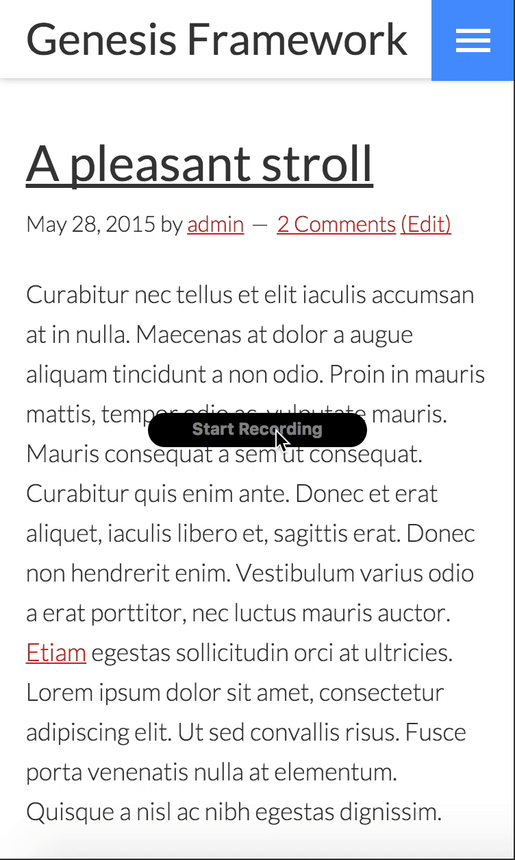
Screencast (before I added the CTA button at the bottom):
While the tutorial has been written for Genesis Sample child theme it should work with some adjustments in any Genesis child theme.
This method does NOT take care of accessibility. For a simpler but accessible mobile navigation, follow my Accessible Responsive Menu in Genesis tutorial instead.
Note:
- This solution is tested and written only for single level menu items. The nav menu has been set to be reduced to one level depth on mobile devices.
- The mobile menu shown will be the Primary Navigation menu.
- Very minimal JS is used - only to assign a class to html element when the menu is open. Everything else is CSS.
Step 1
Ensure that a menu is assigned to Primary Navigation Menu theme location.
Step 2
Create a file named say, mobile-menu.js in child theme's js directory (create if not existing) having the following:
Thanks a lot Sri, it’s awesome! One note: Create a file named say, mobile-menu.js in child theme directory having the following, must be in a js map in the child theme directory.
Corrected. Ty.
I was wondering if Icons could be added next to the menu words.
example would be banggood.com mobile site.
Great piece of work.
Tried to add into Workstation Theme but can’t figure how to integrate it the right way.
Any advice to make it work seamlessly on Workstation Theme?
Thank you.
Thanks for this great implementation!
Do you think it will be possible to display submenu items in a near future?
Would you update the responsive menu included in your custom child theme (https://github.com/srikat/genesis-sample)? Not with this mobile menu but in order to enhance the loading (CF Slack on #questions channel).
Many thanks
Hey Sridhar Katakam this is awesome! Exactly what I need at my current project !
Can you help me to implement this on altitude-pro? Thats a bit tricky with the menu that changes on scroll.
Also how to display this menu all the time, not only on mobile?
Thanks in advance 🙂
I second this
Why isn’t this accessible? You mentioned accessibility isn’t taken care of. What isn’t accessible here? I want to use this in a project.
Coding with accessibility intact means (to put in short) that the solution will be navigable by blind users using the keys on their keyboard.
Most of the solutions/code in my tutorials does not factor for accessibility and translation readiness as I am not knowledgeable about their implementations yet.
Ok awesome, thanks for clarifying Sridhar. Great work, as always! I’m a happy subscriber 🙂