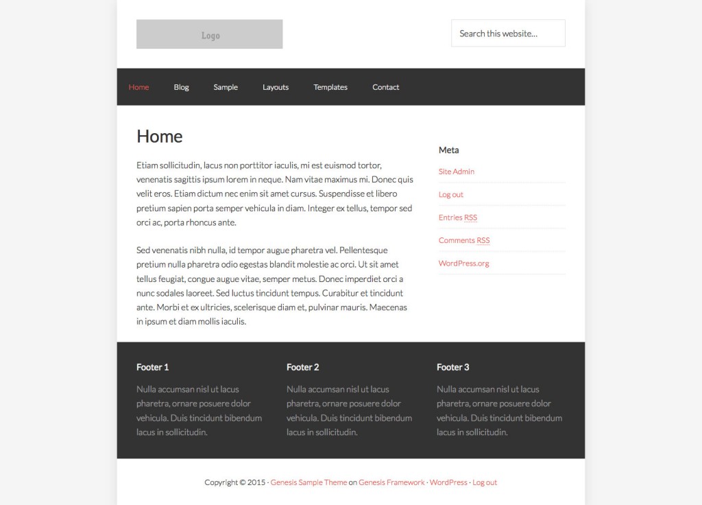
Elements in Genesis are full width with the actual content of various sections constrained by max-width applied to the wrap. I have modified my Genesis Sample-based variant to make it boxed.
The width of site container has been set to 960px. Also the 3-column layouts (like content/sidebar/sidebar) have been removed.

I just found this earlier today. I think this was a great modification. A lot of my clients don’t like the full width themes and/or they don’t have enough content on the page to stretch all the way across. This would work well for some of them.
Hello
This is very nice, however, on mobile the column classes page does not render properly.
Is it possible to offer the code to be applied to @media as well – or was this only for non-mobile.
Thank you.