In the comments section of Full width Soliloquy slider with Header floating on the top in Genesis, a user asked
I want to get this to work for Carrie Dil’s Utility Pro theme and replace the first intro area. Would that work?
In this tutorial we shall
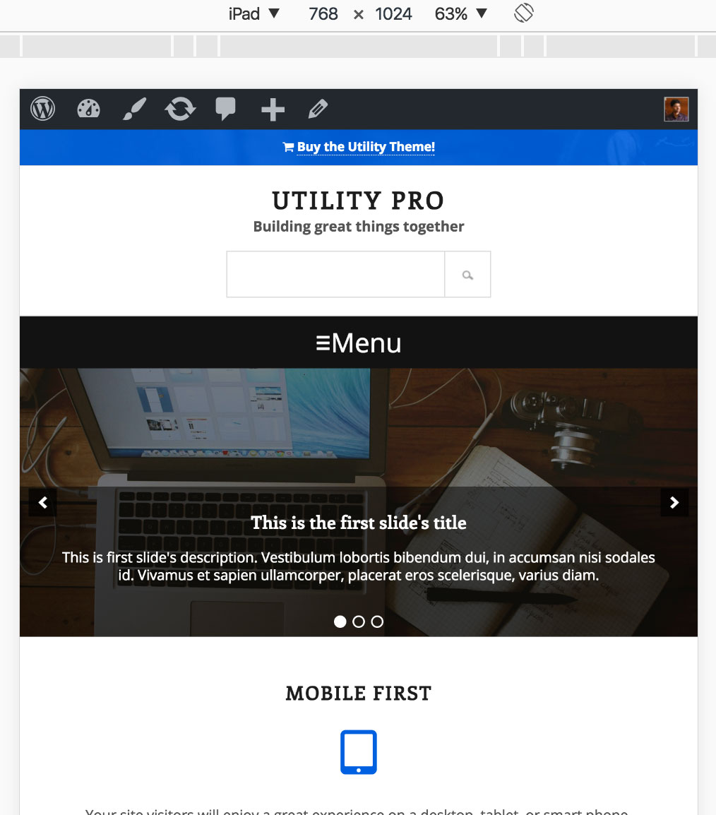
- wrap .utility-bar, .site-header and .nav-primary in a custom div.utility-bar-header-nav
- wrap .utility-bar-header-nav and .home-welcome in a custom div.header-slider-wrapper
- set .header-slider-wrapper's CSS position property to relative and that of .utility-bar-header-nav to absolute so it floats on top of the slider placed inside the Home Welcome widget area
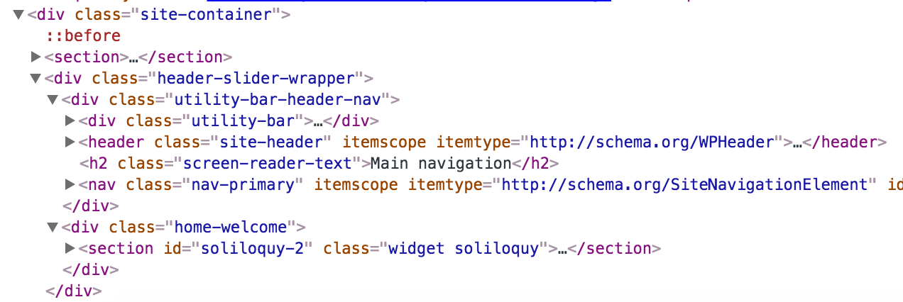
in Utility Pro.
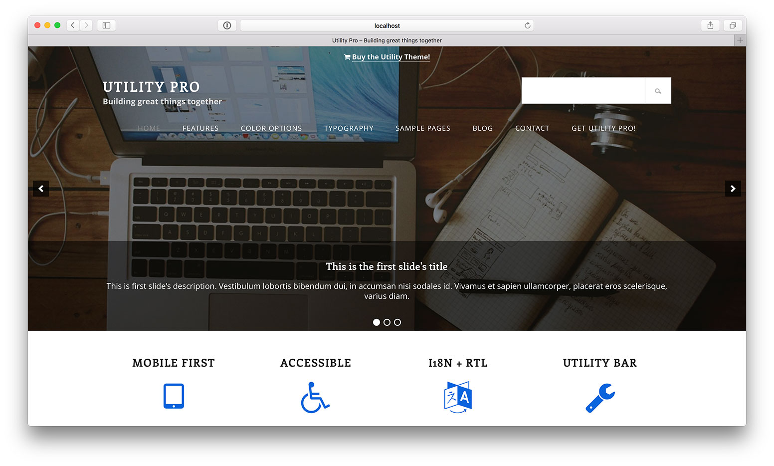
Slide captions are optional.
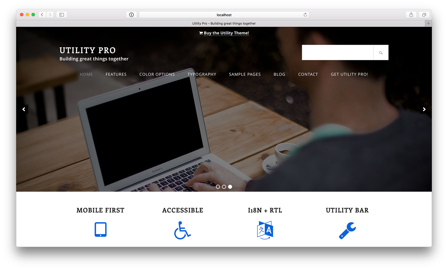
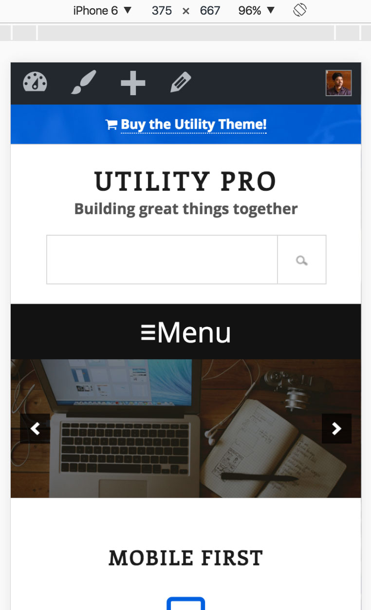
Screenshots on tablet and mobile:
Step 1
Install and activate Soliloquy.
Create a slider named say, Home Slider and upload/select your desired slide images.
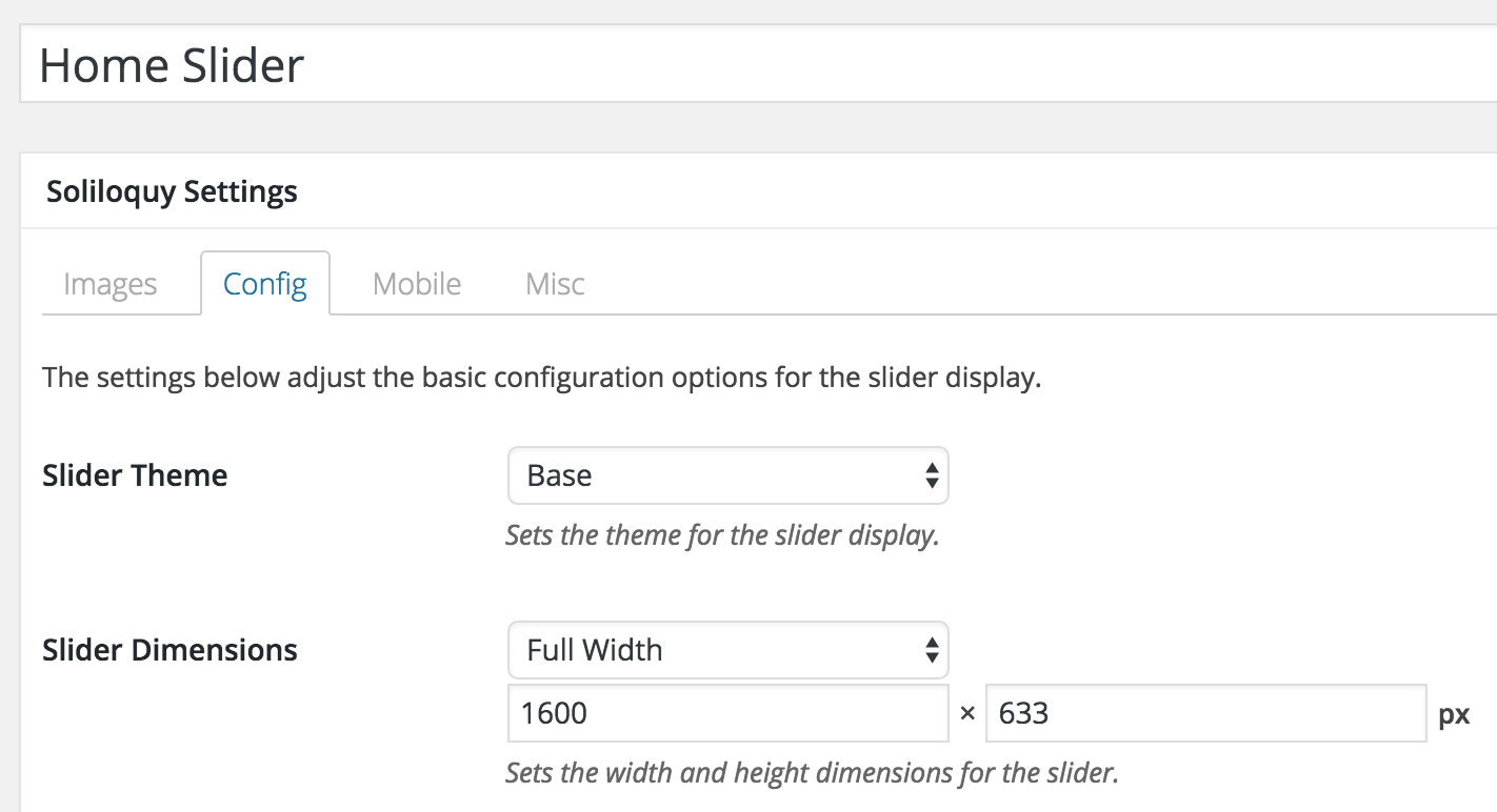
In the Config tab, select "Full Width" for Slider Dimensions and enter your slide images' width and height.
[optional] Use this sample HTML for caption:
To view the full content, please sign up for the membership.
Already a member? Log in below or here.
Brilliant
Quick question – is there a way to make it so the top header and menu aren’t transparent? So they are still solid colour?
so basically replace the content of Home Welcome with full width Soliloquy slider?
Correct. Same as on mobile device view
Although above as an option is great 🙂
Follow https://sridharkatakam.com/full-width-soliloquy-slider-home-welcome-section-utility-pro/ instead.
[…] is a simplified version of my earlier Full width Soliloquy slider with Utility Bar, Header and Navigation floating on the top in Utility P… tutorial where the 100% wide slider is set to replace the text widget in Home Welcome widget […]