In the members-only forum a user asked:
Hello,
To be more specific, like this one:
http://blog.teamtreehouse.com/rj-learned-to-code-and-made-the-switch-from-accountant-to-skilled-front-end-developerI believe this is an awesome layout for a single post. Also done here: (Seems to be on Genesis too)
http://chrislema.com/rainmaker-marketing-automation/*If that already exists please drop a link here. Searched for it but can’t find something.
Thanks!
Update: This one looks even better!
https://premium.wpmudev.org/blog/letting-clients-go/
In this article I share how wpmudev's single Post layout can be set up in Genesis.
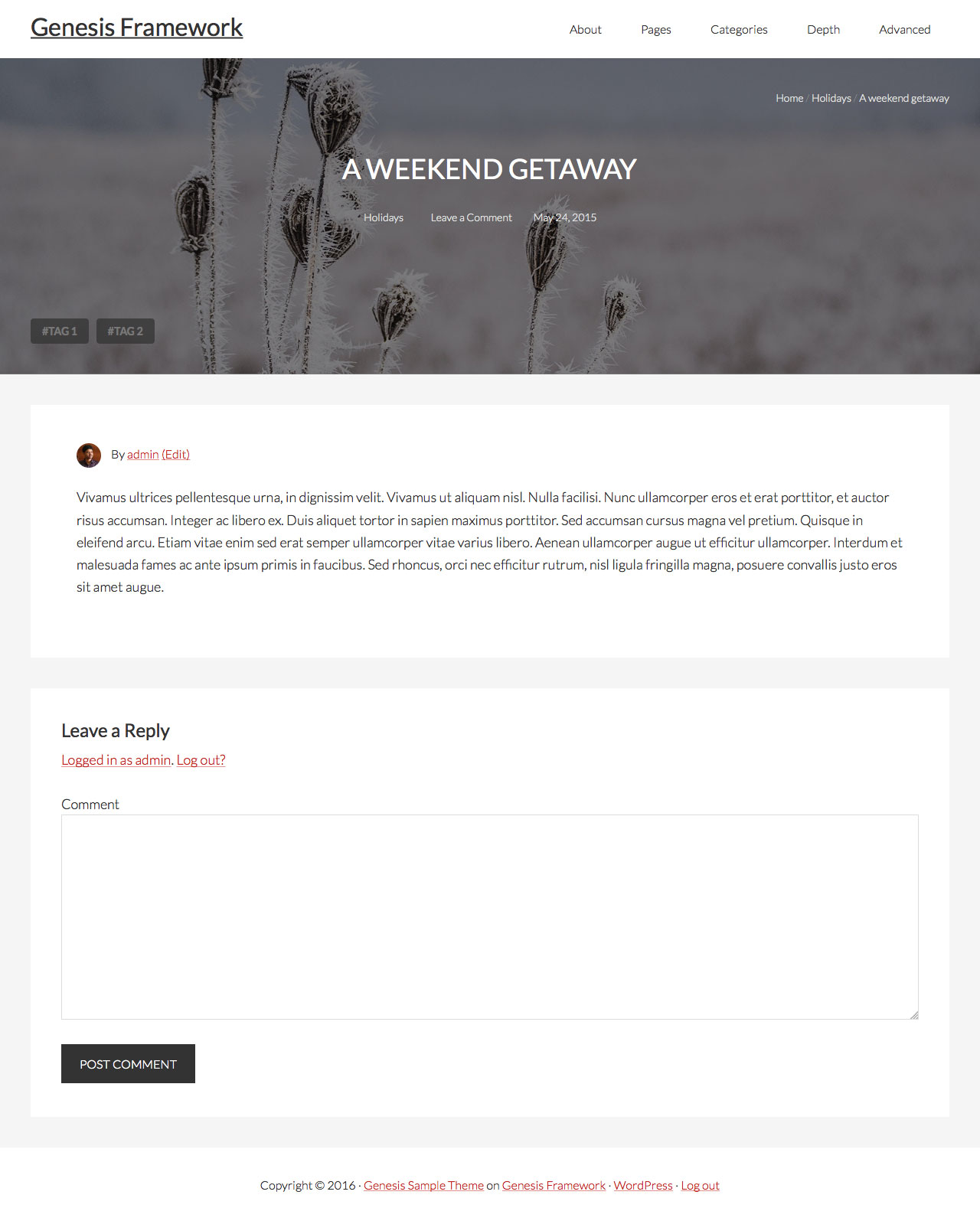
Featured image (if present) or a placeholder image (if a featured image is not present) will appear below the header. Breadcrumbs will appear overlayed near the top of the image aligned to right. Title, linked categories, comment link, published date will appear centered near the middle. At bottom left, the linked tags.
We shall create a template for single Posts and write the code to
- force full width content
- remove 'You are here' from breadcrumbs
- remove breadcrumbs, entry title, post info and entry meta from their default location
- create a function to show unordered list of linked tags with "#" prepended before the tags' text
- register a custom shortcode that displays gravatar of the post's author
- display a div.single-hero section after header and set its background image to the featured image or to a hard-coded image in case the post does not have a featured image; add HTML interspersed with PHP necessary to show breadcrumbs, title, post info and entry meta.
- add the necessary CSS
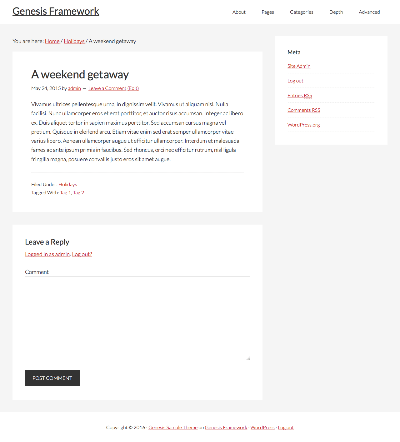
Before:

After:

While the tutorial has been written for Genesis Sample child theme it should work with some adjustments in any Genesis child theme.
Update on March 21, 2016: Dynamik specific steps are added at the end.
Step 1
Create a file named single-post.php in child theme directory having the following code:
To view the full content, please sign up for the membership.
Already a member? Log in below or here.
Hello,
Can you help align all elements to the center? In the URL bellow I test this but the elements in the “hero-content” class are not perfectly aligned. The “hero-bottom wrap” is ok (aligned to the main content below).
What i need is everything in the “single-hero” to have a max-width and be centered with the tags and main content Thanks!
(Seems to be aligned, but I don’t think it is) – http://wpdesigns.gr/2016/01/14/wordpress-resources-at-siteground/
This worked perfectly for Digital Pro. However, the title was pushed all the way to the top of the image. I added padding-top: 150px;, to .hero-content .entry-title selector, but then when viewed on a smaller screen it gets out of whack (not centered). What code can be added to keep the entry title centered as the screen gets smaller? Also, how could the image resize proportionally? Thanks for all you wisdom on this site? I’m learning so much!
This is happening because of the fixed header in Digital Pro. You have to push the .single-hero section down by the height of header. Give a top margin of 91px to .single-hero above 800px. Then remove the top padding for .hero-content .entry-title.
To add to the above post, it’s weird that the styling seems to work on Firefox, but not on Chrome. Here is the url – http://inspiredcreatives.com/2016/02/28/chewy-chocolate-crinkles-cookies-change/ . I tried playing with margin-top instead of padding and editing the .hero-content .headline also, but nothing seems to be working correctly or changing at all on Chrome. I’ve cleared cache as well. Thanks again.
One more thing, I know you do a lot with Dynamik Website Builder as well. How could this be done with that child theme? I’d love to see a tutorial for that if you don’t already have something.
I’ve updated this tutorial with Dynamik specific steps.
Hi Sridhar,
Can this be adapted for pages as well? I promise you a Starbucks coffee for all your help in this! Their site just happened to be down right now;(
Thanks so much for adding the Dynamik Website Builder specific instructions. You are absolutely wonderful. This is by far my most useful subscription!
Hi Sridhar,
This worked out so perfectly for me. Thanks so much. This morning I got the idea of maybe swapping out the entry meta info with the excerpt. I thought I might be able to go down that rabbit hole myself, but got lost quickly. Is that something you could adapt this to?
Sridhar,
Cool tutorial.
I wonder how to do this on single post with content-sidebar layout. So with fullwidth image but the actual content with a sidebar?
Thanks!
Simply deleting
[php]// Force full width content
add_filter( ‘genesis_pre_get_option_site_layout’, ‘__genesis_return_full_width_content’ );[/php]
from the code in single-post.php in Step 1 should do it.
When I try to implement this I get an http 500 error when viewing the blog post. I’ve pasted in the code one block at a time and found that when this block is entered into the single-post.php it breaks. Any idea as to why?
// Customize entry meta in the entry header
add_filter( ‘genesis_post_info’, ‘sp_post_info_filter’ );
function sp_post_info_filter( $post_info ) {
$post_info = ‘[show_gravatar] By [post_author_posts_link] [post_edit]‘;
return $post_info;
}
There was a conflict in functions.php. I’m off and running. Thanks for another great tutorial!