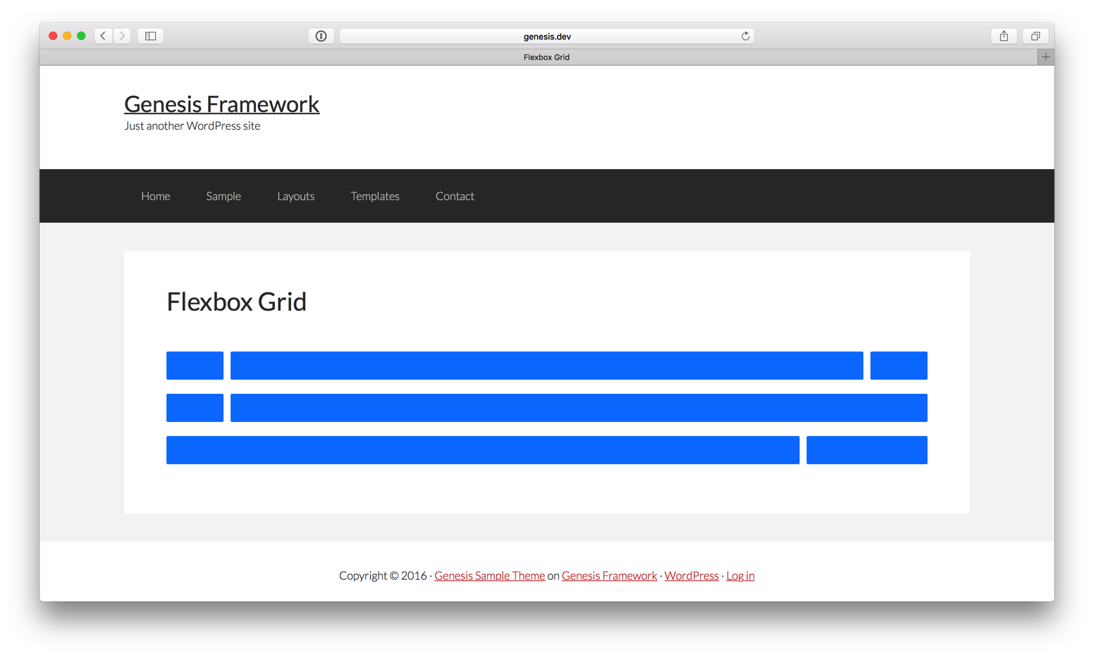
Flexbox Grid is a grid system based on the flex display property.
Here’s how it can be loaded and used in Genesis:
Step 1
Upload flexboxgrid.min.css to child theme’s css directory (create if not existing).
Step 2
Add the following in child theme’s functions.php:
| // Load Flexbox Grid | |
| add_action( 'wp_enqueue_scripts', 'sk_enqueue_flexbox_grid' ); | |
| function sk_enqueue_flexbox_grid() { | |
| wp_enqueue_style( 'flexboxgrid', CHILD_URL . '/css/flexboxgrid.min.css' ); | |
| } |
Step 3
Add the needed markup to display your desired content in a grid by following the examples on Flexbox Grid’s site.
Ex.:
| <div class="flexbox-grid"> | |
| <div class="row"> | |
| <div class="col-xs-12 col-sm-3 col-md-2 col-lg-1"> | |
| <div class="box-row"></div> | |
| </div> | |
| <div class="col-xs-6 col-sm-6 col-md-8 col-lg-10"> | |
| <div class="box-row"></div> | |
| </div> | |
| <div class="col-xs-6 col-sm-3 col-md-2 col-lg-1"> | |
| <div class="box-row"></div> | |
| </div> | |
| </div> | |
| <div class="row"> | |
| <div class="col-xs-12 col-sm-3 col-md-2 col-lg-1"> | |
| <div class="box-row"></div> | |
| </div> | |
| <div class="col-xs-12 col-sm-9 col-md-10 col-lg-11"> | |
| <div class="box-row"></div> | |
| </div> | |
| </div> | |
| <div class="row"> | |
| <div class="col-xs-10 col-sm-6 col-md-8 col-lg-10"> | |
| <div class="box-row"></div> | |
| </div> | |
| <div class="col-xs-2 col-sm-6 col-md-4 col-lg-2"> | |
| <div class="box-row"></div> | |
| </div> | |
| </div> | |
| </div> |
Needless to say, if you are placing HTML similar to the above in WP Post/Page editor, it goes in Text view and not in Visual.
Step 4
Add the following in child theme’s style.css and modify to suit:
| .flexbox-grid { | |
| margin-top: 40px; | |
| } | |
| .box-row { | |
| padding: 20px; | |
| margin-bottom: 20px; | |
| background-color: #007fff; | |
| border-radius: 2px; | |
| } | |
| .flexbox-grid p { | |
| margin-bottom: 0; | |
| } |
to get

For those that like the Visual Editor, they could use Bill Erickson’s Div Shortcode plugin https://wordpress.org/plugins/div-shortcode/
I will definitely look into this module – I’ve been thinking of moving to using Zurb Foundation CSS for my sites (still with Genesis) but this might be easier.
Thanks Sridhar, we were researching on this for an e-commerce child them that we are developing in Genesis. Great Job!
Finally! Thanks for finally doing this tutorial!
The is so GREAT!
Can you explain how this is different or better than Enqueuing bootstrap ??
Your stuff is amazing, thank you!
How do you get the darn thing to scaffold?
Answer, the higher css numbers create stacks.
For those wondering in regards to scaffolding (on column layout) your divs for mobile. All do is add “12” to the class.
So for example, if you used these classes.
col-xs-12
col-sm-12
col-md-12
col-lg-12
Your divs would scaffold in every breakpoint.
If you added col-xs-12 this would stack your div for the 500px and under breakpoint.
The last hurdle is getting the divs to maintain equal heights. Hmmm… Currently, the divs hug the text.
I would just use CSS Grid instead of this today.
https://sridharkatakam.com/css-grid-with-float-fallback/