The following tutorial addresses this question asked by a user in the members-only forum.
We shall
- remove the header right widget area
- remove the primary navigation menu from its default location (below header) and add it inside header
- set up inline image logo that can be set/changed via Header customizer setting
- remove site description (tagline)
- add search icon as the last menu item of the primary menu
- remove the secondary navigation menu from appearing below the header
- implement accessible mobile menu of Genesis Sample so that the navigation collapses into a hamburger menu icon which when tapped displays the menu items one below the other at smaller screen sizes
for a fixed (on non mobile/handhelds) utility bar + site header in Dynamik.
Step 1
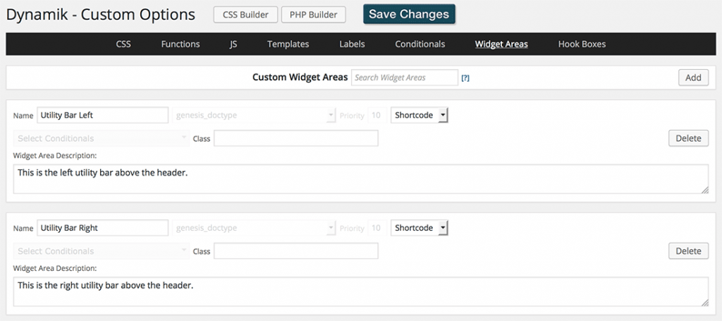
At Genesis > Dynamik Custom > Widget Areas create Utility Bar Left and Utility Bar Right widget areas:
Make sure they are set to Shortcode type.
Step 2
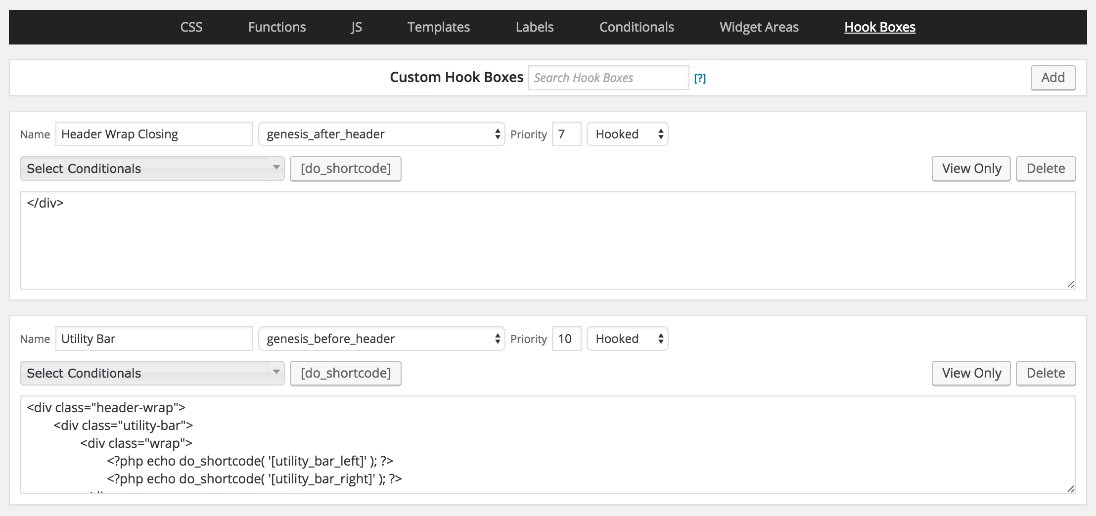
Create custom hook boxes like this:

Code in bottom (Utility Bar) hook box:
To view the full content, please sign up for the membership.
Already a member? Log in below or here.

Your hamburger menu in the demo isn’t showing.
Looking into this..
Fixed. A single line of code to enqueue Dashicons was missing. Added it now.
It’s not responsive , checked on an iPad and iPhone , no menu shows , header image is very small.
What do you want your header/logo image size to be?
Can the menu on mobile have more padding at the bottom so the search bar isn’t half in the menu half out?
Yes. I have updated the CSS to take care of this.
http://d.pr/i/10q7K
Can you center the search bar when shown on all mobile/tablet in all screen orientation. That would make the menu perfect. Can the menu and utility bar be sticky on mobile? Id like it as you have sticky on desktop not on mobile. I also could use a second version sticky on desktop and mobile.
Yes. The updated CSS (per my earlier comment) takes care of this.
Yes. Change the 1140px media query to http://pastebin.com/raw/Tb87u2Bf.
Final question was how do I make just the header sticky on mobile and the utility not. I imputed your css updates and it works fine for mobile sticky header and utility bar. I need for another project I am starting for my self the header and utility bar to be sticky on desktop and only the header to be sticky on mobile.
I need to hide the secondary nav not remove it also thanks.
In Functions, delete http://pastebin.com/raw/Lgm0VzSs.
In CSS add http://pastebin.com/raw/zmnFq43r.
Still not showing the logo. I uploaded the logo and selected in Dynamik’s header section. Please help with this.
Can you send me your WP and FTP logins via the contact form so I can take a look inside?
The logo image needs to be uploaded at Appearance > Header > Header Image. Please do that and let me know when done.
How did you fix the header menu not showing up? I just uploaded the image.
1) At Genesis > Dynamik Design > Header in the “Select Logo Image” section you need to remove the image (bigoven-recipes.png).
I have not made any changes in your site.
I cant see logo in seskroo or moble Firefox. Works fine in chrome on desktop and mobile.
Still can’t see the logo in Firefox desktop our or mobile. Works only on chrome.
Its not using the hamburger menu anymore.
http://www.realgoodmeals.com/wp-content/uploads/dynamik-gen/theme/responsive-menu.js is missing. You need to implement Step 3 of the tutorial.
I added the step 3 file it still doesn’t work.
I opened that file on your server in the browser and see a lot of invalid characters.
See http://www.realgoodmeals.com/wp-content/uploads/dynamik-gen/theme/responsive-menu.js.
You need to click on ‘view raw’ button at the right bottom of the code snippet and copy & paste that.
Please re-do this step correctly and let me know when done.
Just uploaded corrected file.
http://www.realgoodmeals.com/wp-content/uploads/dynamik-gen/theme/responsive-menu.js does not still look right.
Just fixed the js . Found out editing with a text editor ibn my Android caused the issues. Can you advise me on why any browse other then chrome won’t show logo . Thanks
Try adding the CSS here: http://pastebin.com/raw/aTe1r4V1
Will the css fix the logo on other browsers? Do I add it to the header logo part that’s already there and replace anything our just addit top the header css ?
Yes.
Add the code at Genesis > Dynamik Custom > CSS above the media queries.
Any css or function changes please give the info to change out. I would prefer to do it so I can learn from it. Thanks
Ok, will do.
I received your site’s login as a comment. I am not publishing it since it will be visible to other users of this site.
In the future please send such confidential info via the form at https://sridharkatakam.com/contact/
Thank You for being so patient and wanting the perfect tutorial for me.
Am I missing something or is Step 6 and Step 7 the same thing?
Thanks for pointing this out. I have edited the post and removed the duplicate step.
Love the use of the custom widget areas. I know it’s specialized, but Dynamik tutorials that really take advantage of the coolness and flexibility of Dynamik are greatly appreciated.
– Peter
Forgot to mention: One thing that would also be great is to use the Dynamik Custom JS area instead of uploading .js files. It’s safer when upgrading Dynamik and neater because it’s “right there.”
I clicked on the button “live demo” which led to http://dev-dynamik-fixed-utility-header.pantheonsite.io/ where the message reads:
530 Error
Site is frozen
This site was frozen due to inactivity. To unfreeze the site, the site owner must visit dashboard.pantheon.io to visit the site’s dashboard.
It should work again. Please check.
Thank you! It does work again. You’re terrific!