In the members-only forum a user asked:
Hello Sridhar,
What I would like your help with is how to create a 4×2 grid of images that look and act similar to:
Genesis Sandbox Featured Content Page Widgets Grid with Title and Excerpt on HoverTo keep from original tutorial:
1) 4×2 Desktop grid layout with dark background and excerpt (no title) on hover.
2) Graceful responsiveness as browser size shrinks.Adjustments:
1) I do not want to use the featured image because that is already being used as a backstretch image for the page. The grid images are 16×9 aspect ratio “posters” with text already on them and I would love to just to select and add image from the media library to the grid, and then set it to link to a page.
2) No change in aspect ratio and no “dark section with title” as the browser resizes on mobile, just the wide images stacking gracefully (shrinking ok as long as aspect ratio remains). Change in aspect ratio would make text on image unreadable.
Basically, this is a responsive gallery of “poster images with text” that link to pages, and have the excerpt show on hover (desktop only).
I hope this makes sense. Thanks for all your help!
In this article we shall
- register a custom
home-featuredimage size for images in Home Featured section - register a custom
home-featuredwidget area - display Home Featured widget area below header on homepage
- use Advanced Custom Fields plugin to create a image type custom field and attach it to static Pages
- create a custom
home-featured.phptemplate to be used by Flexible Posts widget having the code to display the image field's value and the excerpt - drag an instance of Flexible Posts widget into Home Featured widget area, specify the IDs of Pages which should be featured and set the template as home-featured.php
- write CSS for the grid items using float and :nth-of-type selector
to display a 2 x 4 grid of featured Pages with excerpts appearing on hover at desktop widths. At 1024px and below, the excerpts will be set to not appear. As the viewport width goes down, the items will become 3 columns per row, then 2 per row and finally 1 per row.
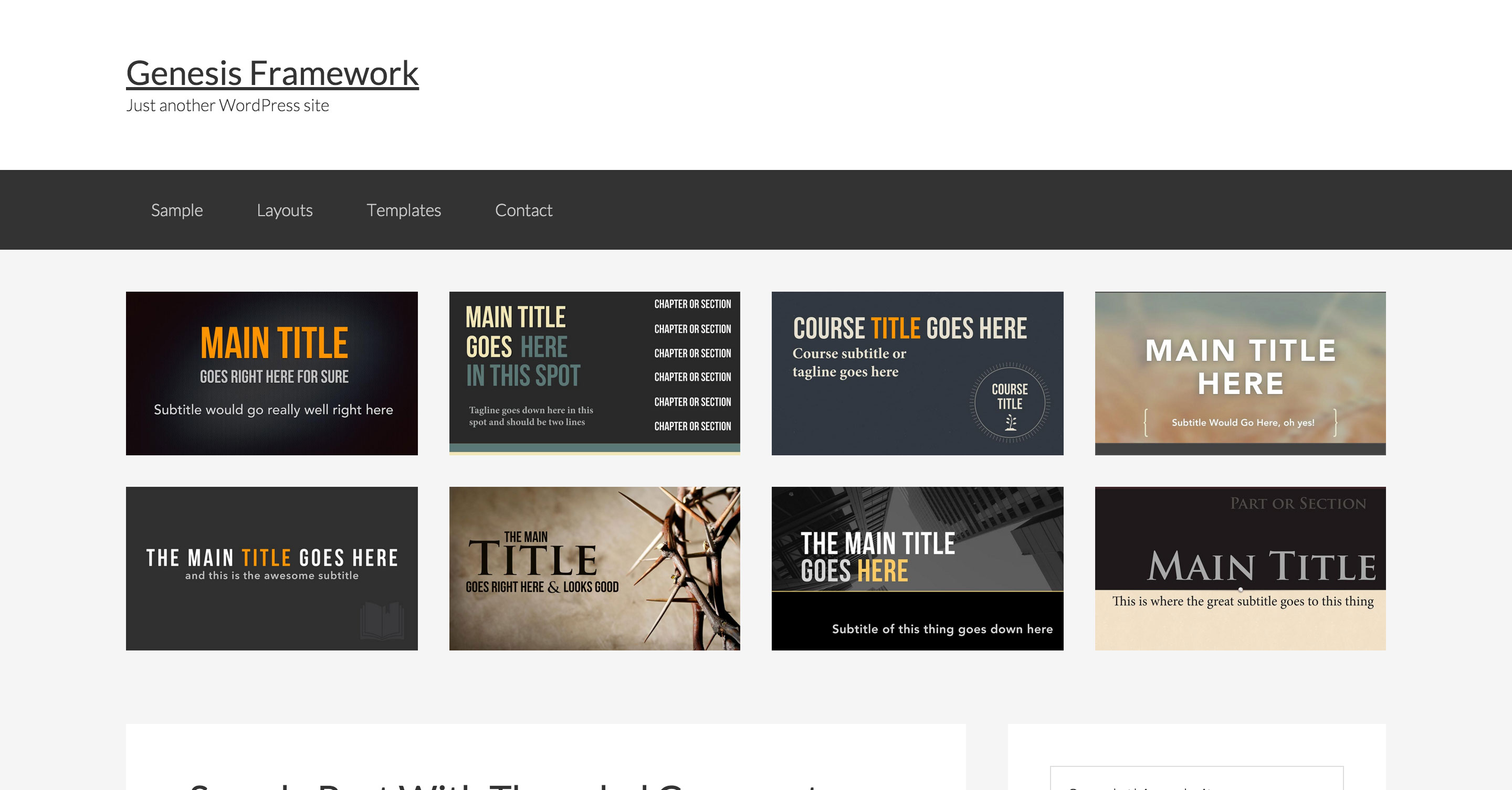
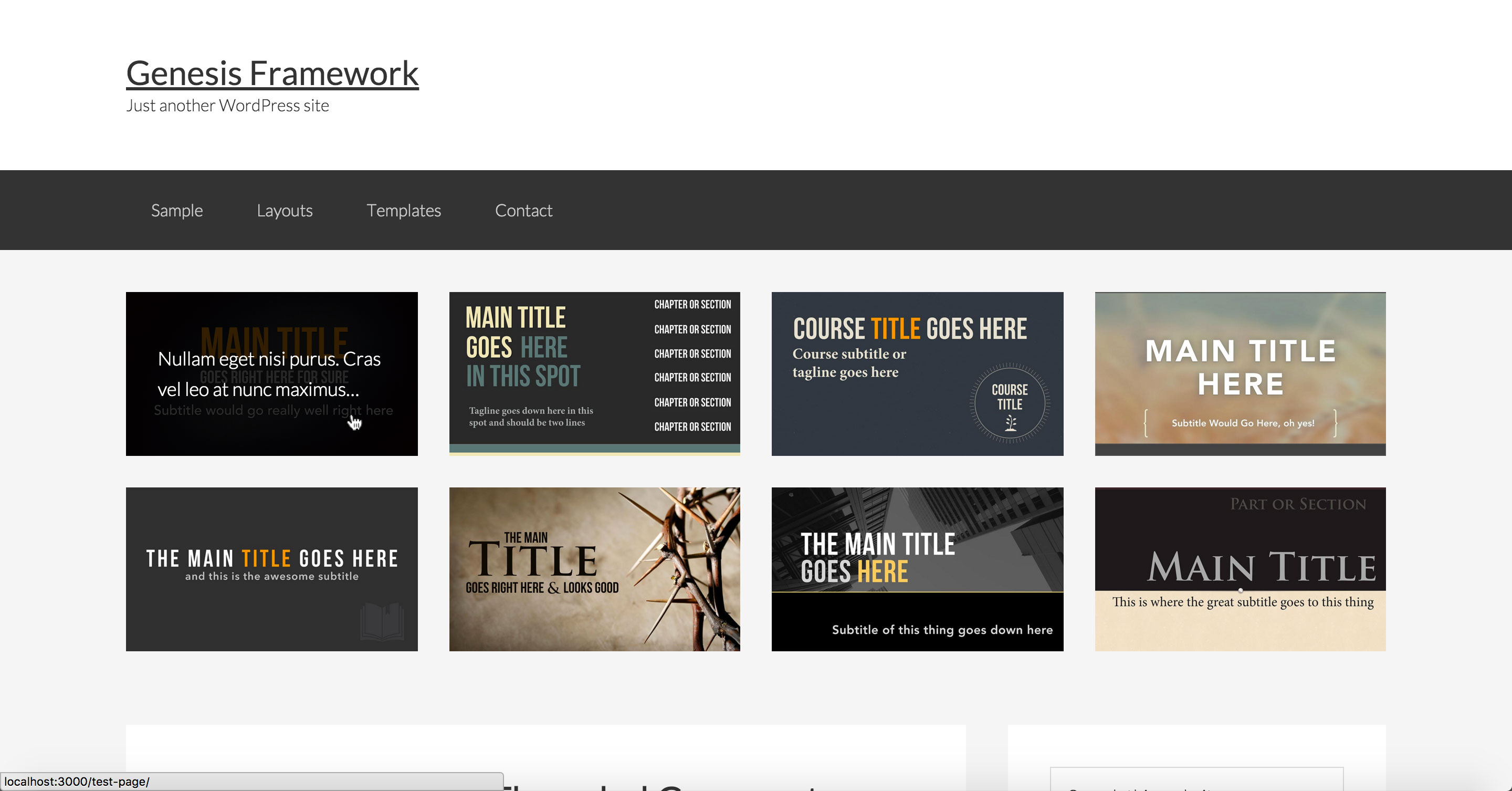
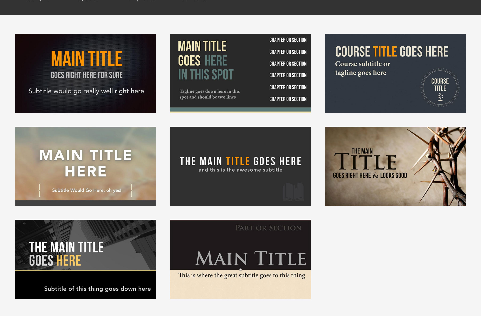
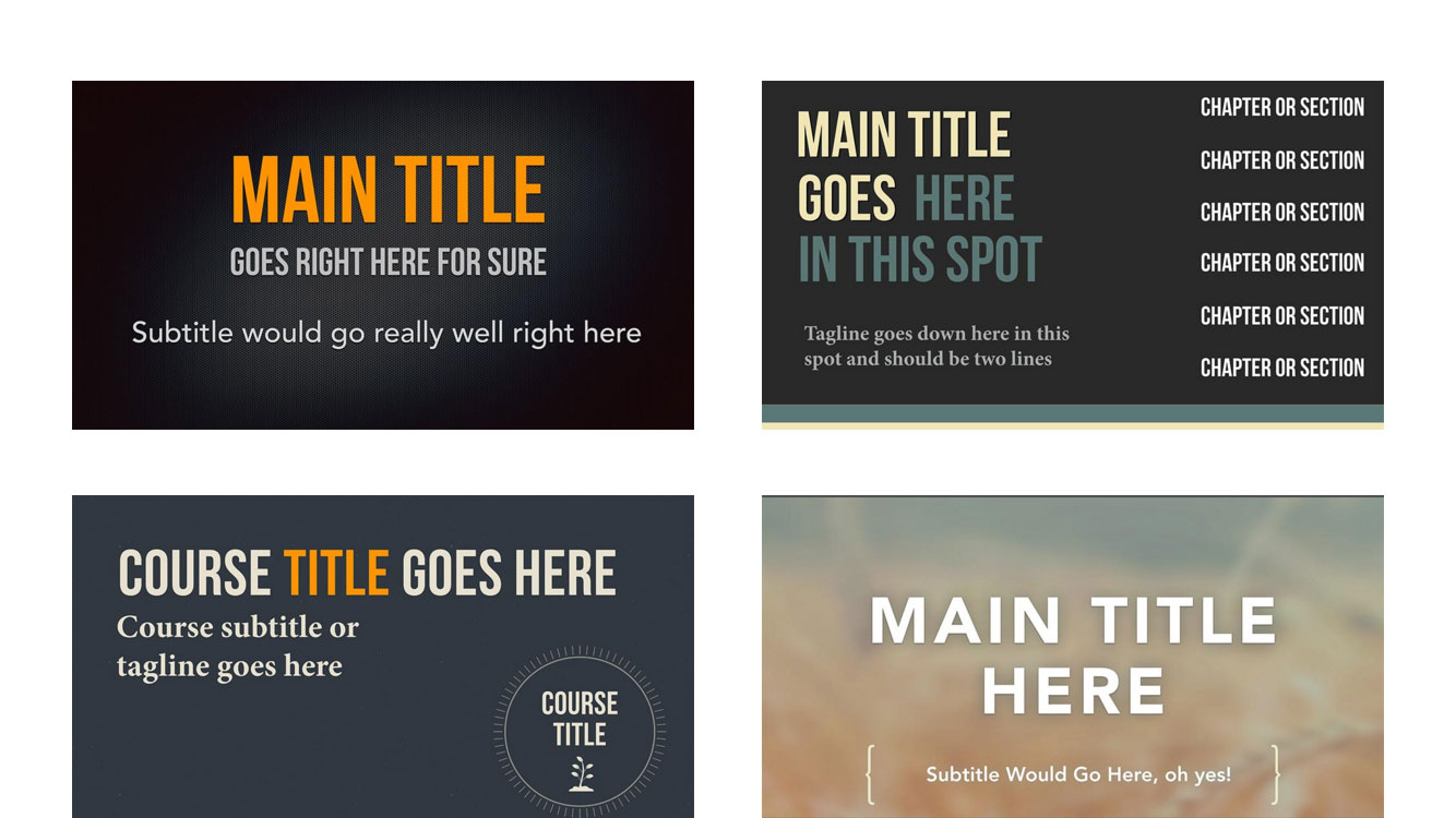
Sample screenshots:
Desktop:
when hovered:
iPad Landscape:
iPhone 6 Landscape:
iPhone 6 Portrait:
While the tutorial has been written for Genesis Sample child theme it should work with minor adjustments in any Genesis child theme.
Step 1
Add the following in child theme's functions.php:
SRIDHAR YOU ARE BRILLIANT!!!
Thanks, I am beyond excited and grateful for your help.
[…] https://sridharkatakam.com/displaying-grid-pages-images-custom-field-value-genesis-using-flexible-po… […]
Sridhar,
I have a follow up question on this tutorial. Is there a way to manually set the order how the images appear? I notice that now matter how I change the order of the ID’s in step 7 they always appear the same way, and of course I want to modify it.
Is there a way to manually order the images? Thanks!
Bodie
There’s a “Order” dropdown in that widget settings a little further below. The default option is Descending (by date). Have you checked the other options available in there?
I did see those options, but still didn’t see a manual way to say “put them in this exact order”, just things like date published, ID, etc. However, I was able to achieve the desired effect by separating the top row and the bottom row into two separate widgets, which worked great, responsive too!
I am now working on the excerpts. How do I get some more text to show up? I see this where you set the variable $limit, but I don’t see where you define what that value is.
function excerpt( $limit ) {
return wp_trim_words( get_the_excerpt(), $limit );
}
Where do I go to define $limit?
Thanks!
There is. It is the “Menu Order” setting. Edit your Pages and give them numbers (1 to 8) in the ‘Page Attributes’ meta box under the ‘Order’ field.
https://d.pr/i/1g3QY
Then in the widget, https://d.pr/i/cN7r.
https://gist.github.com/srikat/d7eab123643422db61f4#file-home-featured-php-L43
Exactly what I needed! Thanks!
Hello Sridhar,
I am getting the following error messages on this setup:
Notice: Undefined variable: before_widget in /Applications/MAMP/…/wp-content/themes/genesis-sample/home-featured.php on line 15
Notice: Undefined variable: flexible_posts in /Applications/MAMP/…/wp-content/themes/genesis-sample/home-featured.php on line 20
I did all set up according to instructions.
Thanks.
Dare
Hello,
Do you have Flexible Posts Widget plugin installed and activated?