In this article I show how Sidr can be used to display Primary Navigation menu items in the left side when a hamburger menu icon font link is clicked.
I am using Genesis Sample as the active theme in this example.
Here's the flow:
Primary navigation bar appears in its entirety at screen width of 1024px (configurable) and above.
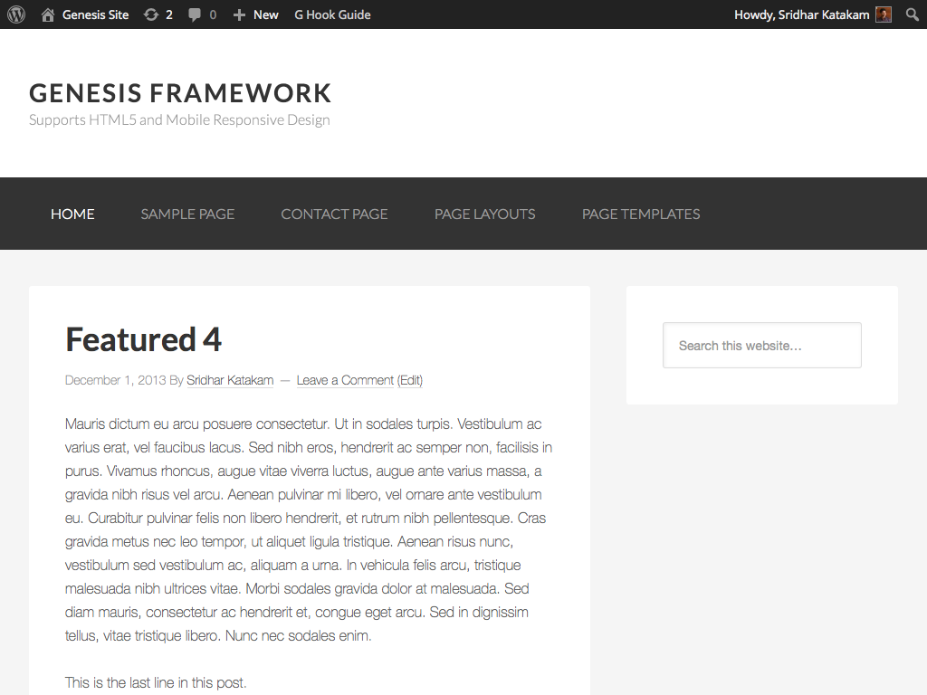
When screen width is 1023px and below, Primary navigation disappears and a hamburger menu icon appears in its place.
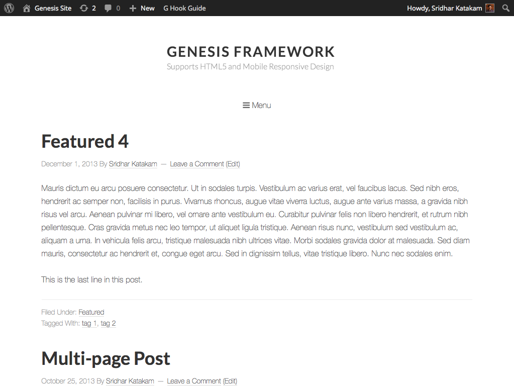
Clicking or tapping this hamburger menu icon will slide open a vertical section at the left side showing the Primary Navigation's menu items.
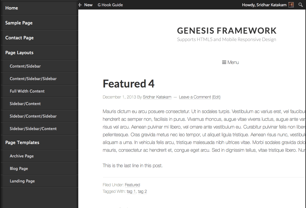
This vertical section can be toggled by clicking/tapping the Menu icon or swiping the screen in touch enabled devices.
This looks brilliant! Looking forward to trying it out. Thank you!
I’ve just updated the post with a important step that I missed earlier and a small demo video.
The return of the side menu to web design is proof that web is old enough that design styles are cycling just like fashion. As a former costume designer, I can appreciate how the side menu is making its come back in a very stylish way. Your post on making it responsive is integral part of how to make this classic 2014 modern.
Thanks for posting this, Sridhar.
Initially, I was trying to implement this on the 16/9 theme. Actually what I was really doing was splicing the side nav from 16/9 into my custom genesis-sample theme then trying to get the sidr to work on that.
Doing it the way you have it here seems much more simple, but essentially, but I’m running into a couple of challenges.
What I’m trying to accomplish is more similar to what Medium does with its sidenav. I want my site header info and nav to be exclusively tucked in my side menu for all breakpoints. I’m trying to make my site clear of all global page elements except for the hamburger menu.
Any thoughts about my best approach might be? Seems like I’m barely overlooking the solution.
Possible. We can group the entire header area elements into a custom div and make this div appear in the left side menu and hide this div + show the hamburger icon at all widths. Actually grouping may not be needed since we can specify multiple elements’ IDs or classes to be tucked into the side menu.
You said you are using Sample child theme, right? Got a URL of your site?
Working locally right now. after i saw what you did in this post i bailed on my sample/16-9 approach in favor of your method. right now i’m basically working with the same code scenario that you have outlined here.
and, yes I’m using the sample theme. 🙂
So, I accomplished pulling in my header content into the side menu using “.site-header” as the content source. And I tweaked the responsive css to keep the hamburger icon active. What’s stumping me now is how to remove the header or the header elements from the main view without also removing them from the side menu. If I use a remove action it removes from both the header and the side menu. if I remove via css it works but it doesn’t seem like that’s the right way.
What do you think, Sridhar?
Sridhar, Many Thanks for the tip on loading the FontAwesome from the Bootstrap CDN. Previously I was using this icon font by downloading all the FontAwesome files and storing them on my site. Now it is looking much slimmer.
Just a quick question. If I want to use this example for the “genesis_header_right” area in Genesis how much of the code do I need to change?
[…] http://www.sridharkatakam.com/adding-responsive-side-menu-genesis/ […]
Hello Sir,
I followed all the above guidance to get the mobile responsive navigation menu on my site called http://www.magnus7.com but I am not able to achieve the same result on my site. Please help me on this!
Thank you!
Do you want to apply this on Header menu or Secondary nav menu?
I wanted to apply this on custom menu.
Hi Sridhar,
I’m wondering if you’d be interested in creating a similar tut using snap.js applied to the sixteen-nine theme’s existing side-header. Sidr seems to be a bit bulkier and doesn’t inherit genesis styles. Snap.js appears to be built more efficient in this regards.
It seems like the trick to getting it to work lies with z-indexes. but the precise implementation is eluding me.
what do you think?
https://github.com/jakiestfu/Snap.js/
I shall look into it when my time permits. Are you aware of Menufication?
I’ve been working with this on a dev site for a few weeks and just realized that the touchwipe js messes up the normal menu interaction on an iPad if you’re in landscape mode (so not using the Sidr menu, still on the normal menu). Made my nav unusable. I was able to resolve this by adding conditionals for window.innerWidth into the jquery.touchwipe.min.init.js file and everything seems to be running smoothly now–just something to be aware of, and maybe revise the init.
Good suggestion Robin, I noticed the same thing on the ipad in landscape mode, you saved me a lot of time with your fix.
Thanks for that.
Thanks Robin, this was helpful for me as well.
Hi,
Can you help me modify it on Genesis, What i mean is that when i view it on mobile the Menu need to slide right or left. However i would like to do it as onClick.
Is that possible?
Please let me know thank you…
[…] Reponsive cho nav sang bên tay trái trang http://www.sridharkatakam.com/adding-responsive-side-menu-genesis/ […]
Hi Sridhar,
Is there a way to just move the logo and nav into the left side without having the hamburger nav under the header?
Thanks,
Mark
This was EXACTLY what I wanted – awesome, thank you so much for this tut for Genesis! I incorporated it onto a ZigZag Press theme, and styled it for my needs. Another reason to love Genesis!!
i am using above instruction but for secondary nav in metro pro skin.
how do i wrap .nav-secondary in a div?
i am using above instruction but for secondary nav in metro pro skin.
how do i wrap .nav-secondary in a div?
i am subscribing to this comment hence the duplicate comment.
Possible to hide child level items until the parent item is clicked?
[…] Related: Adding a responsive side menu in Genesis […]
For some reason, I am getting an error in my console of “Uncaught TypeError: undefined is not a fucntion” which appears to be stemming the jquery.touchwipe.min.init.js file. A litte more detail states the following:
(anonymous function)

j

k.fireWith

m.extend.ready

J
What does this mean?
Hi Sridhar,
I’ve have setup the Side-Menu on this site and it works fine, I think!
I use Font Awesome icons in the Primary-Navigation on this site, but I cannot figure out how to get Font Awesome to show up in the Side-Menu?
Thank you for all of your posts, I learn a lot from your blog;-)
Hi Sridhar,
I have the same problem as the reply above, the search icon won’t show up in the Side menu.
I hope you can solve this out for me.
Can you provide the URL of your site?
Do you want to display a Font Awesome search icon below the Primary Nav in the side menu or display it to the left of a menu item in the side menu?
My site is on a local server at this moment, i want it below the prim.nav in the side menu. The submit button shows up without the icon.
See if this helps: https://sridharkatakam.com/responsive-side-menu-search-form-genesis-using-font-awesome-sidr-genesis/
[…] the comments section of Adding a responsive side menu in Genesis using Sidr a user wanted to know how a search form can be shown in the side menu with the Submit button […]
Don’t work for me in Altitude Pro. Don’t get that the original hamburguer icon disappear, and this menu replace my header.
Can you test?
Thanks.
Hi Sridhar
Thanks for the great tut! I am currently implementing it for Altitude pro. Noticed something in the php code
add_action( ‘genesis_after_header’, ‘sk_add_opening_div’, 9 );
function sk_add_opening_div() {
echo ”;
}
I think it should be genesis_before_header?
Amanda