The recent iThemes Builder themes like Reddinger come with a nice mobile responsive menu built in. We can use the code in such themes in other Builder themes that do not have the mobile menu.
In this article I will list the steps to use Reddinger’s mobile menu in Avail’s child theme.
Desktop view:

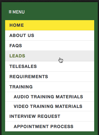
Mobile view:

When tapped:
Step 1
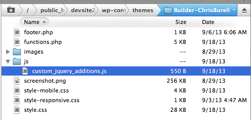
Upload Reddinger’s js directory to under active theme’s directory.
Step 2
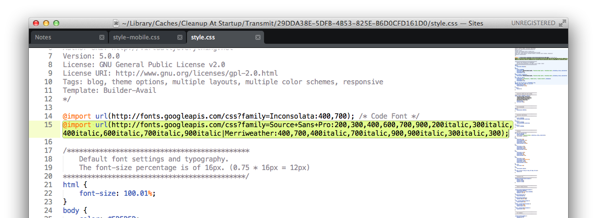
Add this near the top of style.css:
| @import url(http://fonts.googleapis.com/css?family=Source+Sans+Pro:200,300,400,600,700,900,200italic,300italic,400italic,600italic,700italic,900italic|Merriweather:400,700,400italic,700italic,900,900italic,300italic,300); |
and the following at the end:
| /********************************************* | |
| Mobile Navigation Menu | |
| *********************************************/ | |
| .it-mobile-menu { | |
| display: none; | |
| } |
Step 3
Add the following in child theme’s functions.php:
| // Enqueuing and Using Custom Javascript/jQuery | |
| function custom_load_custom_scripts() { | |
| if ( file_exists( get_stylesheet_directory() . '/js/custom_jquery_additions.js' ) ) | |
| $url = get_stylesheet_directory_uri() . '/js/custom_jquery_additions.js'; | |
| else if ( file_exists( get_template_directory() . '/js/custom_jquery_additions.js' ) ) | |
| $url = get_template_directory_uri() . '/js/custom_jquery_additions.js'; | |
| if ( ! empty( $url ) ) | |
| wp_enqueue_script( 'custom_jquery_additions', $url, array('jquery'), false, true ); | |
| } | |
| add_action( 'wp_enqueue_scripts', 'custom_load_custom_scripts' ); |
Step 4
Add the following at the end of child theme’s style-mobile.css:
| /********************************************* | |
| Navigation Module (Mobile/Responsive) | |
| *********************************************/ | |
| .builder-module-navigation.mobile { | |
| } | |
| .builder-module-navigation.mobile .builder-module-navigation-menu-wrapper { | |
| display: inherit; | |
| margin: 0; | |
| } | |
| .builder-module-navigation.mobile ul { | |
| margin-top: .5em; | |
| background: #FFFFFF; | |
| } | |
| .builder-module-navigation.mobile li { | |
| width: 100%; | |
| position: relative; | |
| } | |
| /* second level stuff */ | |
| .builder-module-navigation.mobile li ul { | |
| position: relative !important; | |
| left: 0 !important; | |
| border: 0; | |
| width: 100%; | |
| margin: 0; | |
| } | |
| .builder-module-navigation.mobile li a, | |
| .builder-module-navigation.mobile .current_page_item li a, | |
| .builder-module-navigation.mobile .current-cat li a, | |
| .builder-module-navigation.mobile .current-menu-item li a { | |
| margin: 0; | |
| background: transparent; | |
| border-color: transparent; | |
| color: #3B3F42; | |
| border-bottom: 1px solid rgba(0,0,0,0.1); | |
| } | |
| .builder-module-navigation.mobile li a:hover, | |
| .builder-module-navigation.mobile .current_page_item li a:hover, | |
| .builder-module-navigation.mobile .current-cat li a li a:hover, | |
| .builder-module-navigation.mobile .current-menu-item li a:hover { | |
| background: #423737; | |
| color: #ECECEC; | |
| } | |
| .builder-module-navigation.mobile li li { | |
| border: 0; | |
| width: 100%; | |
| } | |
| .builder-module-navigation.mobile li ul ul { | |
| margin: 0; | |
| } | |
| .builder-module-navigation.mobile li li a { | |
| padding: .25em 0 .25em 2em; | |
| line-height: inherit; | |
| } | |
| .builder-module-navigation.mobile li li li a { | |
| padding-left: 4em; | |
| } | |
| .builder-module-navigation .menu.it-mobile-menu-hidden { | |
| display: none; | |
| } | |
| .it-mobile-menu { | |
| font-family: 'Source Sans Pro', 'Playfair Display', 'Helvetica Neue', Helvetica, Arial, sans-serif; | |
| text-transform: uppercase; | |
| color: #3B3F42; | |
| padding: .25em .75em; | |
| display: block; | |
| cursor: pointer; | |
| -webkit-font-smoothing: antialiased; | |
| } |
At this time you should have a working responsive mobile menu working in your current theme. Open the site in Firefox and bring up Responsive Design View by pressing Cmd + Alt + M. Select 320×480 from the presets or manually just reduce the width of window to any value lesser than 500px to see the mobile responsive menu kick in.
Step 5
Now all that’s left is to add additional styling so the mobile menu looks like your nav bar at desktop widths.
Example:
| .builder-module-navigation-background-wrapper { | |
| padding-top: 0.75em; | |
| } | |
| .builder-module-navigation.mobile .current_page_item a, | |
| .builder-module-navigation.mobile .current-cat a, | |
| .builder-module-navigation.mobile .current-menu-item a { | |
| background: #fbef05; | |
| } | |
| .builder-module-navigation.mobile li a:hover, | |
| .builder-module-navigation.mobile .current_page_item li a:hover, | |
| .builder-module-navigation.mobile .current-cat li a li a:hover, | |
| .builder-module-navigation.mobile .current-menu-item li a:hover { | |
| background: #ECECEC; | |
| color: #5B7E39; | |
| } | |
| .builder-module-navigation li li { | |
| background: transparent; | |
| } |
to change the look of mobile menu per the screenshot at the top of this post.
That’s it!
Bonus
If you would like the mobile menu to kick in at a higher width, say 800px,
1) Edit js/custom_jquery_additions.js and change 500 to 800 in
if(window.innerWidth > 800) {
2) Move the code added in style-mobile.css to style.css in between
@media only screen and (max-width: 800px) {and
}Screenshot:

Thank you so much for this tutorial, Sridhar. You are my hero!
Thanks Sridhar, this tip worked great with iThemes Builder Noise theme too.
Really helpful thank you Sridhar
Sridhar, is there anyway to apply this tutorial to a menu created in an HTML Module? it works perfectly for menus in the Navigation Block but nowhere else.