A user in StudioPress forums asked,
I’ve seen several sites (GameSpot, and this WP demo theme) include a menu that includes a logo/image in the top left corner that links to the homepage. Both of those sites I mentioned have the menu appear only after a visitor scrolls down a ways; I have seen several tutorials online about how to do that. But does anyone know how to create a menu that also includes an image like these ones do?
In this article I explain how a fixed/floating/sticky navigation can be made to fade in as we scroll down and fade out when we go back to top of the page.
First, a video demo:
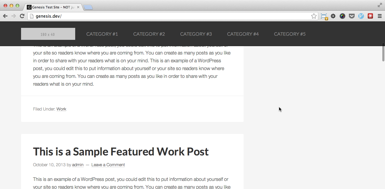
Screenshot:
Create the floating menu
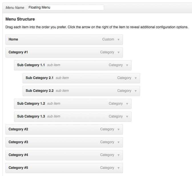
Go to Appearance > Menus in WP dashboard and create a custom WordPress menu which you would like to appear in the sticky nav bar.
Notice that the first menu item is a link to site's homepage. We are going to later set the logo image as this item's background using CSS.
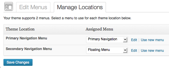
Go to Manage Locations tab and assign this menu to Secondary Navigation Menu location.

Add jQuery to fade in and fade out the Secondary nav bar
Create a file named, say sticky-nav.js having the following code and upload it to js directory under the child theme.
To view the full content, please sign up for the membership.
Already a member? Log in below or here.


Thank you for this. Your tutorials are both extremely useful and well done. Keep them coming!
I found many useful articles on your sites! Thanks so much for this..
For this tutorial, for my site it doesn’t work however to try edit the condition on script as your guide.
I used eleven40Pro theme, the secondary menu disappeared when i scrolled, not appeared like your demo.
I do not know why for this case…
My matter has been fixed! But the sub menu is not appeared! I do not know why….
I have adjusted the CSS to fix this.
Dear Sridhar,
Thanks for your truly supports!
Not working with Copyblogger 2 theme by Wpstuffs. Please provide any solution.
I just tested in Copyblogger 2 and it works fine with a couple of CSS line additions.
You would need to add “max-width: none;” and “margin: 0;” to “.nav-secondary” selector in my above article’s CSS.
https://www.diigo.com/item/image/bcy/ob5u
[…] This can be done by extending my earlier post titled, Displaying a fixed navigation menu upon scrolling down in Genesis. […]
Hello Sridhar. These are really great tutorials! I am wondering if it is possible to modify the Agency theme to behave similar to the Happy Cog website by flipping the primary nav below the “Welcome” area. I like the way Happy Cog displays the welcome/intro first and then hides the intro but leaves the navigation at the top of the screen. I also appreciate the speed of the navigation. Thanks for your comments.
so you do not want to use a Custom Menu widget in the Header Right and instead have the Primary Nav appearing below Welcome Area which when scrolled down, should stay fixed?
Yes, that sounds about right. If you take a look at this site: http://happycog.com/, there appears a rather large orange area at the top. Just below that is the Primary Nav. When the nav items are clicked, the orange area disappears and the Primary Nav moves to the top of the screen and sticks there.That is basically what I want to do, but with Agency Pro. Is that possible?
I also like the speed at which it scrolls. Is that done through a script? Thanks again. Sorry, I don’t have the website up just yet.
Perhaps I should mention that I do not plan to use the background image as in Agency Pro. I intend to use a different background color for each section, each one spanning the width of the screen. So the “Welcome to our Agency” area will not be transparent.
this is really fantastic, but i’m having two slight problems. here’s the url: http://rblarchitects.com/newsite/
issue #1: when i hover over the logo in the secondary menu, a white border appears on the bottom. this is the proper function for the other button, but i don’t want it to do it with the logo.
issue#2: how to i move the other navigation buttons to the right but keep the logo to the left?
your help is so greatly appreciated!!!
Add this CSS and adjust if necessary: http://pastebin.com/raw.php?i=ri7bGTVJ
so the nag spacing worked but the border under the logo now is a border under the whole header. i had tried this solution earlier and it didn’t work. any other ideas?
thanks!
nevermind! i just fixed it. works great. thank you!!!!
hello again! i’m having another small issue with this and was wondering if you wouldn’t mind helping me solve it. overall it works great, however there is one circumstance when i scroll to the top and the secondary nav menu doesn’t fade out. i’m assuming there’s a cross plugin issue but not sure. if you go to rblarchitects.com/newsite and click on “portfolio” and then open one of the portfolio projects (a lightbox of images will appear), then close that and hit the logo to go to the top- you will see that the secondary nav stays in place. any ideas??
thanks 🙂
Looks like something to do with that lightbox plugin. I am not sure how to fix this.
ok. thanks for looking.
i wrote to the created of the lightbox plugin. this was his response:
the function which sorts the header out runs on window load so any new elements added or crated after the page loads are not going to be accounted for, so that function cant work anymore
i’ve implemented a work around using z-index but it’s not as nice as your effect. do you know if this can be remedied?
Hi, Have been waiting you could assist me to do similar navigation (header) like http://briangardner.com/
I’m using parallax. Hopefully there’s a tutorial for this header as kinda new from normal fixed header.
sorry, its not working on my site plz check
thanks again for the great tutorial. Everything worked perfectly as you described, however I cant get my secondary navigation to show. It only appears after scrolling, unlike the video example where it’s visible before you scroll.
You can check it out here: http://www.nanterre.nl/bouwbedrijf/
Any ideas on how to fix it?
Thanks
Nice Tutorial, yeah it help me a lot to fixed my nav-bar while scrolling. Thank you Sridhar
Hi, great tutorials.
Could you please help out wth creating a Magazine Pro and an Eleven40 Pro style fixed menu using Dynamik Builder?
I’ve been able to make it fixed but it looks a mess in responsive mode.
I’ll be very happy to make a donation to the site for your time too, this website is invaluable!
How to keep nav menu appear while scrolling down, like this menu http://tailor-made.yoastdemo.com/
Fantastic tutorial! Thanks Sridhar. Worked like a charm.
Hi, Sridhar. I’ve successfully implemented your code, but I can’t get child elements to appear in the drop-down flyouts. I’m using a custom menu, in the “header right” widget. Any suggestions? Thanks!
Firstly: Great tutorial! BUT…my theme (uses twenty-twelve as a base) only supports 1 menu. What can I do to get the scrolling navbar? 🙁
Works like a charm.
But how do put a bigger logo in the menu, for retina screens?
Hi,
Thanks
How to do header like in http://briangardner.com? I’m using Parallax. The header have transparent background and then when scroll it change. Thanks again.
broken in metro pro
Alright, my apologies its not broken, although.
When you use this script with the 100% width header/menu it isn’t working.
You should add this script first, and then make the menu/header 100% wide.
Only two things that still bothers me, how do I move the primary menu above the header, so where the secondary menu used to be?
And is there a way to show a retina image for media screen in the floating menu?
Albert,
url: http://albertabroad.com/versie3/
Changing add_action( ‘genesis_before’, ‘genesis_do_nav’, 1 ); is solving the problem
Only the retina image is a pain.
Tried this out and couldn’t get it to work. How would I get it to work if I am using Dynamik? When I added the code to functions.php my site wouldn’t load. Any help would be much appreciated!
Hi there
How would you implement this using the WP Nav Plus Plugin?
I would like to show a different icon on the secondary menu.
Thanks
James
See if this helps: https://sridharkatakam.com/split-menu-on-scroll-in-genesis/