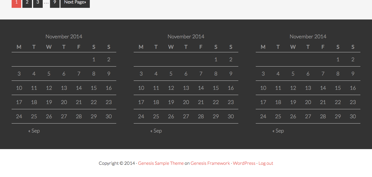
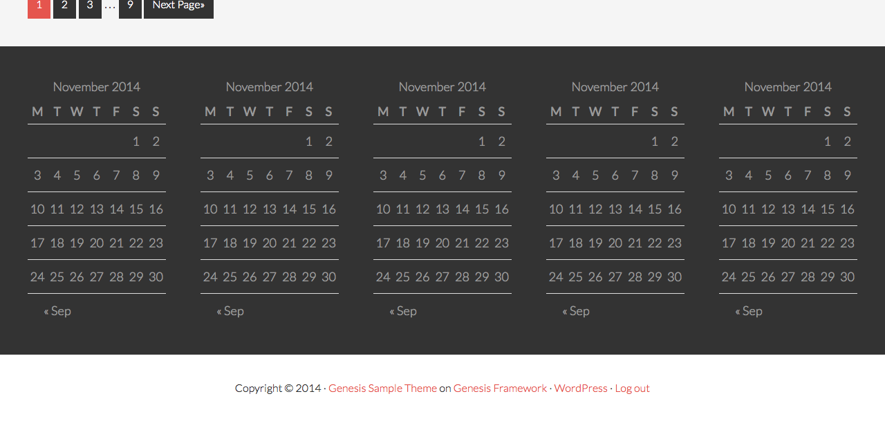
Genesis has built-in support for footer widgets (appearing above the footer) that can be enabled by adding the following in child theme’s functions.php:
| //* Add support for 3-column footer widgets | |
| add_theme_support( 'genesis-footer-widgets', 3 ); |
The second parameter in the above can be changed to reflect the number of footer widgets you would like to use.
In this article I would like to share sample CSS to display the footer widgets in columns. Responsive behavior taken care of. Though the code has been written for Genesis Sample child theme it should still work in other Genesis themes since the widths and right margin values are provided in percentages.
You can change these values depending on the wrap’s width and your desired space or gap between the columns.
Here’s a handy formula:
Width of each column in px = (wrap_width – ((no_of_columns – 1) × gap)) / no_of_columns
Width of each column in % = (Width of each column in px / wrap_width) * 100
Right margin in % = (gap / wrap_width) * 100
2-column Footer Widgets
| /* 2-column Footer Widgets | |
| --------------------------------------------- */ | |
| .footer-widgets-1, | |
| .footer-widgets-2 { | |
| width: 47.5%; /* 570px / 1200px */ | |
| float: left; | |
| } | |
| .footer-widgets-1 { | |
| margin-right: 5%; /* 60px / 1200px */ | |
| } | |
| @media only screen and (max-width: 768px) { | |
| .footer-widgets-1, | |
| .footer-widgets-2 { | |
| width: 100%; | |
| } | |
| .footer-widgets-1 { | |
| margin-right: 0; | |
| } | |
| } |
3-column Footer Widgets
| /* 3-column Footer Widgets | |
| --------------------------------------------- */ | |
| .footer-widgets-1, | |
| .footer-widgets-2, | |
| .footer-widgets-3 { | |
| width: 30%; /* 360px / 1200px */ | |
| float: left; | |
| } | |
| .footer-widgets-1, | |
| .footer-widgets-2 { | |
| margin-right: 5%; /* 60px / 1200px */ | |
| } | |
| @media only screen and (max-width: 768px) { | |
| .footer-widgets-1, | |
| .footer-widgets-2, | |
| .footer-widgets-3 { | |
| width: 100%; | |
| } | |
| .footer-widgets-1, | |
| .footer-widgets-2 { | |
| margin-right: 0; | |
| } | |
| } |
4-column Footer Widgets
| /* 4-column Footer Widgets | |
| --------------------------------------------- */ | |
| .footer-widgets-1, | |
| .footer-widgets-2, | |
| .footer-widgets-3, | |
| .footer-widgets-4 { | |
| width: 22%; /* 264px / 1200px */ | |
| float: left; | |
| } | |
| .footer-widgets-1, | |
| .footer-widgets-2, | |
| .footer-widgets-3 { | |
| margin-right: 4%; /* 48px / 1200px */ | |
| } | |
| @media only screen and (max-width: 1024px) { | |
| .footer-widgets-1, | |
| .footer-widgets-2, | |
| .footer-widgets-3, | |
| .footer-widgets-4 { | |
| width: 47.5%; /* 456px / 960px */ | |
| } | |
| .footer-widgets-1, | |
| .footer-widgets-3 { | |
| margin-right: 5%; /* 48px / 960px */ | |
| } | |
| .footer-widgets-2, | |
| .footer-widgets-4 { | |
| margin-right: 0; | |
| } | |
| } | |
| @media only screen and (max-width: 568px) { | |
| .footer-widgets-1, | |
| .footer-widgets-2, | |
| .footer-widgets-3, | |
| .footer-widgets-4 { | |
| width: 100%; | |
| } | |
| .footer-widgets-1, | |
| .footer-widgets-2, | |
| .footer-widgets-3 { | |
| margin-right: 0; | |
| } | |
| } |
5-column Footer Widgets
| /* 5-column Footer Widgets | |
| --------------------------------------------- */ | |
| .footer-widgets-1, | |
| .footer-widgets-2, | |
| .footer-widgets-3, | |
| .footer-widgets-4, | |
| .footer-widgets-5 { | |
| width: 16.6666666667%; /* 200px / 1200px */ | |
| float: left; | |
| } | |
| .footer-widgets-1, | |
| .footer-widgets-2, | |
| .footer-widgets-3, | |
| .footer-widgets-4 { | |
| margin-right: 4.1666666667%; /* 50px / 1200px */ | |
| } | |
| @media only screen and (max-width: 1024px) { | |
| .footer-widgets-1, | |
| .footer-widgets-2, | |
| .footer-widgets-3, | |
| .footer-widgets-4, | |
| .footer-widgets-5 { | |
| width: 47.7083333333%; /* 458px / 960px */ | |
| } | |
| .footer-widgets-1, | |
| .footer-widgets-3 { | |
| margin-right: 4.5833333333%; /* 44px / 960px */ | |
| } | |
| .footer-widgets-2, | |
| .footer-widgets-4 { | |
| margin-right: 0; | |
| } | |
| } | |
| @media only screen and (max-width: 568px) { | |
| .footer-widgets-1, | |
| .footer-widgets-2, | |
| .footer-widgets-3, | |
| .footer-widgets-4, | |
| .footer-widgets-5 { | |
| width: 100%; | |
| } | |
| .footer-widgets-1, | |
| .footer-widgets-3 { | |
| margin-right: 0; | |
| } | |
| } |


Hello Sridhar, in the past I have just used the CSS from the columns bit in Genesis style.css. Is there a reason NOT to do this? Anything special with the footer or maybe how they display on mobile?
I think all child themes come with the CSS for 3-column footer widgets. I have not looked closely in other child themes but at least the one in Genesis Sample child theme could be improved.
With the built-in CSS: http://cl.ly/image/261826150T16
With the CSS I shared above: http://cl.ly/image/3y2s11180E1V
I have used this in my site, but I am trying to vertical align the second widget area to the bottom of the first widget area, but to no success, how would i do this?
facing the same problem