Latest update: Follow https://sridharkatakam.com/inline-logo-in-genesis/ instead.
Updated on October 18, 2015.
The standard method for displaying logos in Genesis is by adding theme support for custom header like this:
| //* Add support for custom header | |
| add_theme_support( 'custom-header', array( | |
| 'width' => 260, | |
| 'height' => 100, | |
| 'header-selector' => '.site-title a', | |
| 'header-text' => false | |
| ) ); |
(code from Executive Pro’s functions.php)
What if you want to display the logo as a normal HTML image element instead?
In this article I show how genesis_seo_title filter can be used to display an inline image logo in Genesis.
I read about this method first here and then here.
The main benefit is that there’s less headache which directly contributes to increased number of hairs left on your skull when you want the logo to look good (in full and not cut off) in various devices like tablets and mobiles.
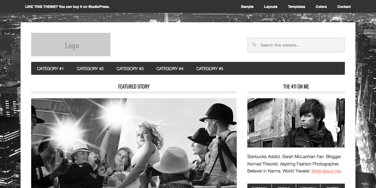
Screenshot of sample output after following this tutorial:
Step 1
Upload your logo image to child theme’s images directory.
Step 2
Add the following in active (child) theme’s functions.php:
| /********************************** | |
| * | |
| * Replace Header Site Title with Inline Logo | |
| * | |
| * @author AlphaBlossom / Tony Eppright | |
| * @link http://www.alphablossom.com/a-better-wordpress-genesis-responsive-logo-header/ | |
| * | |
| * @edited by Sridhar Katakam | |
| * @link https://sridharkatakam.com/use-inline-logo-instead-background-image-genesis/ | |
| * | |
| ************************************/ | |
| add_filter( 'genesis_seo_title', 'custom_header_inline_logo', 10, 3 ); | |
| function custom_header_inline_logo( $title, $inside, $wrap ) { | |
| $logo = '<img src="' . get_stylesheet_directory_uri() . '/images/logo.png" alt="' . esc_attr( get_bloginfo( 'name' ) ) . ' Homepage" width="200" height="100" />'; | |
| $inside = sprintf( '<a href="%s">%s<span class="screen-reader-text">%s</span></a>', trailingslashit( home_url() ), $logo, get_bloginfo( 'name' ) ); | |
| // Determine which wrapping tags to use | |
| $wrap = genesis_is_root_page() && 'title' === genesis_get_seo_option( 'home_h1_on' ) ? 'h1' : 'p'; | |
| // A little fallback, in case an SEO plugin is active | |
| $wrap = genesis_is_root_page() && ! genesis_get_seo_option( 'home_h1_on' ) ? 'h1' : $wrap; | |
| // And finally, $wrap in h1 if HTML5 & semantic headings enabled | |
| $wrap = genesis_html5() && genesis_get_seo_option( 'semantic_headings' ) ? 'h1' : $wrap; | |
| return sprintf( '<%1$s %2$s>%3$s</%1$s>', $wrap, genesis_attr( 'site-title' ), $inside ); | |
| } |
Replace logo.png with the name of your logo image.
Change the width and height values to match that of your logo. For screens with high resolutions like MacBooks, you may want to use image that is 2x sized. Ex.: logo.png is 500px x 160px but in the code we specify 250 and 80.
The above is a modified version of Tony Eppright’s code.
If your child theme’s style.css does not have CSS defined for screen-reader-text, add the following in it:
| /* ## Screen Reader Text | |
| --------------------------------------------- */ | |
| .screen-reader-text, | |
| .screen-reader-text span { | |
| position: absolute !important; | |
| clip: rect(0, 0, 0, 0); | |
| height: 1px; | |
| width: 1px; | |
| border: 0; | |
| overflow: hidden; | |
| } | |
| .screen-reader-text:focus { | |
| clip: auto !important; | |
| height: auto; | |
| width: auto; | |
| display: block; | |
| font-size: 1em; | |
| font-weight: bold; | |
| padding: 15px 23px 14px; | |
| color: #333; | |
| background: #fff; | |
| z-index: 100000; /* Above WP toolbar. */ | |
| text-decoration: none; | |
| box-shadow: 0 0 2px 2px rgba(0,0,0,.6); | |
| } |
Step 3
If you do not wish the tagline (Site Description) to appear, add this in style.css file:
| .site-description { | |
| text-indent: -9999px; | |
| height: 0; | |
| } |
Step 4
Depending on your active theme you may have to adjust styling. I am providing the needed CSS in a few themes here. The code below goes in the corresponding child theme’s style.css.
Genesis Sample
| .header-image .site-title > a { | |
| background: transparent; | |
| } | |
| .header-image .site-title { | |
| text-indent: 0; | |
| } | |
| .site-title img { | |
| vertical-align: top; | |
| } | |
| .title-area { | |
| padding: 0; | |
| } |
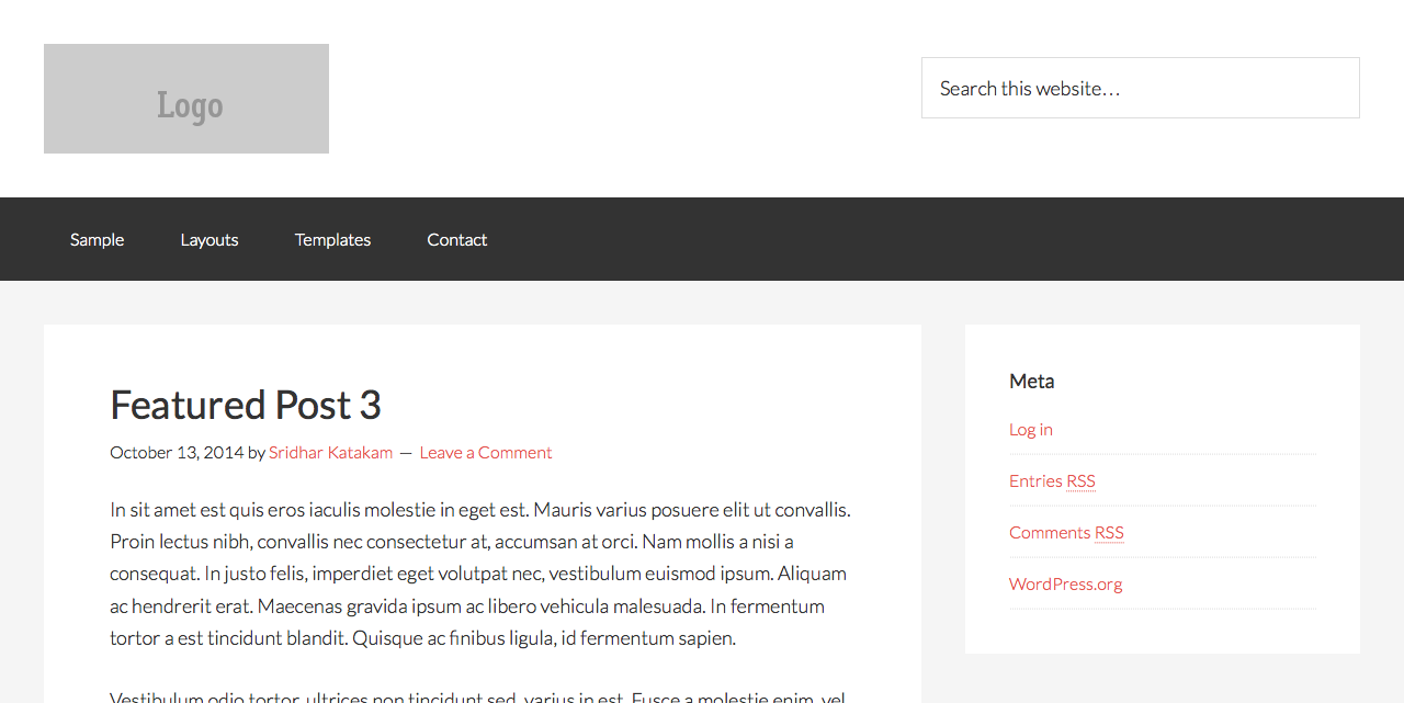
Dimensions of logo image used in the example: 260 x 100.
Executive Pro
| .title-area { | |
| padding-top: 10px; | |
| } | |
| .site-title { | |
| margin-bottom: 0; | |
| } | |
| .site-title a, .site-title a:hover { | |
| padding-top: 0; | |
| } | |
| a img { | |
| margin-bottom: 0; | |
| } | |
| .site-title a img { | |
| vertical-align: top; | |
| } |
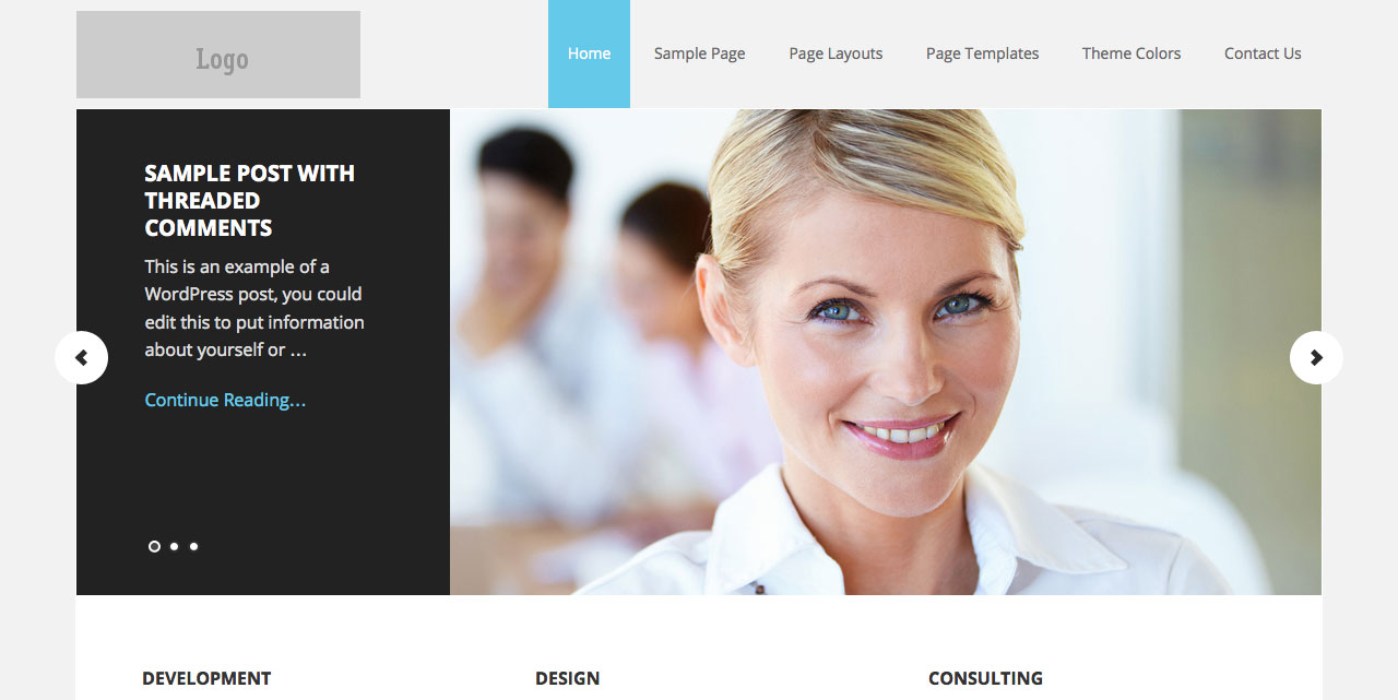
Dimensions of logo image used in the example: 260 x 80.
Parallax Pro
| .site-title img { | |
| vertical-align: top; | |
| } |
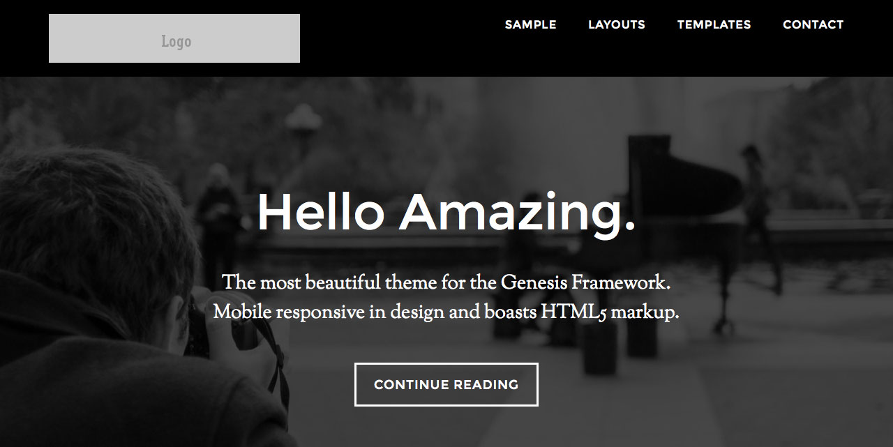
Dimensions of logo image used in the example: 360 x 70.
Magazine Pro
| .site-title img { | |
| vertical-align: top; | |
| } | |
| .title-area { | |
| padding-top: 0; | |
| } |
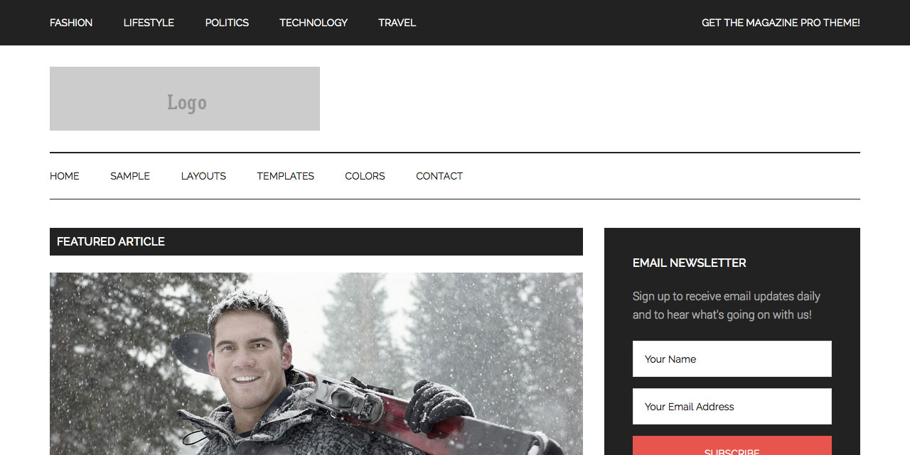
Dimensions of logo image used in the example: 380 x 90.
Metro Pro
| .site-title a, .site-title a:hover { | |
| padding: 0; | |
| } | |
| .site-title img { | |
| vertical-align: top; | |
| } |
Dimensions of logo image used in the example: 270 x 80.
Agency Pro
| a img { | |
| margin-bottom: 0; | |
| } | |
| .site-title a img { | |
| vertical-align: top; | |
| } |
Dimensions of logo image used in the example: 300 x 60.


Hi
I tried to implement this but for some reason, I’m getting a broken link on inside pages, no logo on home page – wondering if I’m missing a step? Prior to you writing this, I had made a lot of changes to the css to try to get things working properly – I can’t see why the link would be broken – any ideas? Thank you as always for your wonderful work! B
Can you provide the URL of site in question?
Ok – I’ve got the image showing up, but the menu items aren’t working… Sorry for the bother, but if you have any suggestions, please let me know… Thank you!
Thank you! mahopacdaycare.com
I am looking at your site in Firefox and the nav menu items are working fine.
In which browser is the problem occurring?
I’M IN chrome – It worked before I put the code in… the navigation works while on the home page – but not on other pages
Try adding this in style.css:
.site-container {
padding-top: 122px;
}
Please note that the code that I provided in my tutorial is meant for child themes out of the box, yours has custom changes for the header/nav area which need additional tweaking such as the above CSS.
While my above CSS suggestion will fix the problem of links not being clickable, when users scroll down the logo will appear behind the sticky secondary nav. Solving that involves digging in.
Just wanted to update you on my issue.
Prior to adding the code, I implemented another of your tutorials for the sticky header – I assume that is where the issue occurred. The css code you gave me did not fix the navigation issue, so I decided I could live without the inline header.
Thank you for your time.
This addresses the issue of having a responsive logo, and allowing the image to become a thumbnail when sharing posts/pages with Facebook, but what are the implications for SEO by not having the website Name wrapped in h1 tags?
Is it possible to have the logo image and the site name in the header area, both wrapped in the h1 tag?
I have installed the function.php and css changes into a “virgin” version of Executive Pro and nothing seems to be different.
Using latest WP, Genesis, and Executive Pro theme.
I have turned off my “Under Construction” so that you can see the site. Obviously it is not finished.
Thanks for any advise.
Thank you very much for the information. I just had a quick question, is it possible to add a gravatar / logo to the left of the default site title and description? Thanks.
Here you go: http://sridharkatakam.com/logo-to-the-left-of-the-default-site-title-and-description-in-genesis/
[…] my earlier tutorial titled How to use an inline logo instead of a background image in Genesis, […]
are there some news about svg logos?
This solution works with svg image files as well. Just use a .svg file instead of the .png from the code.
https://css-tricks.com/using-svg/
Hi Sridhar,
Thank you for the tutorial 🙂
The reason I wanted to do this, was because I have a fairly large homepage, and the logo, since it was a background image, was being loaded only after everything else on the page had finished loading. So I was informed to use a logo with img tags instead so that it loads immediately.
But it is still not happening. I’m pretty sure I have followed your tutorial properly.
My site: http://bit.ly/1PpHiIn
Using the Beautiful Pro theme, with Genesis Extender.
What do you think I should do?
I see inline logo on your site. Guess you managed it?
Yes, I think I just had to clear the cache.
The tutorial worked perfectly. Thanks 🙂
[…] there was this, then this, then this, then this and now […]
Hi,
On current sample child theme need to add following to style sheet so logo doesn’t get repeated on all pages except home page, is there a way to do this with the filter?
p.site-title {
background: none !important;
}