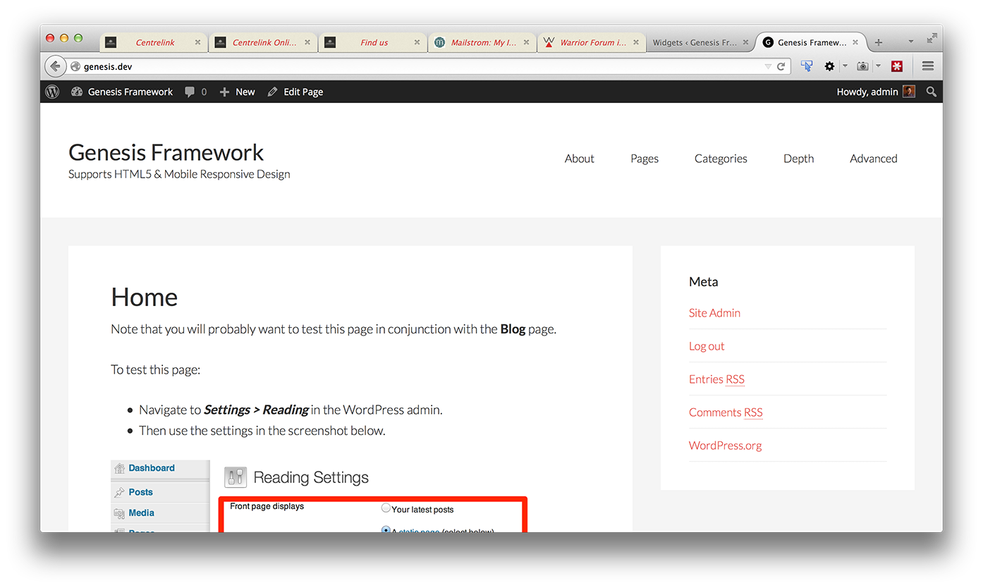
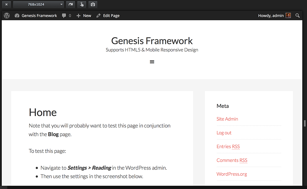
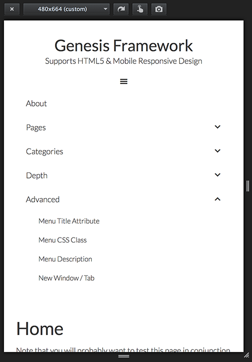
Gary Jones authored a plugin called Genesis Header Nav for Genesis that registers a menu location and displays it inside the header. The benefit of using this plugin over the built-in Header Right widget area is that when the requirement is to display a custom menu in header's right side, Genesis Header Nav plugin does it with lesser HTML markup.
In this article I show how Genesis Header Nav can be used to display a custom menu in the right side of Header in a Genesis site including the necessary CSS (taken from Beautiful Pro) to make this nav mobile responsive.
Screenshots:


Screencast:
Step 1
Download Genesis Header Nav's zip file from here, install and activate it.
Step 2
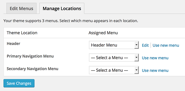
Go to Appearance > Menus > Manage Locations and set your desired menu in "Header" Theme Location.

[Optional] Step 3
If you do not wish to use 'Header Right' widget built into Genesis, add this in functions.php:
To view the full content, please sign up for the membership.
Already a member? Log in below or here.
Might you have any insight as to how to reposition the menu above the header when using this plugin?
Yes.
See https://github.com/GaryJones/genesis-header-nav#priority and https://github.com/GaryJones/genesis-header-nav#top-menu-above-header.
Hi,
Is this tutorial working with last version of genesis and worpdress 4.2.1 as I have implemented it as explained and the menu is not responsive, nothing happens.
I’m trying to find one responsive menu method for the header and could not find any, I’ve try already 5 or 6 tutorials and none is working.
Thanks a lot 🙂
Can you let me know which Genesis child theme are you using? Can you provide the URL of your site?
I’m using genesis-sample child theme. For the url, it’s a test server so I don’t want to let the address visible here, could I sent it to you by PM? If yes, how?
Thanks 🙂
I’ve just tested this on a site and it is working fine.
Can you send me the URL of your site via http://sridharkatakam.com/contact?
Thanks Sridhar for your help by email, it is now working 🙂
A last question, my menu is three level depth, is there a way through customization of the .js file to have the second depth level to be “openable/closable”? As actually, you can open the first level but then all the levels below are all open…I’m pretty sure their is something to do with this code but don’t know how:
 $(".responsive-menu > .menu-item").click(function(event){

		if (event.target !== this)

		return;

			$(this).find(".sub-menu:first").slideToggle(function() {

			$(this).parent().toggleClass("menu-open");

		});

	});
I’ve tried this:
 $(".responsive-menu >.sub-menu > .menu-item").click(function(event){

		if (event.target !== this)

		return;

			$(this).find(".sub-menu:first").slideToggle(function() {

			$(this).parent().toggleClass("menu-open");

		});

	});
but without success. Any idea ?
Hi Sridhar,
I’m hoping you can help me out with something. I have everything setup to include the mobile navigation on my site and it’s working perfect, the only problem I have is the WooCommerce cart items in the top right is also a “menu” so is picking up the same settings on mobile devices. I would like to have only the actual navigation responsive but not sure what to change to make that happen.
Any advice you could give would be greatly appreciated.
Caley
Hi Caley,
Can you provide the URL of your site?
So this plugin won’t activate for me. I get a result along the lines of:
Parse error: syntax error, unexpected T_STRING in ../public_html/wp-content/plugins/genesis-header-nav-develop/genesis-header-nav.php on line 28
Am I doing something wrong here in terms of the upload? Wrote to Gary just now, but you might have an idea…
I have just tested it on my test site and did not get the error you got.
Try posting here: https://github.com/GaryJones/genesis-header-nav/issues
When I add the code to the functions.php file, it breaks the site. I’m currently working on a locally hosted project so can’t send a link or anything, but any suggestions as to what’s going on?
Come up against a problem with this, that the responsive menu icon only seems to be visible on Chrome. When viewed on Safari on desktop or phone the icon disappears.
Any help?
Website is http://adclubdev.co.uk/centurion