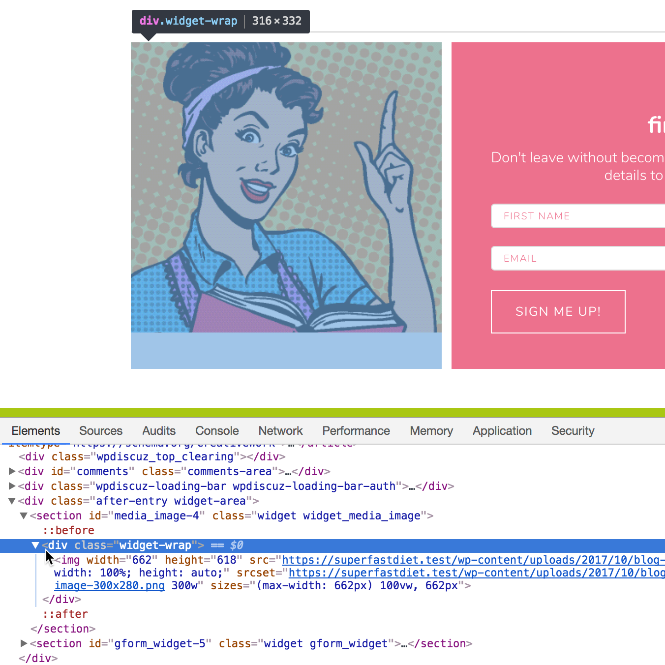
In a recent website that I developed, the requirement was to display an image (via an image widget – i.e., not a background) next to an opt-in form and have the image automatically take up as much height as the form.
After setting the display of the parent container of the widgets to flex, both the widgets (section elements if using Genesis) get equal height.
But the image inside the image widget will most probably not take up the full height because of aspect ratio of the image.
Traversing one level above the img element, we can set the height of .widget-wrap to 100%.
.after-entry .widget_media_image .widget-wrap {
    height: 100%;
}
The image continues to appear at the top.
Wouldn’t it be nice to have something similar to background-size: cover but for inline images? Luckily, there is object-fit: cover.
Adding
.after-entry .widget_media_image .widget-wrap img {
    object-fit: cover;
    width: 100%;
    height: 100% !important;
}
results in
!important is needed for height to override the auto inline value (which may be coming from WordPress srcset/Jetpack Photon).
You can find several clever implementations of this CSS property in Studio Pro child theme for not only images but also other elements like videos and iframes.
References:


I will be using this one in the future I am sure. Thanks
Definately gonna use this, thanks for the explanation Sridhar 🙂