Previous videos in the series so far:
Today's session covers:
- writing media queries for adjusting mobile responsive behavior
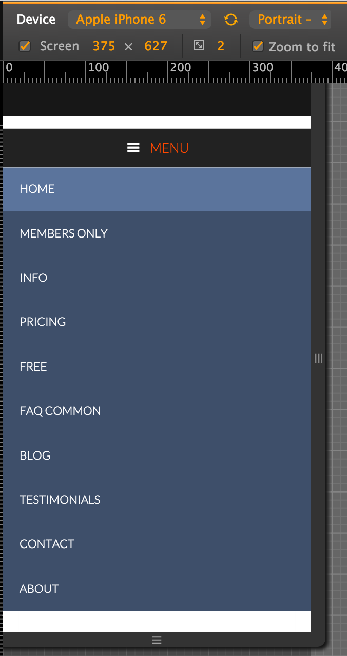
- adding hamburger mobile responsive menu for the navigation
- changing footer text and styling the footer
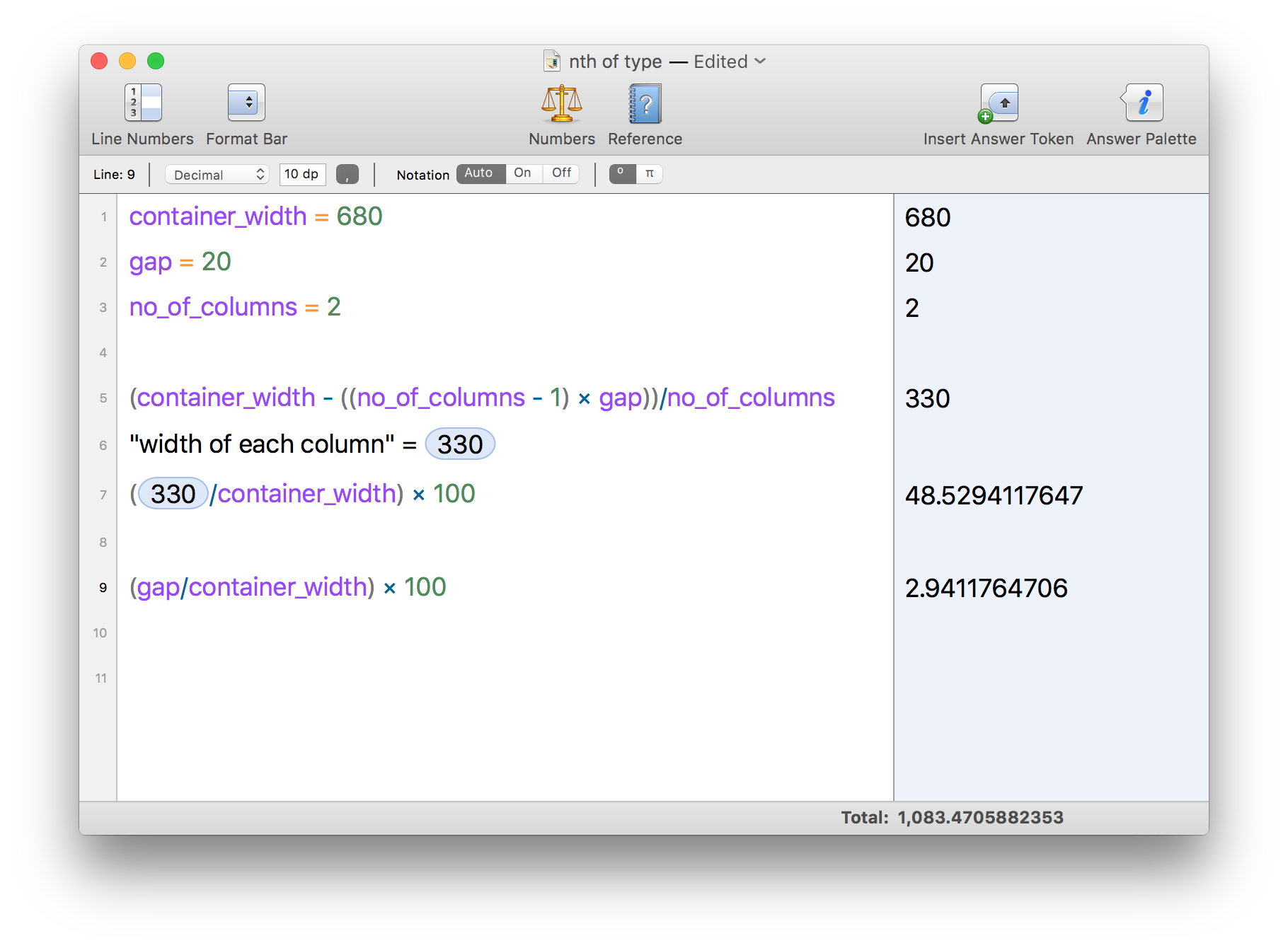
- displaying items in a column grid using custom CSS as well as Genesis column classes
- using visual hook guide to add elements on webpages
- adding custom body class for content archives for simplying CSS
References:
https://sridharkatakam.com/accessible-responsive-menu-in-genesis/
https://sridharkatakam.com/google-webmasters-sites-mobile-menu-in-genesis/
https://genesistutorials.com/visual-hook-guide/
Soulver content:

https://gist.github.com/srikat/525cb083f079f252b5d3
https://github.com/JiveDig/grid-frameworks
Screenshot of the mobile responsive menu:

Screencast:
To view the full content, please sign up for the membership.
Already a member? Log in below or here.
This tutorial has been awesome!!! Learned more about good processes than I had hoped! My only question regarding the setup is, what if I wanted to use a non landing page layout? I tried setting up to content-sidbar and I get an error on line #71 of functions.php and don’t know what issue could be? Once I change to Landing site works fine.
All I did was make up a dummy site and add the files from the zip file.
Great Job as always Sridhar and a BIG Thank you to Cognitive Results for allowing this process to be shown!
Ken
Glad you found the video series helpful Ken.
Can you elaborate on your question? Are you trying to create a Page Template in which layout should be set to Content Sidebar?
You’re welcome Ken!
Great job, thanks!