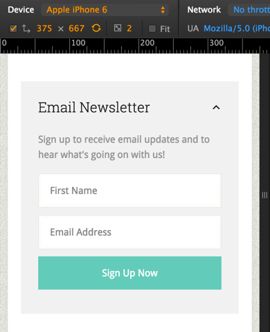
In the members-only Tutorial Requests forum a user asked,
Question – I’m implementing a horizontal opt-in on my new site but I’d like for it to be collapsible ONLY on mobile (primarily phones – kind of like mobile menus) since it takes up a lot of room when not collapsible and viewed on mobile. How would I go about doing that?
mobble provides conditional functions and body classes to target tablets and mobiles in WordPress. In this tutorial I show how Collapsible Horizontal Opt-in form in Genesis tutorial can be tweaked so that the closing and opening of opt-in section option is visible only when the front page is viewed in mobiles.
While the tutorial has been written for Lifestyle Pro child theme it should work with minor adjustments in any Genesis child theme.
Screenshots:
Non-mobiles (desktops and tablets):
Mobiles:
expanded (default):

collapsed:

Screencast:
Step 1
Install and activate Genesis eNews Extended and mobble plugins.
Step 2
Create a file named say, home.js in child theme's js directory (create, if not existing) having the following:
To view the full content, please sign up for the membership.
Already a member? Log in below or here.
