In GenesisWP Facebook group, a user asked:
I'm looking to make the Foodie Pro navigation menu look like this on mobile--with search bar visible while collapsed (example site that client wants mobile menu to look like: http://deliciouslysprinkled.com/). Any suggestions? Thank you!
We can remove the search form from being injected inside the primary navigation's list items, add it below the primary nav, wrap primary nav and the search form inside a custom div and modify CSS to float the hamburger menu icon to the left and the search form to the right in Foodie Pro.
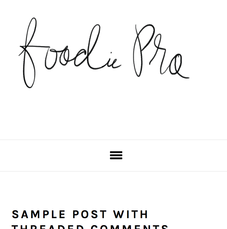
Before:

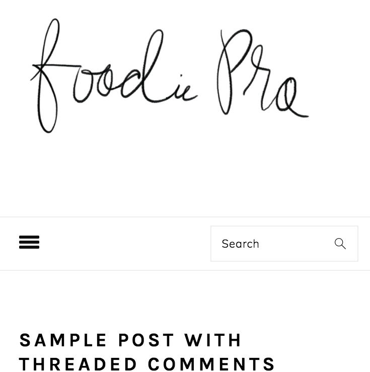
After:

Screencast:
Tested in Foodie Pro 3.0.0.
Step 1
Edit Foodie Pro's functions.php.
a) Change
$menu_search = sprintf( '%s</li>', __( genesis_search_form() ) );
return $menu . $social . $menu_search;
to
To view the full content, please sign up for the membership.
Already a member? Log in below or here.