In Genesis Facebook group James asks:
I'm working on a customization of Atmosphere Pro and I'm trying to accomplish the checkerboard display in one of my front-page widget areas, but instead of using multiple "featured page widgets" with alternate image alignments (per the default config), I'd like to use a single "featured post widget" to pull in my blog feed instead. I know the auto alignment can be accomplished simply by using the nth-of-type(odd) pseudo class, I'm just not sure on which class to apply it.
In this tutorial I share the code for customizing the appearance of entries of a single Genesis - Featured Posts widget so they look similar to the multiple Featured Page entries of Atmosphere Pro.
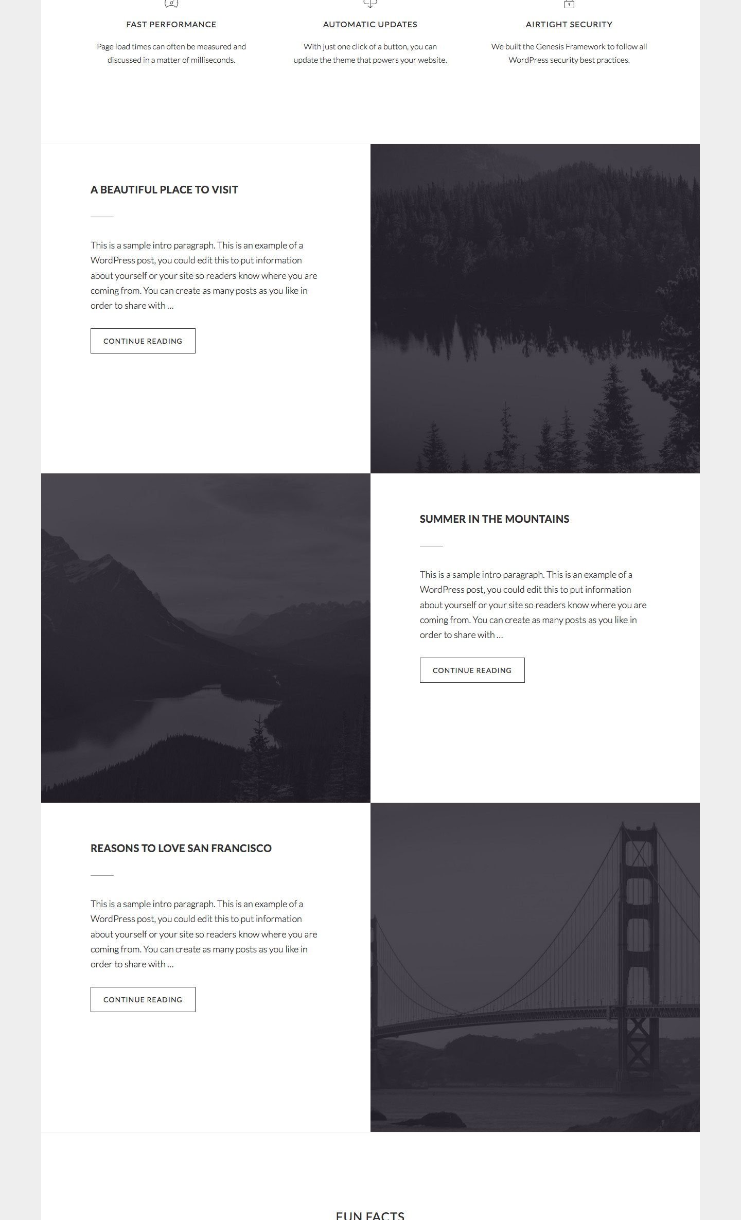
Step 1
Drag a Genesis - Featured Posts widget into Front Page 3 widget area and configure it like this:
To view the full content, please sign up for the membership.
Already a member? Log in below or here.
You nailed it, brother. Thank you.
Amazing. Thanks 🙂 I don’t get square images though even when set to 640px. Site is at http://fujifilmcollective.com/
You may want to change http://pastebin.com/raw/dLPyYcJp to http://pastebin.com/raw/LPDxsuuc to get rid of the vertical space between the rows.
I do see 640 x 640 square images at http://fujifilmcollective.com/. http://cl.ly/0Q1V3r2X051V
Great thanks.
This is my CSS. Can you please change what needs to be changed to this? I’m confused with your explanation.
Many Thanks,
/*
Welcome to Custom CSS!
To learn how this works, see http://wp.me/PEmnE-Bt
*/
.front-page .site-inner {
clear: both;
margin-top: 0;
}
.site-inner {
clear: both;
margin-top: 77px;
padding: 8%;
}
.gallery img {
border: 0 solid #ddd;
height: auto;
padding: 0;
}
.gallery img:hover,
.gallery img:focus {
border: 0 solid #999;
}
/*Featured posts front page */
.front-page-3 {
border-bottom: 1px solid #eee;
}
.front-page-3 .featured-content .entry {
padding-bottom: 0;
margin-bottom: 0;
border-bottom: none;
}
.front-page-3 .featured-content a.alignnone {
margin-bottom: 0;
}
.front-page-3 .featured-content a.alignnone img {
vertical-align: top;
}
.front-page-3 .featured-content .entry:nth-child(odd) a.alignnone {
float: right;
}
.front-page-3 .featured-content .entry:nth-child(even) a.alignnone,
.front-page-3 .featured-content .entry:nth-child(even) .entry-header,
.front-page-3 .featured-content .entry:nth-child(even) .entry-content {
float: left;
}
.front-page-3 .featured-content .entry-header,
.front-page-3 .featured-content .entry-content {
padding-left: 7.5%;
padding-right: 7.5%;
width: 50%;
}
.front-page-3 .featured-content .entry-header {
padding-top: 6%;
}
.front-page-3 .featuredpost .entry-title {
font-size: 20px;
font-size: 2rem;
font-weight: 700;
}
.front-page-3 .featuredpost .entry-title:after {
border-bottom: 1px solid #333;
content: “”;
display: block;
margin-bottom: 40px;
padding-bottom: 40px;
width: 10%;
}
.front-page-3 .featuredpost .entry-title a:hover {
color: #333;
}
@media only screen and (max-width: 960px) {
Hello. Any update on this please? I’d like the correct code complete to add to CSS. I’ve uploaded my current code above.
Will email you now too.
Thanks,
Paul
Can you deactivate caching/CSS minification so I can give you clearer instructions?
Done. Thank you.
Any update? This is kind of annoying having to keep follow this up 🙂 Would appreciate your help.