Update on May 12, 2018: Follow this newer and updated tutorial instead.
In this tutorial I share how Masonry, which comes shipped with WordPress can be activated and used on Category archive pages in Genesis.
We are going to display the featured images of Posts in the grid and set Post's title and excerpt to appear when hovering on the images.
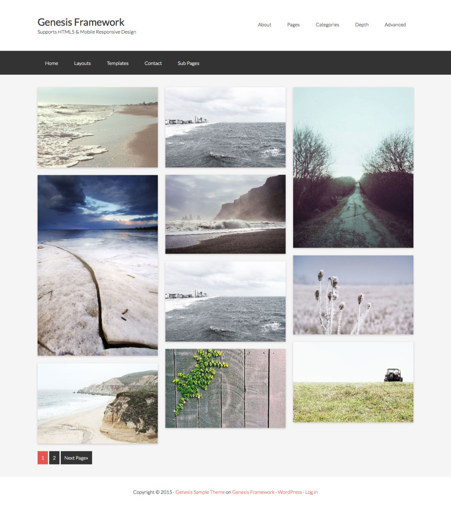
Desktop:
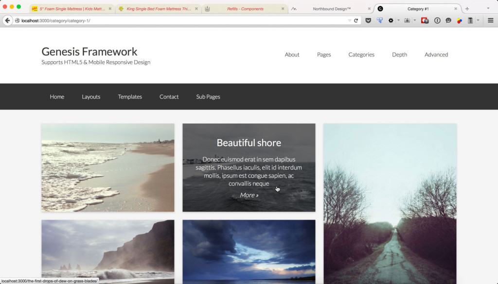
Hover state:
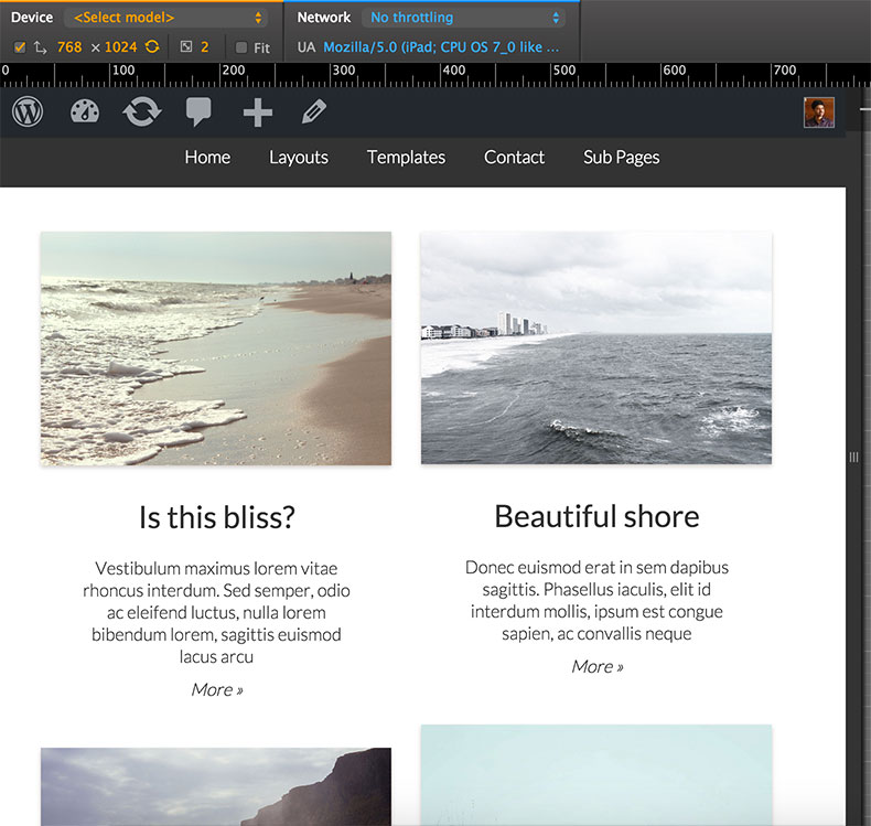
Tablet:
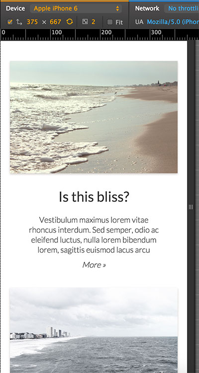
Mobile:

While the tutorial has been written for Genesis Sample child theme it should work with minor adjustments in any Genesis child theme.
Step 1
Add the following in child theme's functions.php:
To view the full content, please sign up for the membership.
Already a member? Log in below or here.


Another great post, thanks.
Any idea why the 3 column layout only shows up when I have the firefox ‘inspect elements’ open to the right of the screen, otherwise it displays single columm? (Altitude Theme).
Keep it up !
Content padding right was messing it up, all good now,
What about if I want to use for tags? Maybe work copying category.php in tag.php?
Thanks
Try adding this in functions.php: http://pastie.org/pastes/10334956/text
Thanks! Finally i did it copy category.php to tag.php
I having this working well on my site (it looks great), but my excerpt text is all running together. Text on different lines in the post is all on the same line in the excerpt. Is there a way to make that format correctly?
Hi, Sri. Love this. Added this on a test site – http://robinanne.org/canuck/category/appetizers/ but it is showing duplicate featured images.
Any suggestions?
I’ve been using this tutorial on the site http://contaks.com. It’s works great, but I’ve recently discovered that if I put a link anywhere in a post, it breaks the image and hover effect on the homepage. My example is the one at the top called Legal Marketing.
Bye the way, I figured out my earlier issue posted above.
Thank you,
Jeremy
I am unable to re-create the problem on my test site. I have copied the exact HTML from the post that’s ‘breaking’ from your site in mine and it appears fine in the grid.
Can you send me your WP login via https://sridharkatakam.com/contact so I can look inside?
It works great, thanks. But only for category or tag,
I try to setup this tutorial as the home page.
i’ve made a template and choosed it for the page which is home page but it doesn’t work
i understand, we are not in categories..
what i will have to add to get all the posts of a particular category on this manner on homepage
thanks
Hey Sridhar!
All issues resolved – no need to reply… Thank you for all your work! I hope you have resolved your house issues and you and your family are comfortably at home.
All the best!
Barbara Tierney
Thank you for this! Is it possible to apply this to the blog page or a new page template (blog-page-grid.php) that can be selected to show a blog loop in this format?
Thank you for your awesome help!
Try this:
1) Create a static Page called say, “Blog” and set it as Posts page at Settings > Reading.
2) In Step 3 instead of naming the file as category.php, name it home.php.
Sridhar,
What if we wanted the default blog page to display like this? I still would like to have my Altitude homepage appear like it does in the demo, but want the masonry layout to be my default “blog” page.
Thanks!
Chris
Sridhar,
Any idea why stories are only falling into one column? I am building on the Altitude theme.
https://mpdropshare.s3.amazonaws.com/Stories__2016-08-22_11-17-09.png
http://jcca100.wpengine.com/category/stories/
Thanks!
Chris
Nevermind – it was a padding issue as was stated by an earlier commenter.
Thanks for the great tutorial!
Any idea how I could use this on the Portfolio Archive?
Tom
This tutorial is ideal for my portfolio https://sridharkatakam.com/masonry-grid-on-category-archives-with-title-and-excerpt-on-hover-in-genesis/
I just wonder how I can have this apply to the portfolio archive on the Portfolio custom post type?
Thank-you in advance.
Tom
Hi Sridhar,
This worked perfect. Thanks!
I used this code on the Categories page and also in the Blog page (for the same theme). The only problem I’m having is the Pagination. They’ve disappeared (on the blog page only). I’ve double checked and made sure the pagination code is there. If I view it in Firefox Inspector… there is no line for the pagination.
Do you have any suggestions? Thanks!
Which child theme are you using?
I believe it was the Lifestyle Pro theme. I completely customized it so I can’t remember for sure which one I used. Here is the test site and the blog page http://temp.studiomommy.com/templates/blog/
https://twitter.com/srikat/status/990914733661347840
I do not recommend/support using Blog Page Template for the blog.
Use the feature that’s built into WordPress:
Create a static Page named say,
Homeand another namedBlog.At Settings > Reading, set
Homeas the homepage andBlogas the Posts page.Okay, thank you 🙂
Hi Sridhar
I realise this is quite an old tutorial, which may be causing this issue, but the masonry layout is not showing up at all in IE11. Working fine in Chrome/Firefox/Safari. Can you advise?
http://kevinhaynes-co-uk.stackstaging.com/
Thanks
Dom
Just to add to this. It appears the calculations are askew in IE. In Chrome, for example, the absolute positioning of each .entry-content is different to that in IE. And I have to set the container to “display: block;” for the masonry items to show up.
Does that fix it in IE 11? Which child theme did you start with?
No, it’s still not fixed. I’m using Sample 2.6.1, WP 4.9.5
When you load the page in IE11, the first masonry tile flashes up and then disappears. If you hover over around the left-hand side you can see the overlay texts appear. When I added “display: block;” to “.full-width-content .content” (I think) then the images appeared, all stacked on top and overlaying each other.
Then, when I looked at the positioning, it was all different to what I see in Chrome.
For example, in Chrome, the top middle tile (“Where’s He Off To?”) has this:
position: absolute;
left: 33.9263%;
top: 0px;
In IE, that same tile has:
left: 0%;
top: 71px;
position: absolute;
Hi 🙂
I’m having a similar issue. It was working fine for several months but now the images are stacking on top of each other, on the left side. I’m seeing this on Firefox Developer Edition.
http://demos.studiomommy.com/adore-me/category/category-1/
It seems to be working fine on Safari, Chrome, and the regular Firefox.
Thanks,
April
I will post an updated version of the tutorial that works on IE 11 as well.
Regarding Firefox Developer edition, do you see the same problem for the demos on the Masonry official site, https://masonry.desandro.com/?
Follow https://sridharkatakam.com/masonry-grid-on-content-archives-with-title-and-excerpt-on-hover-in-genesis/.
The Masonry Official site on Firefox Developer looks good. I see no problems. Thanks.
I tested the output my new updated tutorial, https://sridharkatakam.com/masonry-grid-on-content-archives-with-title-and-excerpt-on-hover-in-genesis/ in Firefox Developer Edition. All the entries are appearing one below the other. I do not know why it is so and how to fix it.
If it were happening in the regular Firefox, I would have pursued it by posting in Masonry project’s GitHub forum or StackExchange etc. but since the problem is in Developer edition, I am not going to.
[…] is an updated and improved version of Masonry Grid on Category Archives with Title and Excerpt on Hover in Genesis […]
Thanks for the update, Sridhar. I need to make some changes to the site before it is launched so will implement your new solution.
Appreciate you looking at this.
Hi Sridhar – still having problems with this now in Firefox latest release 61.0.1 here –> https://www.toplittlethings.com/ (slightly customised version of the original tutorial, but nevertheless showing the same issue of posts appearing one below the other… Need a fix asap please??
TIA,
Chris