In Cafe Pro by default site title and site description appear centered on top of a big fixed background image below the Before Header section. In this tutorial I show how we can replace this background image with a slider.
Overview of the steps:
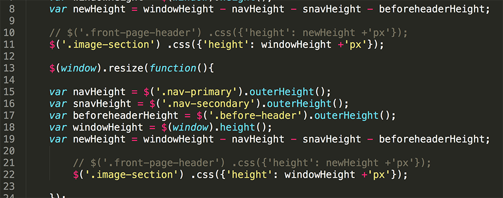
- Remove the front page header from automatically getting inline height via JS to ensure that the solution works in a responsive manner.
- Insert Soliloquy (commercial plugin) slider in a function hooked togenesis_header on the front page.
- Float the title area using absolute positioning relative to the front page header using CSS.
Step 1
In home.js inside the js directory, comment out or delete both the instances of
| $('.front-page-header') .css({'height': newHeight +'px'}); |
Step 2
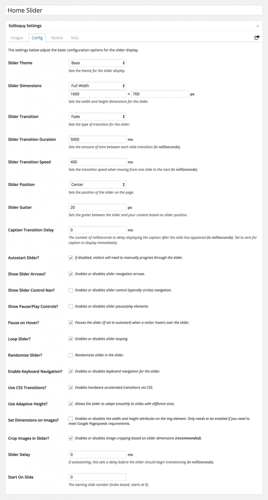
Install and activate Soliloquy. Create a slider named say, 'Home Slider' and upload your desired slide images. Use images that are big and wide or as per your design needs. Images used in the demo site are 1600 x 1034.
In the 'Config' tab, select 'Full Width' for Slider Dimensions. Set the width of your slide images in the width field. Set the height to how tall/high you want the slider to be. In the demo site, I used 700.
Step 3
In front-page.php add the following before closing genesis();:
To view the full content, please sign up for the membership.
Already a member? Log in below or here.


The Homepage looks great with the Soliloquy slider, but on your demosite the single pages and posts have the site title on top of the menu?
http://cafe-pro.websitesetuppro.com/hello-world/ & http://cafe-pro.websitesetuppro.com/hello-world/
I will give it a try, and come back here with my result.
Thank your for this great site Sridhar, you helps me a lot.
Fixed. I’ve updated the tutorial.
Can you check the inner page(s) again?
on your demosite it works fine now. I have made the changes on a testsite too, but on my site it not responsive? (I have the original files back in /lib)
Here my testsite: http://dieglaskuppel.eu/
I have a bigger “whitespace” before menu, and not the same resize if testing mobile sizes?
maybe because I use a image logo?
Screenshot: http://goo.gl/SiZYxI
I don´t know where, the height:783px, in the header on my site comes from?
on our site the last part, style=”height: 783px;”, are not there at all ?
I updated the tutorial and added Step 1 that should take care of this.
Yes, now everything works perfect on my site too.
Unfortunately it did not work for me. The site looks as if I have done nothing to it: http://www.festivalofinspiration.net/
Any thoughts?
I have updated the steps and code after you have implemented the tutorial. Can you ensure that you follow what’s currently there?
I see the CSS but it’s commented out: http://d.pr/i/aKP2
Since I was working on a live site, I only had maintenance mode turned on momentarily – so I commented out the CSS. I will try to implement this solution again tomorrow & let you know my findings.
Still not working. Same issue despite updating JS. Slider is not responsive. The bg image is visible behind the slider & is setting the height…so there is 235px top, 120px bottom where the image is showing through behind the slider. Unfortunately, I am unable to provide link as I don’t have a dev site set-up for this site.
Can you try to implement the tutorial on another installation of Cafe Pro that I can look at?
I can implement the tut, deploy mm, & give you login creds. Would that work?
Yes. http://sridharkatakam.com/contact/
Fixed.
The problem was a missing closing brace.
I corrected http://pastebin.com/raw.php?i=CkzYLPSi to http://pastebin.com/raw.php?i=pGiaiBKZ
Next time please do the bdn test: http://sridharkatakam.com/bdn-test/
Oh man – I feel like such an idiot for missing that. Thanks so much for the investigation & link for future reference.
How would I do this in Metro Pro?
Metro Pro has a boxed look. Do you want to display a slider below the Primary Nav?
Would this also work for the altitude pro theme? I want to replace the static image in the first widget area with a soliloquy slider. Not sure if I should follow these directions or the ones for centric or maybe for the parallax theme?
Okay, I’m stumped. I’ve added this code to the site, but the slider doesn’t appear. I don’t even see it being referenced in the source code.
If I add it to a widget (I tested it by adding the short code to Front Page 1) it DOES appear there. But the front-page.php function is not adding it. I’ve tried using both the slug (home-slider) and the numerical ID for the slider, but no luck.
It’s a fresh install and unmodified theme. Any idea what I might be doing wrong?
My site’s temp URL is: http://ecbiz171.inmotionhosting.com/~kithar5/
Any ideas what might be wrong?
Thanks.
Okay, never mind. Typo in the slider title! (It’s always something stupid…)
Thanks for the terrific tutorial.
Friend:
I need pay for Soliloquy and for me the slider is not good.
Question:
How I can insert Slider Pro “http://codecanyon.net/item/slider-pro-responsive-wordpress-slider-plugin/253501” or usind Genesis Responsive Slider
Some news about this.
Or How I can implement an free slider in Cafe Pro
Wonderful. Thank you for this. You saved me untold time!
Hi there.
Firstly, I got excited but I think the slider isn’t “parallax” is it? Man it would be awesome if it was
Secondly, your example doesn’t “stretch” – how can that happen?
David
Hi Sridhar,
This is great! And it’s working for me! One question though… is it possible to force the slideshow area to equal the height of the window? And have the bottom navigation always attached (and visible) on the bottom of the window, no matter the size?
Thanks!
Kristine
Hi Can this be done with LayerSlider instead of Soliloquy keeping the menu at the bottom of the screen
Regards Alistair
I have updated the tutorial and added steps for using LayerSlider instead of Soliloquy.
Also you can use Master Slider with this code. Change the 1 to the id of your slider ID
add_action( ‘genesis_header’, ‘sk_slider’ );
function sk_slider() {
masterslider(1);
}
genesis();
Hi Sridar,
I used this on two sites and the most recent one just brought it to my attention that the slider shifts either to the left or stays in the center on larger monitors. I thought maybe I did something wrong, but your demo is behaving the same way. If you reduce it down – the slider doesn’t stay full width like the backstretch images. Is this possible? The client is using an iMac and she’s a photographer and she wants to make sure her visitors can see her images in the best possible way.
Here’s a screenshot of what it looks like on your demo – https://drive.google.com/file/d/0Bw1EEUG2USHYd0R0YjJMVWNEcUE/view?usp=sharing.
Thanks for your help.
If this helps, I changed 1600 to 2300 and it seems to have fixed it on her devices.
Hello – thanks s this great tutorial! Everything is good, except, The title which should overlay the slider on the homepage is under it.. how do i put it back on top? Also i would like to use a logo image in place of the site title –
thank you
url: http://kensingtoncircuspub.com/