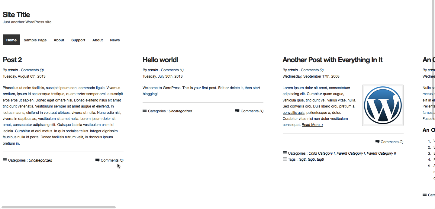
In this article I provide sample CSS to make the posts laid out next to each other in a iThemes Builder powered WordPress site.
[symple_box color=”red” text_align=”left” width=”100%” float=”none”]
This is a NOT a final ready-to-use production version and should be considered a Proof of Concept and a starting point to further customize.
[/symple_box]
Create a new layout titled say “Very Wide”. Layout width does not matter. Add a View so homepage uses this layout.
Then add the following at the end of child theme’s style.css:
body {
	background: #FFF;
}

.home .builder-container-outer-wrapper {
	max-width: 100% !important;
}

.home .builder-module-navigation .builder-module-element {
    padding-left: 1.5em;
}

.home .builder-module-content {
	white-space: nowrap;
	width: 100% !important;
	height: 100% !important;
}

.home .builder-module-content .hentry {
    max-width: 400px;
    margin-right: 5em;
    display: inline-block;
    position: relative;
    width: auto;
    height: 100%;
    white-space: normal;
    vertical-align: top;
}

.home .builder-module-content-outer-wrapper,
.home .builder-module-content .builder-module-block-outer-wrapper,
.home .builder-module-content .builder-module-element {
	overflow: visible !important;
}
A google search led me to Fluxus, a commercial WP theme having the horizontal scrolling feature. Looks neat. Left/right arrows and up/down scrolling can be used to navigate horizontally.
