In the comments section of How to split Navigation Menu in Genesis using WP Nav Plus tutorial, a user asked:
Thank you for this! I am using Minimum Pro and I am wondering if I can use this technique to create a similar nav style to http://www.oliviarosecosmetics.com/ which was built on Minimum as well.
In this tutorial I share the code to make the fixed header in Minimum Pro static instead followed by displaying the inline logo, giving it rounded corners and floating it absolutely on the header.
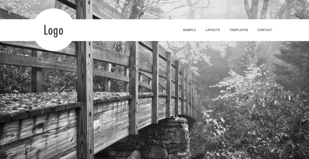
Desktop:
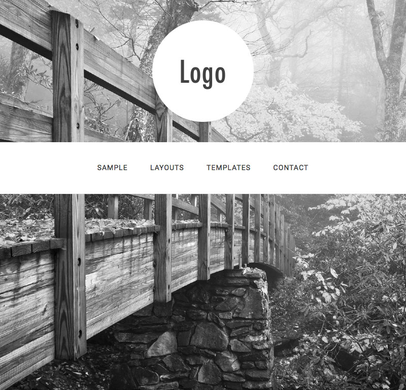
Between 1023px and 769px:
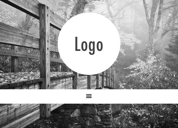
768px and below:

Step 1
Upload your image to Minimum Pro's images directory. In this example I have used one named logo.png having dimensions of 400 x 400. Note that this is twice the desired size at which the logo is to be displayed (200 x 200) to ensure that logo appears crisp on retina displays.
Step 2
Add the following in Minimum Pro's functions.php:
To view the full content, please sign up for the membership.
Already a member? Log in below or here.


Thanks for this! Just what we need. However: would it be possible to link to a logo file uploaded i WP media library?
Dear Sridhar,
I’ve followed the tutorial with the logo image placed in the theme image folder. However, on my page the logo is not floating, but rather stuck in the upper right corner. Looks fine at desktop screen, but not in any other resolution. What could cause this? link: http://www.coat.no .
Wondering if anyone can help with my issue. I have used the floating logo here: http://rehabresourcesinc.com/. One thing I would like to change is the position of the primary menu so that it is above the logo on screens 1023 and below. Is that possible?
Since the title-area (which holds the logo) is within the site-header (which holds the menu), it seems to me that the title-area needs to jump out of the site-header and moved to a lower position for certain screen sizes. Is there a Genesis hook to accomplish this? Thank you in advance.
Hi Sridhar,
I am having the same problem as Jane above. It looks great 1024px and above but below, the logo floats to left and menu bar is off too. I’m not sure what I am doing wrong or if there is some other code in conflict. I love how this looks and really want it to work. The site is http://www.elp.eatlaughpurr.com. Your help is greatly appreciated, as always!
I have still not managed to solve this one and make the logo floating. Does anyone have a suggesting as to why the tutorial may not produce the expected result in Minimum Pro? The page is http://www.coat.no. The logo is stuck in one corner and the hamburger menu appears to the right, not in the centre.
Any advise is greatly appreciated!
I’m having the same problem as you. I’m hoping Sridhar has an answer because I don’t want to switch back to the standard look.
I finally found a work-around. Here is what I did:
I deleted all the php and css Sridhar gave us and started with a clean slate.
I adjusted the width and height for a custom header in functions.php to 200.
I adjusted the width and height for .header-image .site-title a in the CSS stylesheet to 200px.
I uploaded my logo through Minimum’s header image uploader
Then I added back Sridhar’s original CSS and tweaked it a bit to suit my needs:
/* Floating Circular Logo
——————————————— */
a img {
margin-bottom: 0;
}
.site-header {
position: static;
width: auto;
margin-top: 70px;
}
.site-header .wrap {
position: relative;
}
.title-area {
padding: 0;
width: 100%;
position: absolute;
left: 0;
top: -51px; /* half of “.site-header .wrap” height */
}
.header-image .site-title a {
border-radius: 50%;
}
.site-header .widget-area {
width: auto;
padding: 20px 0;
}
@media only screen and (max-width: 1023px) {
.site-header .wrap {
max-width: 100%;
}
.site-header {
background: transparent;
margin-top: 40px;
box-shadow: none;
}
.title-area {
position: static;
margin-bottom: 40px;
}
.site-header .widget-area {
background-color: #fff;
padding: 20px 5%;
width: 100%;
}}
@media only screen and (max-width: 768px) {
.site-header {
border-bottom: none;
}
.site-header .widget-area {
width: 100%;
padding-top: 10px;
padding-bottom: 5px;
}
#responsive-menu-icon {
line-height: 1;
}}
Jane and Tanya,
Both your sites look great.
I’m working locally at the moment and followed your (Tanya’s) work-around.
For mine, the logo works but I’m not getting the nav up there beside the logo, it remains in its original spot above the content and below the tag.
Any thoughts on what I might check?
Thanks!
@akap
If you would like me to take a look at the site where you have implemented the steps in this tutorial but is not working as it should, let me know.
Sridhar,
Thank you, yes if you have a moment I’d very much appreciate it.
It’s on GitHub here : https://github.com/akapheim/GSWGAlocal and I will send you a link to my localhost via email.
It’s a very basic setup now only for testing (like the floating circular logo / nav menu here) before I push it onto the real site (which is sitting on dev server not yet live).
I have downloaded the theme directory you shared from your GitHub repo and activated it on my test site and it looks fine (the expected look after following this tutorial): http://d.pr/i/15AQo
Does it appear differently on your localhost?
If it looks the same, how were you expecting it to look/work?
Thanks Sridhar!
Appreciate the help :
Removing the assignment of the main menu from the Primary Navigation Menu in Appearance>Menu>Manage Locations
AND
Assigning it to the Appearance>Widgets>Custom Menu Widget to right header did the trick.
Well done Tanya! I tried your solution and with a few tweaks it works here as well. Thanks!