In the members-only forum in Tutorial Requests topic, Bodie asks:
Could you help me change the Remobile pro navigation? I would like to:
1) move it under the header instead of above it.
2) Have it centered below the site title and tagline and be visible by default (no hamburger menu)
3) Implement the Beautiful Pro mobile responsive menu code on smaller screens.
In this tutorial I share the steps to customize Remobile Pro such that the hamburger menu does not appear until 800px and making it appear below the Header.
Desktop widths:
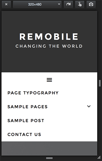
Mobile widths:

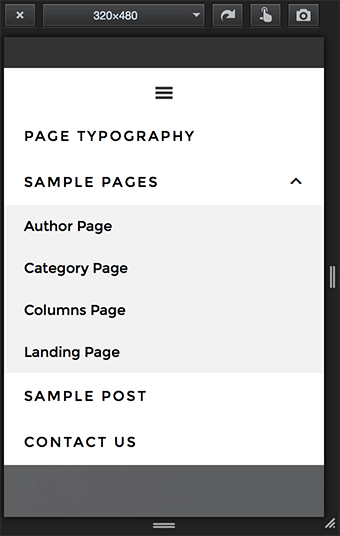
With 'Sample Pages' menu item tapped:

Step 1
In functions.php replace
This file contains hidden or bidirectional Unicode text that may be interpreted or compiled differently than what appears below. To review, open the file in an editor that reveals hidden Unicode characters.
Learn more about bidirectional Unicode characters
| wp_enqueue_script( 'remobile-responsive-menu', get_bloginfo( 'stylesheet_directory' ) . '/js/responsive-menu.js', array( 'jquery' ), '1.0.0' ); |
with
To view the full content, please sign up for the membership.
Already a member? Log in below or here.

Sridhar,
Thanks very much for this. Worked great. One question – how would I now exclude the navigation from the home/front page only?
-Kent
Add http://pastie.org/pastes/10579504/text before closing
genesis();in front-page.php.http://d.pr/i/1dkpg
Hello Sridhar,
I’ve made the adjustments but I am struggling to get the results. The menu has moved below the header but it still has the icon.
Here is the site: https://loadingdose.uk
Can you help?
I’ve earlier sent this via email to you:
I took a look at your site and see that Step 3 is not done.
Please do that and let me know.