In my Facebook group a user posted a tutorial request:
A cpt with a popup image with details to the right of the image. Just like if you visit instagram.com/account and it will popup with a right and left arrow.
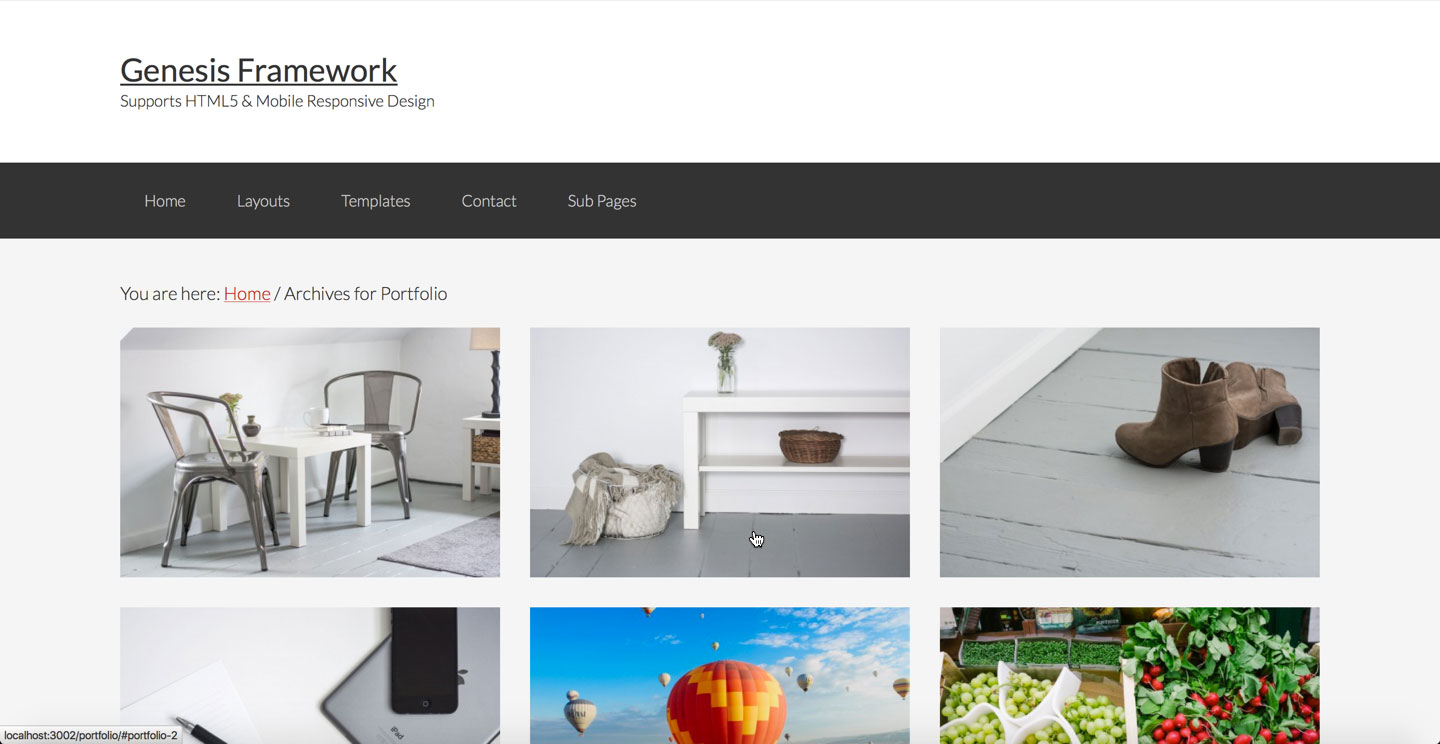
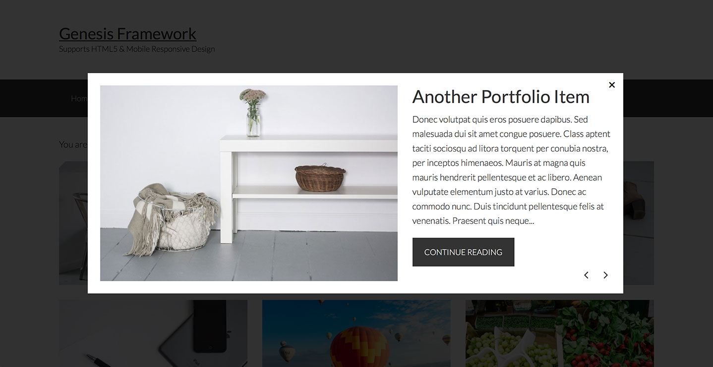
In this tutorial I share the code for setting up Portfolio CPT (using Portfolio Post Type plugin) archive page into columns with just the featured image appearing for each entry. Clicking on an image will open a lightbox (using Featherlight jQuery script) and shows the image at left and title and excerpt on the right.
Users can click left/right arrows on their keyboard to navigate to previous and next entries within the lightbox or press the left and right arrow buttons. Lightbox can be dismissed by pressing the Close button or pressing Escape on the keyboard.
Screenshots:


Screencast:
We are going to
- register two custom image sizes for featured images on Portfolio archive - regular and large (appears inside the lightbox)
- load Font Awesome for the previous and next icons inside the lightbox
- create Featherlight initialization file
- create a template for Portfolio CPT archive in which we shall
- enqueue CSS for Featherlight and its gallery extension in the head
- add "portfolio-archive" custom class to body element to make it easier the elements on the archive page
force full width content - reposition breadcrumbs from inside main.content to above
- remove the standard Genesis elements from entry header, entry content and entry footer
- show featured image. The key here is to assign a unique id to the container of each entry's content so it can be loaded inside lightbox when that entry's image is clicked. This is done using the built-in loop counter.
- modify the Excerpt read more link
- create a function to display Lightbox Content having featured image at left, title, excerpt and read more button at right
- enqueue JS for Featherlight and its gallery extension in the footer
- add the necessary styling
While the tutorial has been written for Genesis Sample child theme it should work with minor adjustments in any Genesis child theme. Also the steps work for any CPT with a few corresponding changes.
Step 0
Install and activate Portfolio Post Type plugin. Add your Portfolio items while making sure that featured images are uploaded for each.
Step 1
Create a directory named css inside child theme directory and upload these files:
Step 2
a) Create a directory named js (if not existing already) inside child theme directory and upload these files:
b) Create a file named featherlight-init.js in the same location having this code:
To view the full content, please sign up for the membership.
Already a member? Log in below or here.
A+ as always.
Outstanding. I’m looking forward to giving this a whirl… on my own site!
This is another great post Sridhar. Thank you.
I’ve implemented on a staging site (just to play with this) and I managed to implement with your code and instructions; the only issue though is in the light box, the text excerpt displays below the featured image.
http://www.staging1.pixelhappy.co/portfolio/
This is a Dynamic Gen based site and haven’t been able to figure out what is causing the excerpt to display below — rather than to the right — of the featured image.
If you have a moment to take a look, I would really appreciate.
Thanks, Yael
Looks fine. Guess you managed to fix it?
You have this
This is the reason why it not looking right.
It needs to be this.
https://www.dropbox.com/s/jsxfqj0e983ars3/Screen%20Shot%202016-02-07%20at%2012.55.37%20PM.png?dl=0
The
portfolio-content-right div
you need to remove the -right from it.
Really, Sridhar, it displays right for you? This is how it displays for me (in Chrome, IE 10):
https://gyazo.com/25a059e56206ded578e1070175f3ac44
Although it does display right in Firefox… so seems it’s a Chrome / IE 10 issue .
Thanks for taking a look.
It displays fine in Chrome on Mac: http://d.pr/i/1gdoR
I will check on a PC..
Hey, yeah, @256studio is right.
It’s this little piece of CSS from the original code Sridhar provided:
.portfolio-content-right {
/* float: left;
max-width: 400px;*/
}
Just comment that out in your stylesheet, and the content will look like you want :).
On second look (a thorough one), here’s an example of a solution you can add to your stylesheet:
.featherlight .featherlight-content {
width: 80% !important;
}
And then leave Sridhar’s original code untouched:
.portfolio-content-right {
float: left;
max-width: 400px;
}
…You’re going to have to play around with things at varying screen sizes— .align-left too, perhaps. Have fun :).
Can this be done with the Genesis Portfolio that comes with themes such as Modern Portfolio Pro?
I’ve got nearly one hundred portfolio items already created, so recreating them in a different plugin would, well, suck.
Yes.
What needs to be changed? I’ve uploaded and created the files above, but my portfolio is not registering any changes.
[…] on displaying content in lightbox upon clicking featured images in portfolio CPT archive follow this […]