In the members-only forum a user asked:
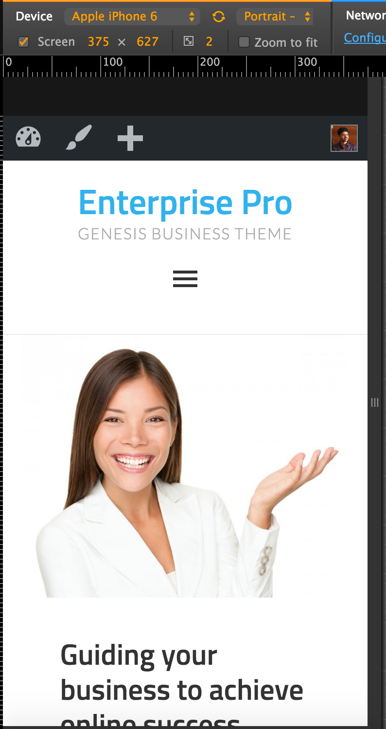
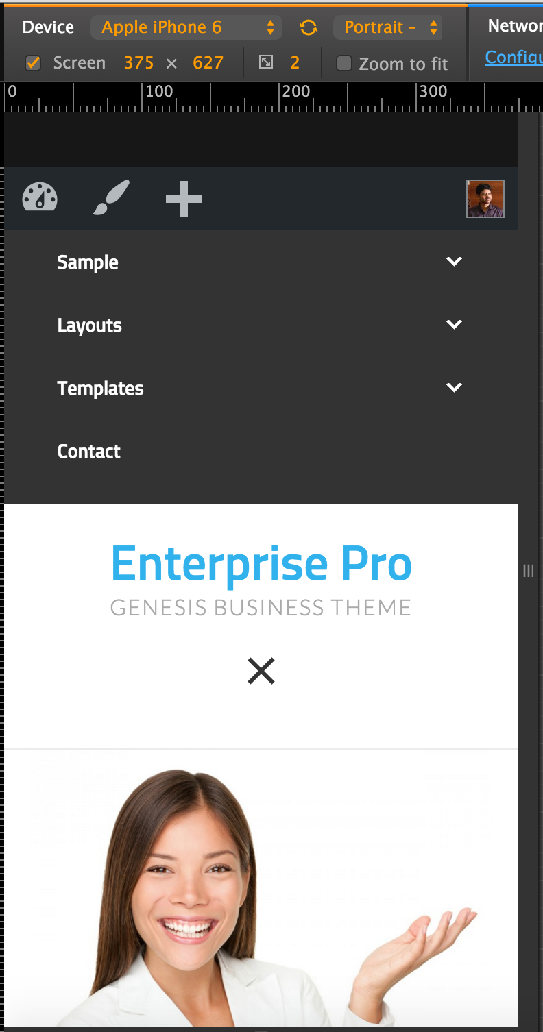
I’m looking to modify the responsive menu in the Enterprise Pro Theme from StudioPress. I’ve inserted to screenshots from where I have got to so far…
Responsive Menu Closed: http://s9.postimg.org/hptq5f3mn/responsive_menu_closed.png
Responsive Menu Open/Active: http://s12.postimg.org/3qjlpwxsd/responsive_menu_open.png
I would like to try and achieve a similar result as Brian Gardners personal site, (i.e when the responsive menu icon is clicked the navigation appears inline below).
Then when the viewpoint goes below 768px (or similar) the menu-items will display as block and stack vertically, just like a traditional responsive menu…
As you can see from the second screenshot the menu-items are block and stacked vertically.
What would be the best way to approach this?
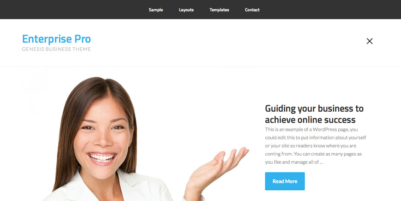
In this tutorial we shall relocate the Primary Navigation from below the header to above the header, hide it and make it slide down from the top when hamburger menu button placed in Header Right is clicked. The menu icon animates to a close icon as the nav menu is opened. When the close button is clicked navigation slides up out of the view.
At 768px and below, the menu items will be set to appear one below the other.
Screencast:
Screenshots:
Desktop:
Default (closed state):

With the nav menu open:

Mobile:
Default (closed state):

With the nav menu open:

Step 1
In Header Right widget area drag a text widget and paste the following:
To view the full content, please sign up for the membership.
Already a member? Log in below or here.
Sir, you nailed it! Thx 🙂
Nice 🙂 Anyone switching to the black theme colour may wish to comment out line 1721 in style.css to make the hamburger visible again 🙂