This is an update to my earlier article titled How to make Header menu in Genesis mobile responsive similar to that in Beautiful Pro. The earlier article worked with Beautiful Pro version 1.0.1. This tutorial is for the current latest v1.1.
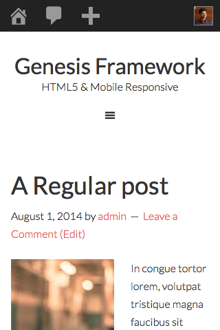
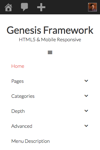
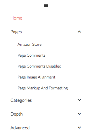
Below are screenshots showing the result of applying the steps in Genesis Sample.


Step 1
Upload beautiful-pro/js/responsive-menu.js (mirror) to {child theme directory}/js (create 'js' if not existing).
Ex.: wp-content/themes/genesis-sample/js/responsive-menu.js
Step 2
Add the following in child theme's functions.php:
To view the full content, please sign up for the membership.
Already a member? Log in below or here.
[…] Update: Current latest version of this tutorial is here. […]
Thanks for this! It worked perfectly on the older version of Minimum Pro. Only the Dashicons script had to be called, and some minor CSS adjustments after that. Appreciate it!
HI,
thanks a lot for the tutorial. I have the enterprise pro theme and followed your steps. I still see some bugs, because the new responsive menu interferes with the exstitisting responsive menu of enterprise pro.
Can you check my site on your phone to see the problem. thanks.
I solved it.
[…] http://www.sridharkatakam.com/add-beautiful-pros-mobile-responsive-menu-genesis-themes/ […]
Thanks for your numerous tutorials. I have the last Minimum Pro theme and followed your steps.
But not all is OK. I think the existing responsive menu of Minimum pro interferes with the new menù.
Minum Pro has his responsive-menu.js, I used the new one and add the new function in function.php.
Must I delete something in function.php?
This the site demo: http://www.hotelinlignano.com/aipt
Some suggestions?
Mathias, how you resolved?
Yes, as you mention Minimum Pro has its own code for mobile responsive hamburger menu. I need to look into the code to get the mobile menu of this tutorial working in Minimum Pro for which I am afraid I have no time.
You may contact me via http://GenesisCustomizations.com/ if you want me to look in detail and fix it.
Hi Sridhar, I solved thank you. With Minimum Pro:
Step 1: OK, use the new responsive-menu.js (write over the old one)
Step 2 OK, but remove the row 23/24 in function.php (otherwise it doesn’t run; it is the same code because Minimum Pro has already it in function.php)
Step 3: OK
I made some customizations in the CSS to have a more friendly navigation (used an image icon for Dashboard, moved the arrows in submenu,…). You and the other guys can view the result here:
Corsi Personal Trainer
This the CSS:
/* Responsive Menu

--------------------------------------------- */

.responsive-menu-icon {

	cursor: pointer;

	display: none;

	margin-bottom: -1px;

	text-align: center;

}
.responsive-menu-icon::before {
content: "";
display: inline-block;
font: normal 20px/1 'dashicons';
margin: 0 auto;
background-image: url(/img/menu-icon2.png); /* insert here your image path */
width:88px;
height:43px;
}
.nav-primary .responsive-menu-icon::before {
color: #fff;
}
@media only screen and (max-width: 768px) {
.genesis-nav-menu.responsive-menu > .menu-item > .sub-menu,
.genesis-nav-menu.responsive-menu {
display: none;
}
.genesis-nav-menu.responsive-menu .menu-item,
.responsive-menu-icon {
display: block;
}
.genesis-nav-menu.responsive-menu .menu-item {
margin: 0;
}
.genesis-nav-menu.responsive-menu .menu-item:hover {
position: static;
}
.genesis-nav-menu.responsive-menu .current-menu-item > a,
.genesis-nav-menu.responsive-menu .sub-menu .current-menu-item > a:hover,
.genesis-nav-menu.responsive-menu a,
.genesis-nav-menu.responsive-menu a:hover {
background: none;
line-height: 1;
}
.nav-primary .genesis-nav-menu.responsive-menu .current-menu-item > a,
.nav-primary .genesis-nav-menu.responsive-menu .sub-menu .current-menu-item > a:hover,
.nav-primary .genesis-nav-menu.responsive-menu a,
.nav-primary .genesis-nav-menu.responsive-menu a:hover {
color: #fff;
}
.genesis-nav-menu.responsive-menu .menu-item-has-children {
cursor: pointer;
}
.genesis-nav-menu.responsive-menu .menu-item-has-children > a {
margin-left: 60px;
}
.genesis-nav-menu.responsive-menu > .menu-item-has-children:before {
content: "\f347";
float: left;
font: normal 16px/1 'dashicons';
height: 16px;
padding: 16px 20px;
right: 0;
text-align: right;
z-index: 9999;
}
.nav-primary .genesis-nav-menu.responsive-menu > .menu-item-has-children:before {
color: #fff;
}
.genesis-nav-menu.responsive-menu .menu-open.menu-item-has-children:before {
content: "\f343";
}
.genesis-nav-menu.responsive-menu .sub-menu {
border: none;
left: auto;
opacity: 1;
padding-left: 25px;
position: relative;
-moz-transition: opacity .4s ease-in-out;
-ms-transition: opacity .4s ease-in-out;
-o-transition: opacity .4s ease-in-out;
-webkit-transition: opacity .4s ease-in-out;
transition: opacity .4s ease-in-out;
width: 100%;
z-index: 99;
}
.genesis-nav-menu.responsive-menu .sub-menu .sub-menu {
margin: 0;
}
.genesis-nav-menu.responsive-menu .sub-menu .current-menu-item > a:hover,
.genesis-nav-menu.responsive-menu .sub-menu li a,
.genesis-nav-menu.responsive-menu .sub-menu li a:hover {
background: none;
border: none;
padding: 12px 20px;
position: relative;
width: 100%;
}
}
Hi, thanks for the great tutorial, is all worked for me with the exception of now having the dash icon showing on my desktop size nav ? Did i miss something.
Assuming that you are referring to http://dunjokodesigns.com.au/, looks like you have removed the code in this tutorial. Can you re-implement and let me know when done so I can inspect?
Works great on the Eleven40 Pro theme, thanks.
I’m glad I searched for this solution now and that you shared the exact steps to make this work.
I didn’t like the way the old menu used over half the fold on my phone.
Hi Sri! Thanks for this, it works great! I was wondering if it’s easy to limit this to a specific menu. I have one menu that I don’t want converted.
thanks!
Carleigh
Hi, we have beautiful pro’s menu working on metro pro theme. The client doesnt like the dashicons nor the arrow for the drop down, can you actually put the word MENU instead of the dash icons, and is it possible to get it more obvious that you need to click the arrow for the drop down. The menu is also sitting hard left, no padding at all.
Sorry, i know and probably half the world knows what dashicons are, these guys are very old school.
http://turtlenursery.com.au
Having issues with Sub-Menus not opening with the Metro-Pro theme.
the arrows don’t go all the way to the “end” and when you click nothing opens.
any ideas?
Kim
here’s what it looks like.
https://www.dropbox.com/s/tcino1li8x646kh/Screenshot%202015-04-10%2010.58.10.png?dl=0
Kim that is what mine looks like also. I have tried all sorts of things……
Perfect. Thank you
This works great but it’s duplicating the menu and shows two toggles, one above the other, any idea why? http://tp1.tinselpops.com/
Looks like you are trying to implement this tutorial in a theme based on Genesis Sample 2.2.4. If so, there is no need to. Genesis Sample 2.2.4 already has a mobile menu built-in.
Got it to work, Thanks so much!