This members-only tutorial provides the steps to display primary navigation menu at the left, title area in the middle and secondary navigation menu at the right in Genesis Sample.

Between 960px and 1399px (inclusive) we shall center the site header elements one below the other.

959px and below, it will appear as usual.

Tested in Genesis Sample 3.3.1 and Genesis 3.3.3.
Step 1
Let's combine the primary and secondary menus in the mobile menu.
In /wp-content/themes/genesis-sample/config/responsive-menus.php change
return [
	'script' => [
		'menuClasses' => [
			'others' => [ '.nav-primary' ],
		],
	],
	'extras' => [
		'media_query_width' => '960px',
	],
];
to
Hi Sridhar,
What does the mobile menu look like when extended with Primary and Secondary menus?
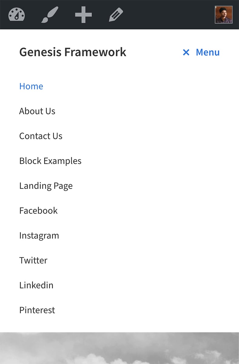
Hi Dale,
The items will appear combined with the primary nav at the top and the ones in secondary nav below them. I’ve updated the tutorial and added a screenshot.